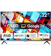
¡Descubre la Android TV serie H7A en Bitech!
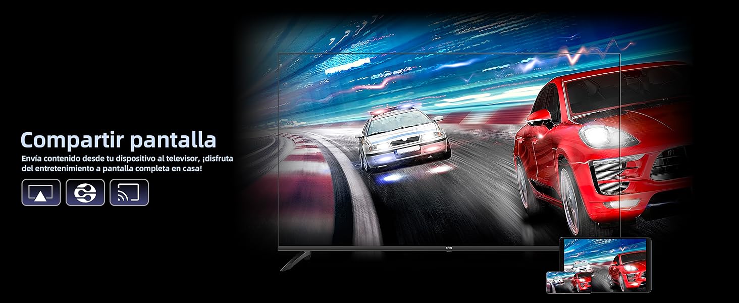
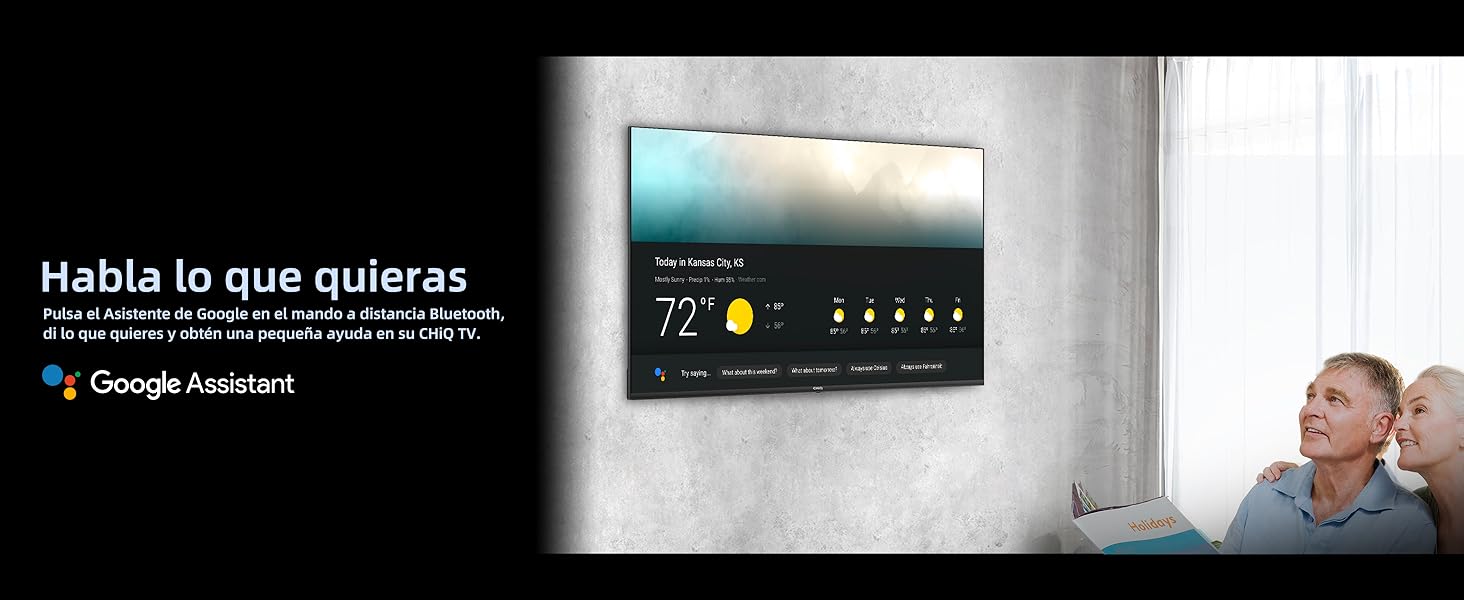
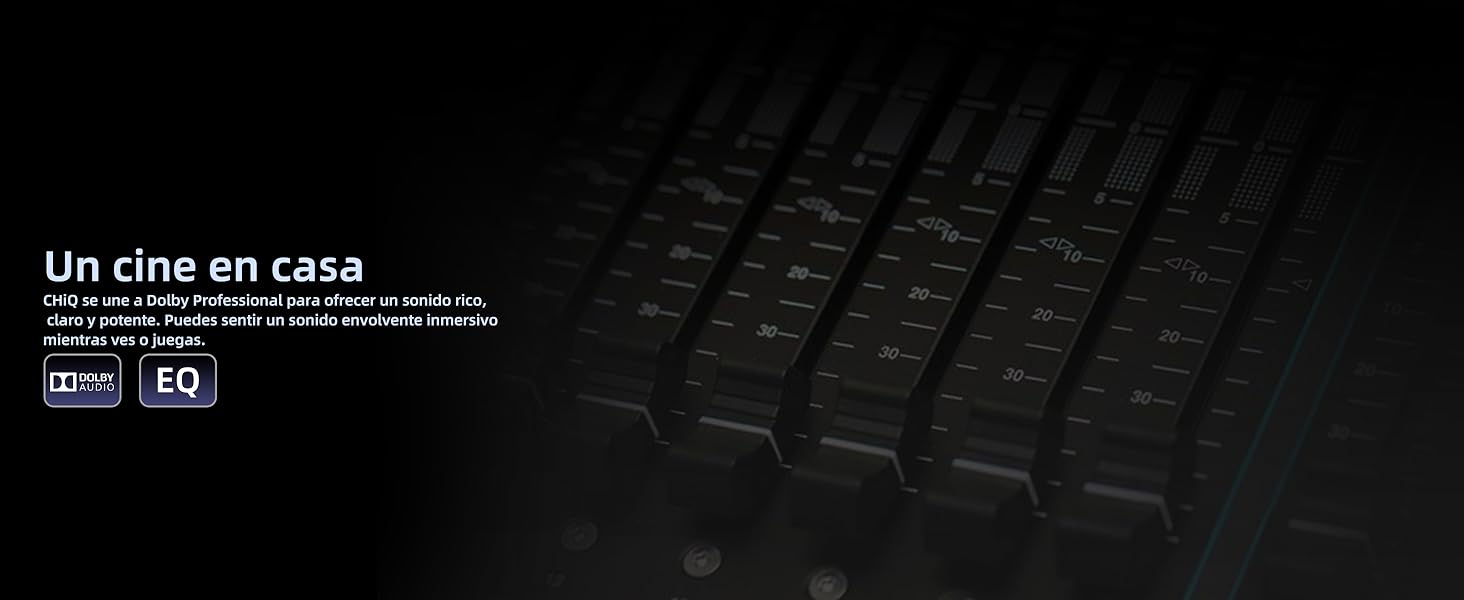
Disfruta del entretenimiento a pantalla completa en casa con la Android TV serie H7A. Pulsa el Asistente de Google en el mando a distancia Bluetooth y disfruta de un sonido rico y potente gracias a la colaboración de CHiQ con Dolby Professional. Además, su diseño avanzado y acabado impecable lo convierten en una excelente opción para tu hogar.
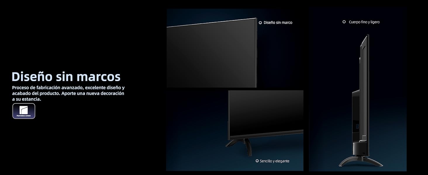
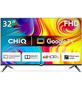
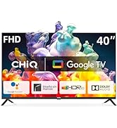
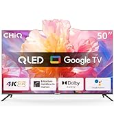
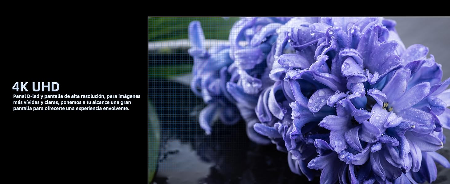
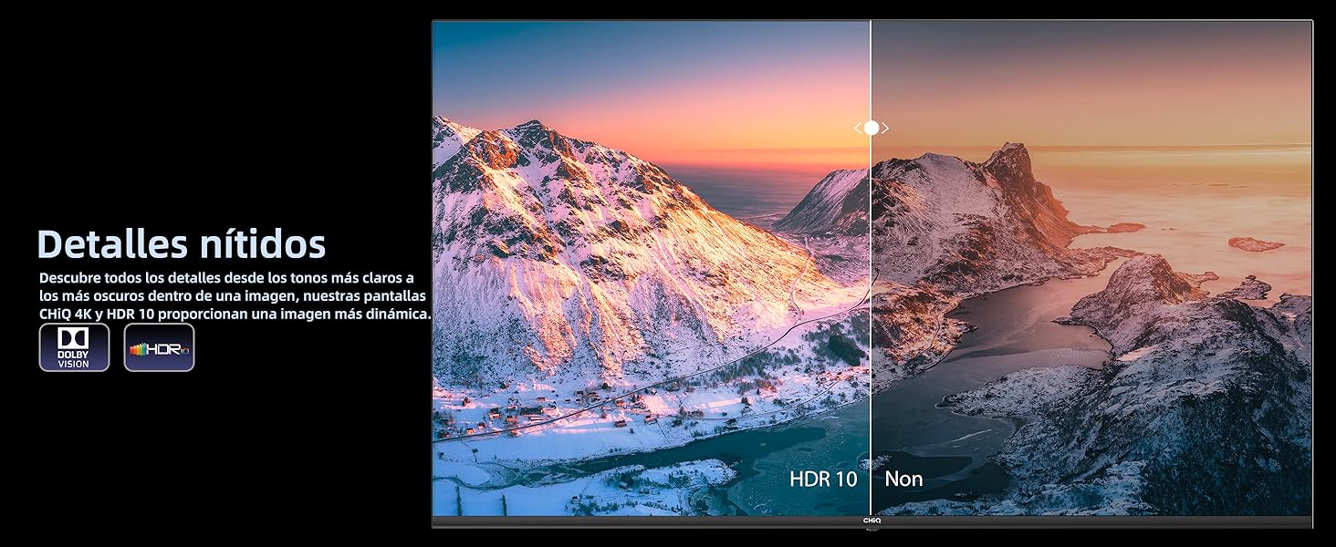
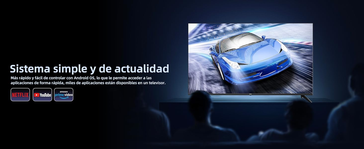
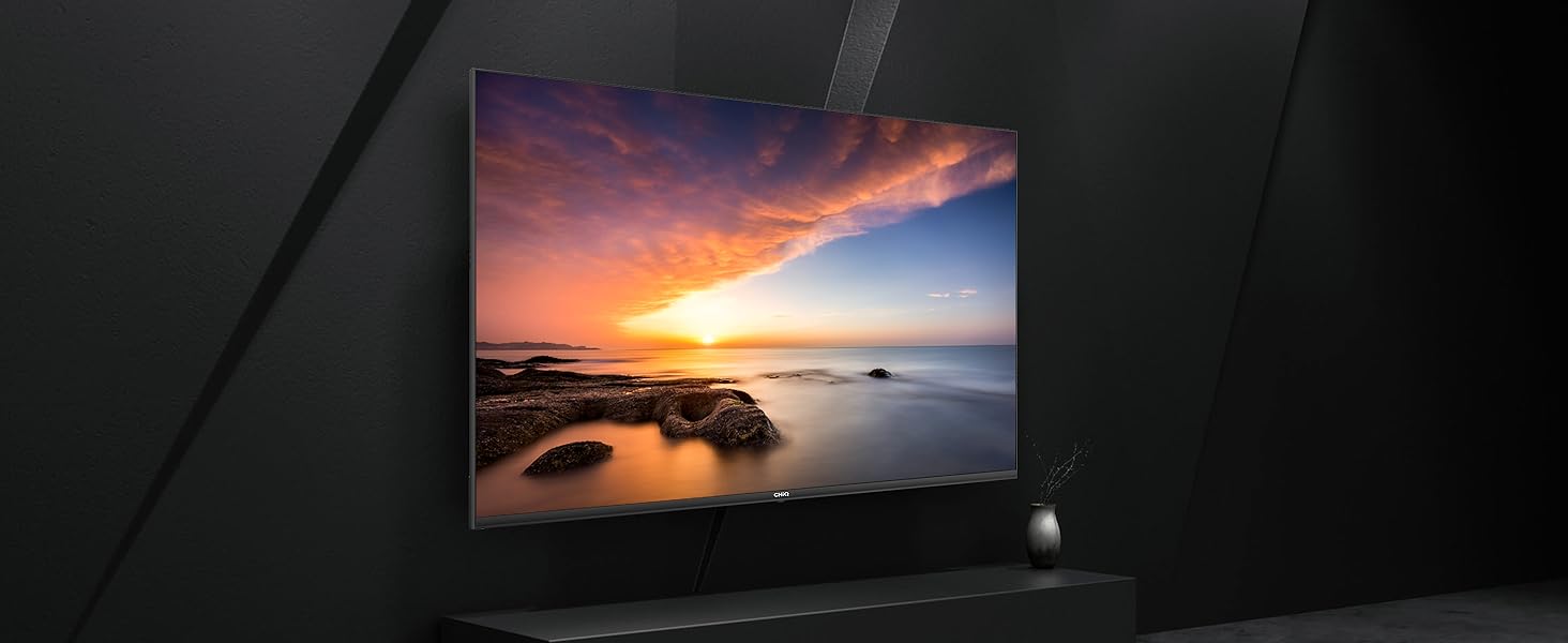
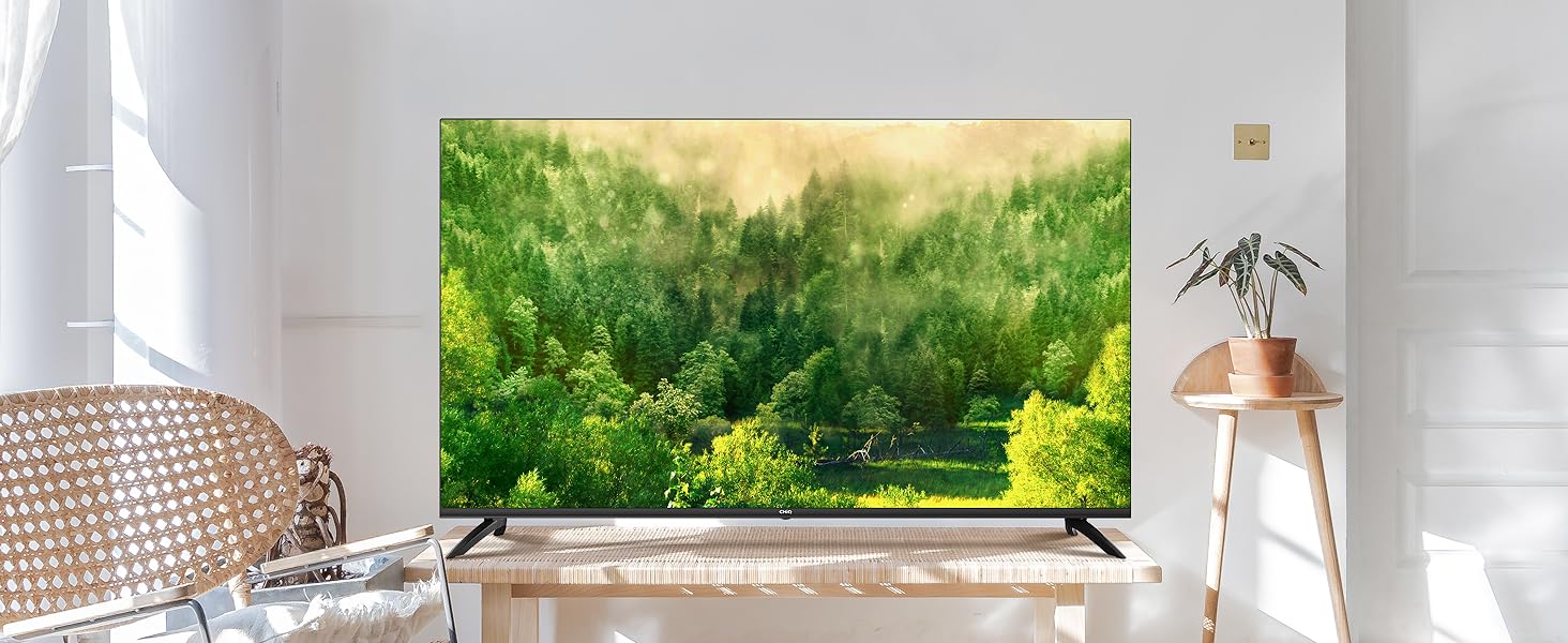
Con un televisor LED de 43 pulgadas, diseño sin marco y resolución 4K, la Android TV serie H7A ofrece una experiencia visual realista y activa. Además, cuenta con Android 11 TV, HDR, Dolby Vision, Asistente de Google, Google Play y mucho más. ¡No te pierdas esta oportunidad en Bitech!
Aprovecha esta oferta y añade la Android TV serie H7A a tu cesta de compra en Bitech. ¡No te arrepentirás!
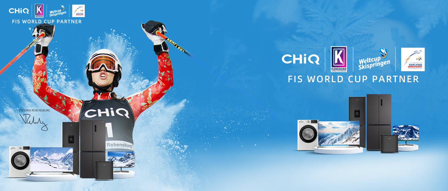
Somos una marca internacional de electrodomésticos profesionales que innova continuamente en respuesta a la demanda de los consumidores.
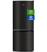
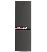
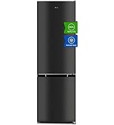
CHiQ se ha asociado con marcas de compresores de renombre mundial. El resultado es un frigorífico respetuoso con el medio ambiente, de alta calidad y eficiente. Los consumidores de todo el mundo reconocen a CHiQ.
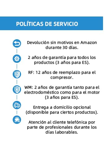


En BiTech, ofrecemos , 30 días de Devolución GRATUITA, para que puedas comprar con total tranquilidad. Si no estás satisfecho te devolvemos el dinero. A parte, tienes 3 años de garantía.
Más información
¡Descubre la Android TV serie H7A en Bitech!
Disfruta del entretenimiento a pantalla completa en casa con la Android TV serie H7A. Pulsa el Asistente de Google en el mando a distancia Bluetooth y disfruta de un sonido rico y potente gracias a la colaboración de CHiQ con Dolby Professional. Además, su diseño avanzado y acabado impecable lo convierten en una excelente opción para tu hogar.
Con un televisor LED de 43 pulgadas, diseño sin marco y resolución 4K, la Android TV serie H7A ofrece una experiencia visual realista y activa. Además, cuenta con Android 11 TV, HDR, Dolby Vision, Asistente de Google, Google Play y mucho más. ¡No te pierdas esta oportunidad en Bitech!
Aprovecha esta oferta y añade la Android TV serie H7A a tu cesta de compra en Bitech. ¡No te arrepentirás!
Somos una marca internacional de electrodomésticos profesionales que innova continuamente en respuesta a la demanda de los consumidores.
CHiQ se ha asociado con marcas de compresores de renombre mundial. El resultado es un frigorífico respetuoso con el medio ambiente, de alta calidad y eficiente. Los consumidores de todo el mundo reconocen a CHiQ.