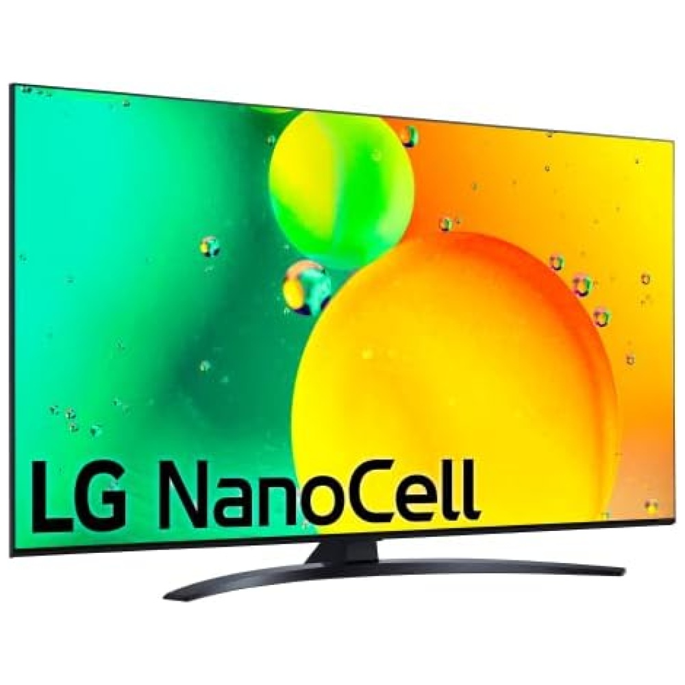
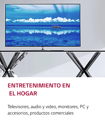
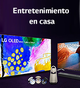
En Bitech, tenemos la televisión LG Nanocell NANO766QA, ¡y es una maravilla! Con una experiencia audiovisual LED mejorada, podrás disfrutar de imágenes nítidas y colores vibrantes gracias a su compatibilidad con formatos HDR 10, HLG, HGiG, Filmmaker y sonido Dolby Digital.
Además, cuenta con un potente procesador 4K a5 Gen 5 que garantiza una gran precisión en los tonos y colores de cada fotograma. También identifica el movimiento de los objetos para ofrecerte un sonido surround de 5.1 canales. ¡Te sentirás como si estuvieras dentro de la acción!
Y eso no es todo, esta televisión forma parte del ecosistema abierto e inteligente ThinQ. Podrás controlarla fácilmente con tu voz gracias a su compatibilidad con Apple Home Kit, Google y Alexa. ¡Imagina poder encender la televisión o cambiar de canal sin moverte del sofá!
Si eres un amante de los videojuegos, esta televisión también es perfecta para ti. Con funciones gaming como Cloud Gaming (Stadia y GeForce Now), un menú exclusivo para juegos y baja latencia (menos de 19ms), disfrutarás de una experiencia de juego inigualable.
No pierdas la oportunidad de tener esta increíble televisión en tu hogar. ¡Compra ahora en Bitech y lleva tu experiencia audiovisual al siguiente nivel!


1958 - Establece Gold Star (ahora LG Electronics)
1959 - Produce la primera radio de Corea
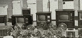
1965 - Produce el primer refrigerador de Corea
1966 - Produce el primer televisor de Corea
1978 - Logra USD 100 Millones en exportaciones
1982 - Establece la primera base de producción en el extranjero en los EE.UU.
1995 - Cambia el nombre de la empresa a LG Electronics
1999 - Entra en una empresa conjunta para desarrollar paneles LCD
2005 - Toma la delantera en el mercado de lavado de bidones de EE.UU.
2008 - Desarrolla el primer chip de módem móvil LTE
2009 - Se convierte en la segunda marca de televisores LCD

2011 - Lanza televisores 3D con lentes obturadores
2012 - Primeros en el mundo en comercializar televisores ULTRA HD de 84 pulgadas
2013 - Presenta el servicio HomeChat para electrodomésticos inteligentes, lanza Vehicle Components Company
2014 - Presenta el primer televisor OLED 4K y el televisor inteligente webOS, presenta el teléfono inteligente G3 con pantalla Quad HD
2016 - Presenta la marca premium LG SIGNATURE
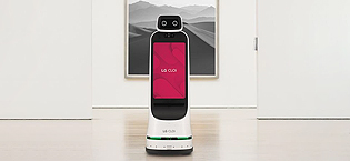
2018 - Presenta los robots comerciales CLOi
2020 - Lanza el primer televisor OLED enrollable
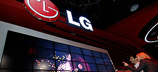
2022 - LG Smart Park es seleccionada como Fábrica Faro por el Foro Económico Mundial (FEM)


En BiTech, ofrecemos , 30 días de Devolución GRATUITA, para que puedas comprar con total tranquilidad. Si no estás satisfecho te devolvemos el dinero. A parte, tienes 3 años de garantía.
Más información
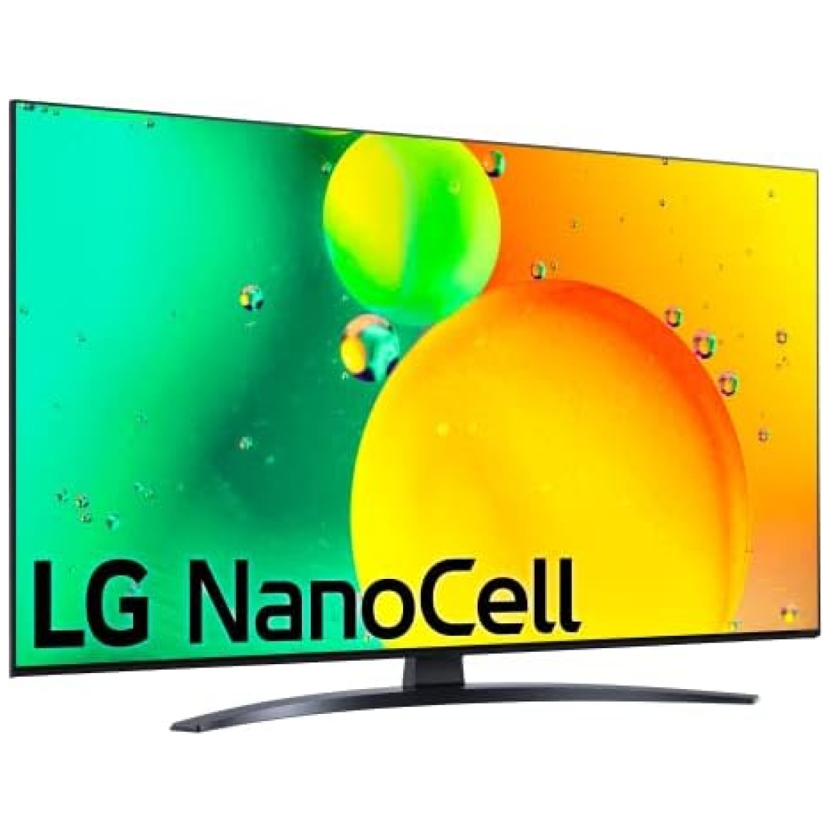
En Bitech, tenemos la televisión LG Nanocell NANO766QA, ¡y es una maravilla! Con una experiencia audiovisual LED mejorada, podrás disfrutar de imágenes nítidas y colores vibrantes gracias a su compatibilidad con formatos HDR 10, HLG, HGiG, Filmmaker y sonido Dolby Digital.
Además, cuenta con un potente procesador 4K a5 Gen 5 que garantiza una gran precisión en los tonos y colores de cada fotograma. También identifica el movimiento de los objetos para ofrecerte un sonido surround de 5.1 canales. ¡Te sentirás como si estuvieras dentro de la acción!
Y eso no es todo, esta televisión forma parte del ecosistema abierto e inteligente ThinQ. Podrás controlarla fácilmente con tu voz gracias a su compatibilidad con Apple Home Kit, Google y Alexa. ¡Imagina poder encender la televisión o cambiar de canal sin moverte del sofá!
Si eres un amante de los videojuegos, esta televisión también es perfecta para ti. Con funciones gaming como Cloud Gaming (Stadia y GeForce Now), un menú exclusivo para juegos y baja latencia (menos de 19ms), disfrutarás de una experiencia de juego inigualable.
No pierdas la oportunidad de tener esta increíble televisión en tu hogar. ¡Compra ahora en Bitech y lleva tu experiencia audiovisual al siguiente nivel!
1958 - Establece Gold Star (ahora LG Electronics)
1959 - Produce la primera radio de Corea
1965 - Produce el primer refrigerador de Corea
1966 - Produce el primer televisor de Corea
1978 - Logra USD 100 Millones en exportaciones
1982 - Establece la primera base de producción en el extranjero en los EE.UU.
1995 - Cambia el nombre de la empresa a LG Electronics
1999 - Entra en una empresa conjunta para desarrollar paneles LCD
2005 - Toma la delantera en el mercado de lavado de bidones de EE.UU.
2008 - Desarrolla el primer chip de módem móvil LTE
2009 - Se convierte en la segunda marca de televisores LCD
2011 - Lanza televisores 3D con lentes obturadores
2012 - Primeros en el mundo en comercializar televisores ULTRA HD de 84 pulgadas
2013 - Presenta el servicio HomeChat para electrodomésticos inteligentes, lanza Vehicle Components Company
2014 - Presenta el primer televisor OLED 4K y el televisor inteligente webOS, presenta el teléfono inteligente G3 con pantalla Quad HD
2016 - Presenta la marca premium LG SIGNATURE
2018 - Presenta los robots comerciales CLOi
2020 - Lanza el primer televisor OLED enrollable
2022 - LG Smart Park es seleccionada como Fábrica Faro por el Foro Económico Mundial (FEM)
