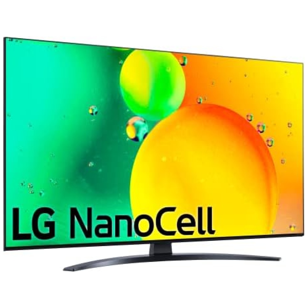
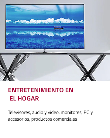
En Bitech, te presentamos el increíble televisor LG Nanocell NANO766QA. Con una experiencia audiovisual LED mejorada, este televisor es compatible con formatos HDR 10, HLG, HGiG, Filmmaker y cuenta con sonido Dolby Digital. Además, su potente procesador de gran precisión de tonos y colores garantiza una calidad de imagen excepcional.
Con el ecosistema abierto e inteligente ThinQ, este televisor es compatible con Apple Home Kit, Google y Alexa, lo que te permite controlar por voz todos tus dispositivos inteligentes compatibles. Además, cuenta con funciones gaming como Cloud Gaming (Stadia y GeForce Now), un menú exclusivo para gaming y baja latencia para una experiencia de juego fluida.
No te pierdas la oportunidad de disfrutar de la mejor calidad de imagen y sonido con el televisor LG Nanocell NANO766QA. ¡Compra ahora en Bitech y lleva tu experiencia audiovisual al siguiente nivel!

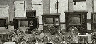
1958 - Establece Gold Star (ahora LG Electronics)
1959 - Produce la primera radio de Corea
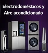
1965 - Produce el primer refrigerador de Corea
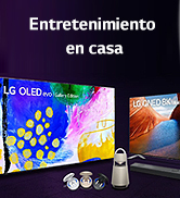
1966 - Produce el primer televisor de Corea
1978 - Logra USD 100 Millones en exportaciones
1982 - Establece la primera base de producción en el extranjero en los EE.UU.
1995 - Cambia el nombre de la empresa a LG Electronics
1999 - Entra en una empresa conjunta para desarrollar paneles LCD
2005 - Toma la delantera en el mercado de lavado de bidones de EE.UU.
2008 - Desarrolla el primer chip de módem móvil LTE
2009 - Se convierte en la segunda marca de televisores LCD
2011 - Lanza televisores 3D con lentes obturadores
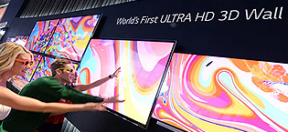
2012 - Primeros en el mundo en comercializar televisores ULTRA HD de 84 pulgadas
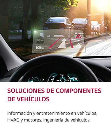
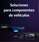
2013 - Presenta el servicio HomeChat para electrodomésticos inteligentes, lanza Vehicle Components Company
2014 - Presenta el primer televisor OLED 4K y el televisor inteligente webOS, presenta el teléfono inteligente G3 con pantalla Quad HD
2016 - Presenta la marca premium LG SIGNATURE
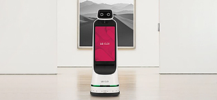
2018 - Presenta los robots comerciales CLOi
2020 - Lanza el primer televisor OLED enrollable
2022 - LG Smart Park es seleccionada como Fábrica Faro por el Foro Económico Mundial (FEM)


En BiTech, ofrecemos , 30 días de Devolución GRATUITA, para que puedas comprar con total tranquilidad. Si no estás satisfecho te devolvemos el dinero. A parte, tienes 3 años de garantía.
Más información
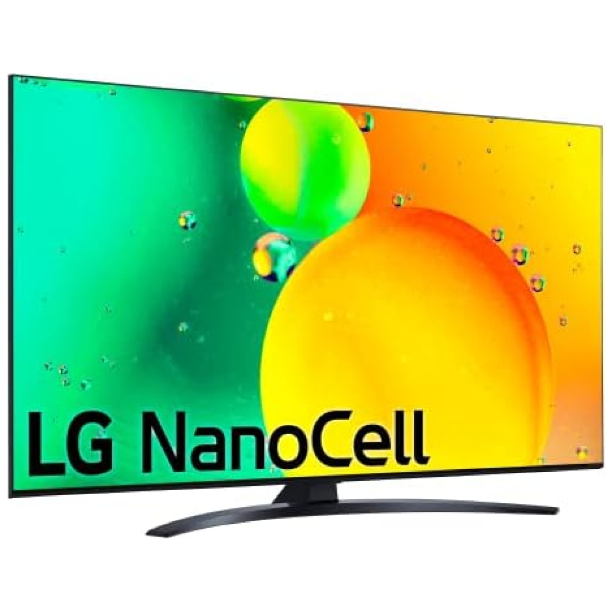
En Bitech, te presentamos el increíble televisor LG Nanocell NANO766QA. Con una experiencia audiovisual LED mejorada, este televisor es compatible con formatos HDR 10, HLG, HGiG, Filmmaker y cuenta con sonido Dolby Digital. Además, su potente procesador de gran precisión de tonos y colores garantiza una calidad de imagen excepcional.
Con el ecosistema abierto e inteligente ThinQ, este televisor es compatible con Apple Home Kit, Google y Alexa, lo que te permite controlar por voz todos tus dispositivos inteligentes compatibles. Además, cuenta con funciones gaming como Cloud Gaming (Stadia y GeForce Now), un menú exclusivo para gaming y baja latencia para una experiencia de juego fluida.
No te pierdas la oportunidad de disfrutar de la mejor calidad de imagen y sonido con el televisor LG Nanocell NANO766QA. ¡Compra ahora en Bitech y lleva tu experiencia audiovisual al siguiente nivel!
1958 - Establece Gold Star (ahora LG Electronics)
1959 - Produce la primera radio de Corea
1965 - Produce el primer refrigerador de Corea
1966 - Produce el primer televisor de Corea
1978 - Logra USD 100 Millones en exportaciones
1982 - Establece la primera base de producción en el extranjero en los EE.UU.
1995 - Cambia el nombre de la empresa a LG Electronics
1999 - Entra en una empresa conjunta para desarrollar paneles LCD
2005 - Toma la delantera en el mercado de lavado de bidones de EE.UU.
2008 - Desarrolla el primer chip de módem móvil LTE
2009 - Se convierte en la segunda marca de televisores LCD
2011 - Lanza televisores 3D con lentes obturadores
2012 - Primeros en el mundo en comercializar televisores ULTRA HD de 84 pulgadas
2013 - Presenta el servicio HomeChat para electrodomésticos inteligentes, lanza Vehicle Components Company
2014 - Presenta el primer televisor OLED 4K y el televisor inteligente webOS, presenta el teléfono inteligente G3 con pantalla Quad HD
2016 - Presenta la marca premium LG SIGNATURE
2018 - Presenta los robots comerciales CLOi
2020 - Lanza el primer televisor OLED enrollable
2022 - LG Smart Park es seleccionada como Fábrica Faro por el Foro Económico Mundial (FEM)
