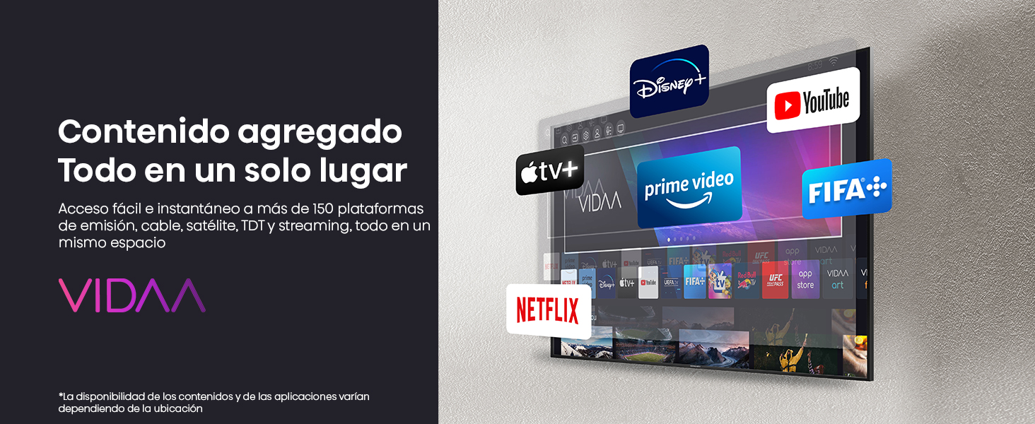
Más información del producto


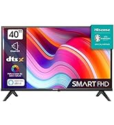
 1 HD 2 Reduccion de Ruido 3 Alto contraste 4 Potenciador del color 5 Potenciador


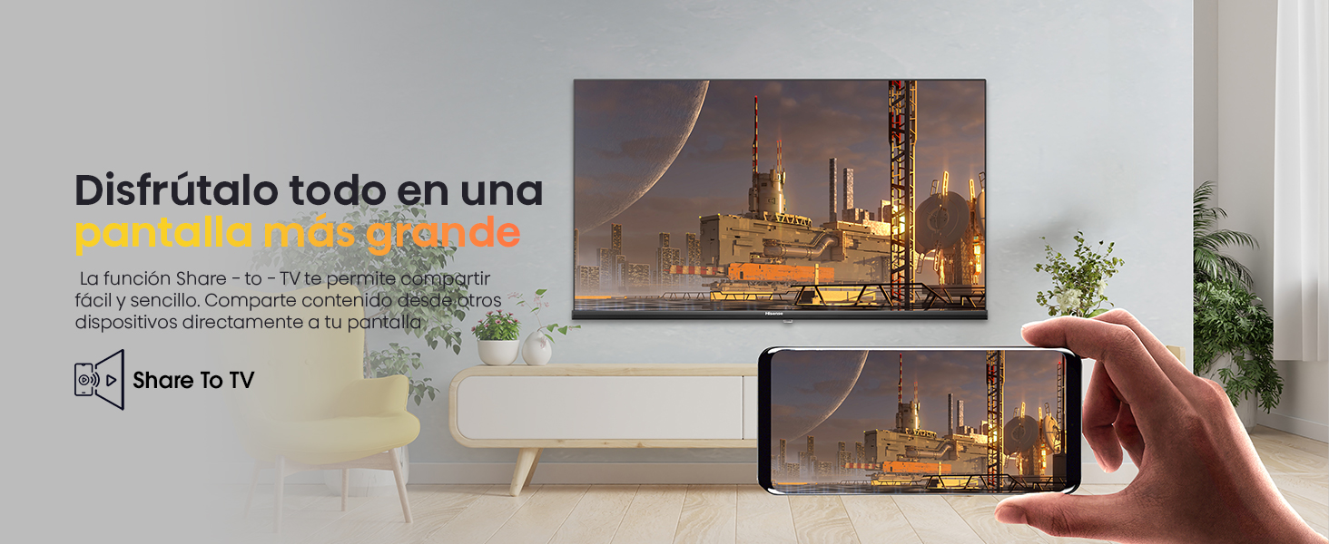
 1 Share To TV 2 Conectividad Total
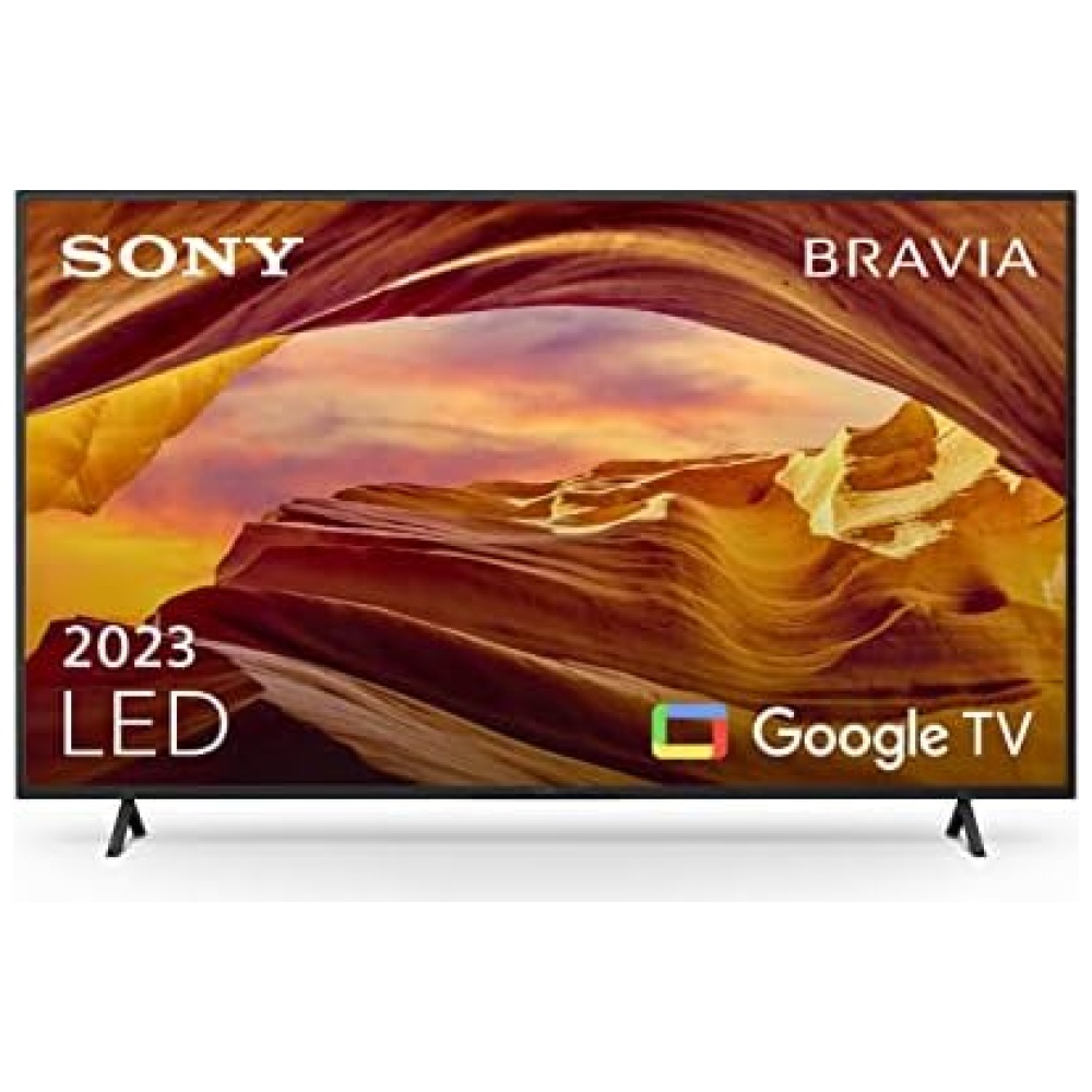
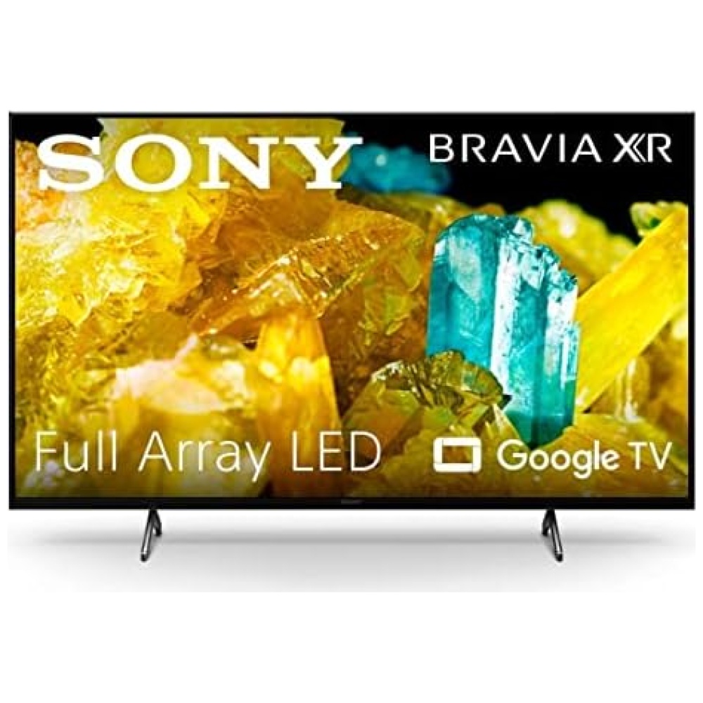
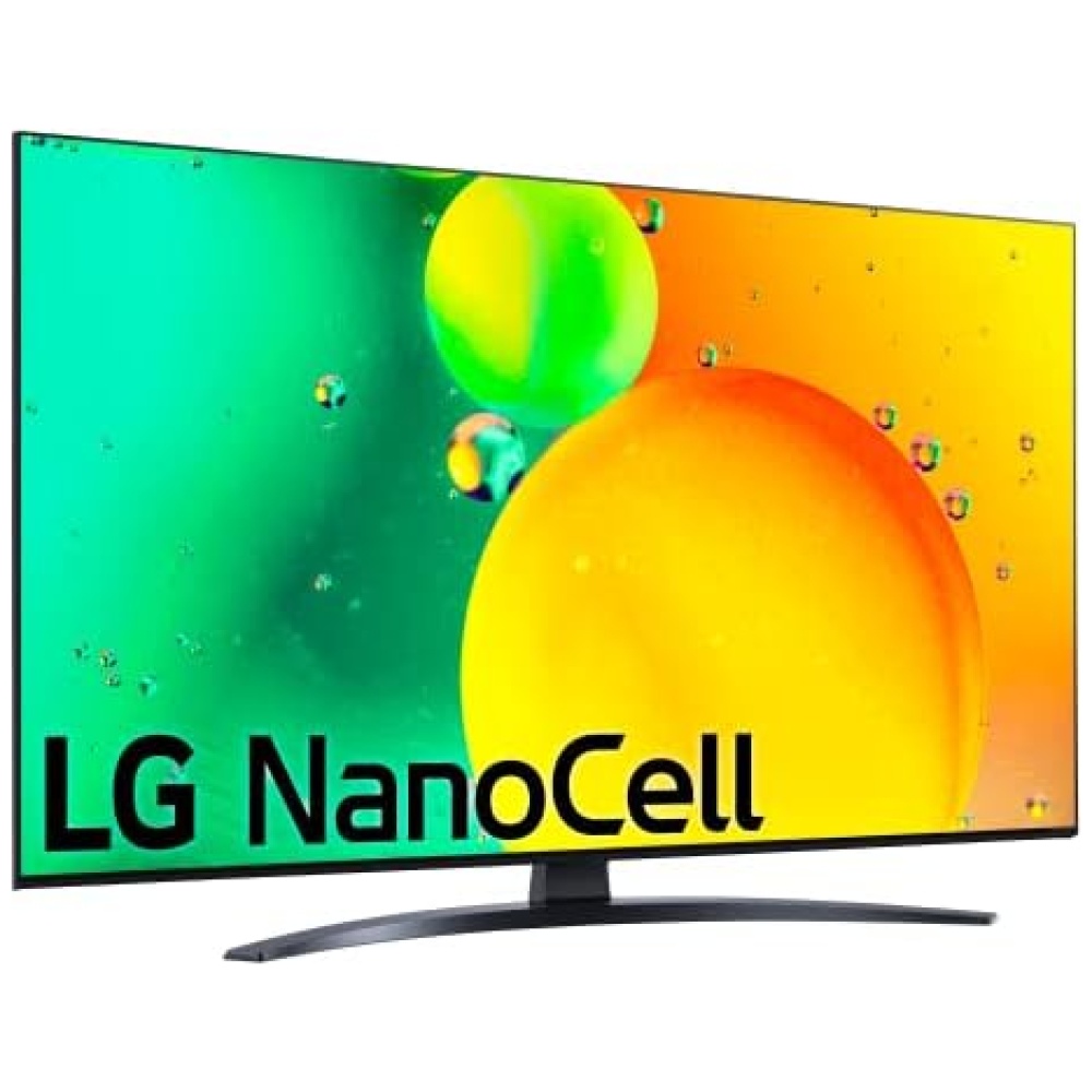
Productos Similares
Pulgadas
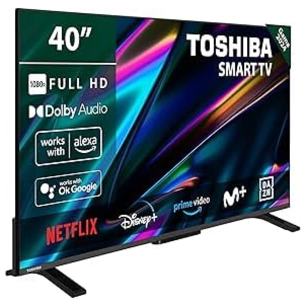
40" / 32"
40" / 32"
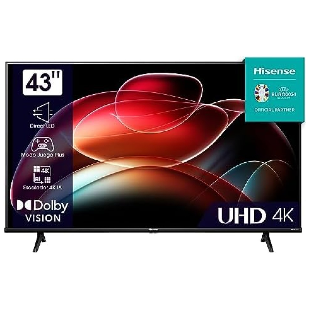
85”/ 65"/ 58"/ 55"/ 50"/ 43"
75"/ 65"/ 55"/ 50"/ 43"
Sistema Operativo
VIDAA 6
VIDAA 6
VIDAA 6
VIDAA 6
Categoría
FHD / HD
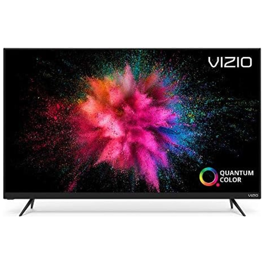
QLED FHD
UHD
QLED
Audio
2.0
2.0
2.0
2.0
Velocidad Panel
60 Hz
60 Hz
60 Hz
60 Hz
Quantum Dot
-
Sí
-
Sí
Brillo (nits)
200
200
300(65"&58"&55"&50")/250(43")
300(75"&65")/275(55"&50")/250
Local Dimming
-
-
-
-
Dolby Vision IQ / Dolby Atmos
- / -
- / -
- / -
- / Sí
Game Mode
Modo Juego
Modo Juego
Modo Juego Plus
Modo Juego Plus
HDMI 2.1
-
-
-
-
Vioce Control
Works with Alexa/VIDAA VOICE
Works with Alexa/VIDAA VOICE
Alexa Built-in/VIDAA VOICE
Alexa Built-in/VIDAA VOICE
Descatalogado por el fabricante: No
Natural Colour Enhancer: Optimiza la reproducción de color para que disfrutes de los colores de manera realista y uniforme, sin importar el contenido que elijas.
DTS Virtual X: Disfruta de un audio inmersivo sin necesidad de altavoces adicionales, sentirás los bajos en el centro de la acción.
Modo Deportes: Cambia automáticamente al modo Deportes cuando detecta una señal deportiva, para una experiencia como en el estadio, tanto en imagen como en sonido.
Modo Game: Reduce el lag de entrada y aumenta tus posibilidades de victoria legendaria en los juegos.
Fabricante: Hisense
ASIN: B0BTPZ51W7
Número de modelo del producto: 32A4K
¡Descubre más en nuestra tienda de tecnología Bitech (bitech.es)!
1 Share To TV 2 Conectividad Total
Productos Similares
Pulgadas
40" / 32"
40" / 32"
85”/ 65"/ 58"/ 55"/ 50"/ 43"
75"/ 65"/ 55"/ 50"/ 43"
Sistema Operativo
VIDAA 6
VIDAA 6
VIDAA 6
VIDAA 6
Categoría
FHD / HD
QLED FHD
UHD
QLED
Audio
2.0
2.0
2.0
2.0
Velocidad Panel
60 Hz
60 Hz
60 Hz
60 Hz
Quantum Dot
-
Sí
-
Sí
Brillo (nits)
200
200
300(65"&58"&55"&50")/250(43")
300(75"&65")/275(55"&50")/250
Local Dimming
-
-
-
-
Dolby Vision IQ / Dolby Atmos
- / -
- / -
- / -
- / Sí
Game Mode
Modo Juego
Modo Juego
Modo Juego Plus
Modo Juego Plus
HDMI 2.1
-
-
-
-
Vioce Control
Works with Alexa/VIDAA VOICE
Works with Alexa/VIDAA VOICE
Alexa Built-in/VIDAA VOICE
Alexa Built-in/VIDAA VOICE
Descatalogado por el fabricante: No
Natural Colour Enhancer: Optimiza la reproducción de color para que disfrutes de los colores de manera realista y uniforme, sin importar el contenido que elijas.
DTS Virtual X: Disfruta de un audio inmersivo sin necesidad de altavoces adicionales, sentirás los bajos en el centro de la acción.
Modo Deportes: Cambia automáticamente al modo Deportes cuando detecta una señal deportiva, para una experiencia como en el estadio, tanto en imagen como en sonido.
Modo Game: Reduce el lag de entrada y aumenta tus posibilidades de victoria legendaria en los juegos.
Fabricante: Hisense
ASIN: B0BTPZ51W7
Número de modelo del producto: 32A4K
¡Descubre más en nuestra tienda de tecnología Bitech (bitech.es)!


Calidad e Innovación para tu Hogar


En BiTech, ofrecemos , 30 días de Devolución GRATUITA, para que puedas comprar con total tranquilidad. Si no estás satisfecho te devolvemos el dinero. A parte, tienes 3 años de garantía.
Más información
Más información del producto
1 HD 2 Reduccion de Ruido 3 Alto contraste 4 Potenciador del color 5 Potenciador
1 Share To TV 2 Conectividad Total
Productos Similares
Pulgadas
40" / 32"
40" / 32"
85”/ 65"/ 58"/ 55"/ 50"/ 43"
75"/ 65"/ 55"/ 50"/ 43"
Sistema Operativo
VIDAA 6
VIDAA 6
VIDAA 6
VIDAA 6
Categoría
FHD / HD
QLED FHD
UHD
QLED
Audio
2.0
2.0
2.0
2.0
Velocidad Panel
60 Hz
60 Hz
60 Hz
60 Hz
Quantum Dot
-
Sí
-
Sí
Brillo (nits)
200
200
300(65"&58"&55"&50")/250(43")
300(75"&65")/275(55"&50")/250
Local Dimming
-
-
-
-
Dolby Vision IQ / Dolby Atmos
- / -
- / -
- / -
- / Sí
Game Mode
Modo Juego
Modo Juego
Modo Juego Plus
Modo Juego Plus
HDMI 2.1
-
-
-
-
Vioce Control
Works with Alexa/VIDAA VOICE
Works with Alexa/VIDAA VOICE
Alexa Built-in/VIDAA VOICE
Alexa Built-in/VIDAA VOICE
Descatalogado por el fabricante: No
Natural Colour Enhancer: Optimiza la reproducción de color para que disfrutes de los colores de manera realista y uniforme, sin importar el contenido que elijas.
DTS Virtual X: Disfruta de un audio inmersivo sin necesidad de altavoces adicionales, sentirás los bajos en el centro de la acción.
Modo Deportes: Cambia automáticamente al modo Deportes cuando detecta una señal deportiva, para una experiencia como en el estadio, tanto en imagen como en sonido.
Modo Game: Reduce el lag de entrada y aumenta tus posibilidades de victoria legendaria en los juegos.
Fabricante: Hisense
ASIN: B0BTPZ51W7
Número de modelo del producto: 32A4K
¡Descubre más en nuestra tienda de tecnología Bitech (bitech.es)!
Calidad e Innovación para tu Hogar


