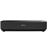
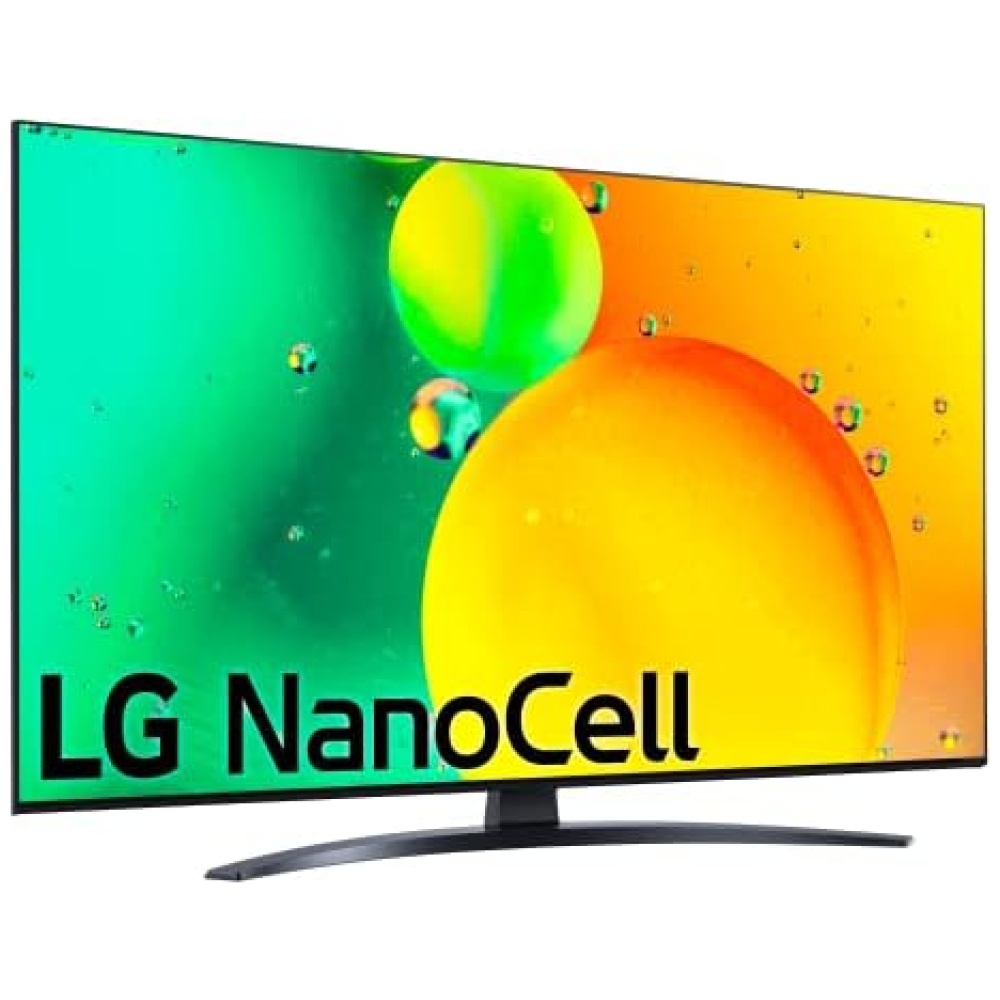
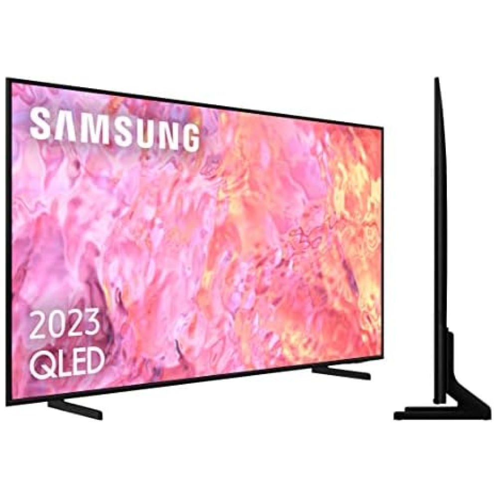
Más información del producto


 Productos Similares
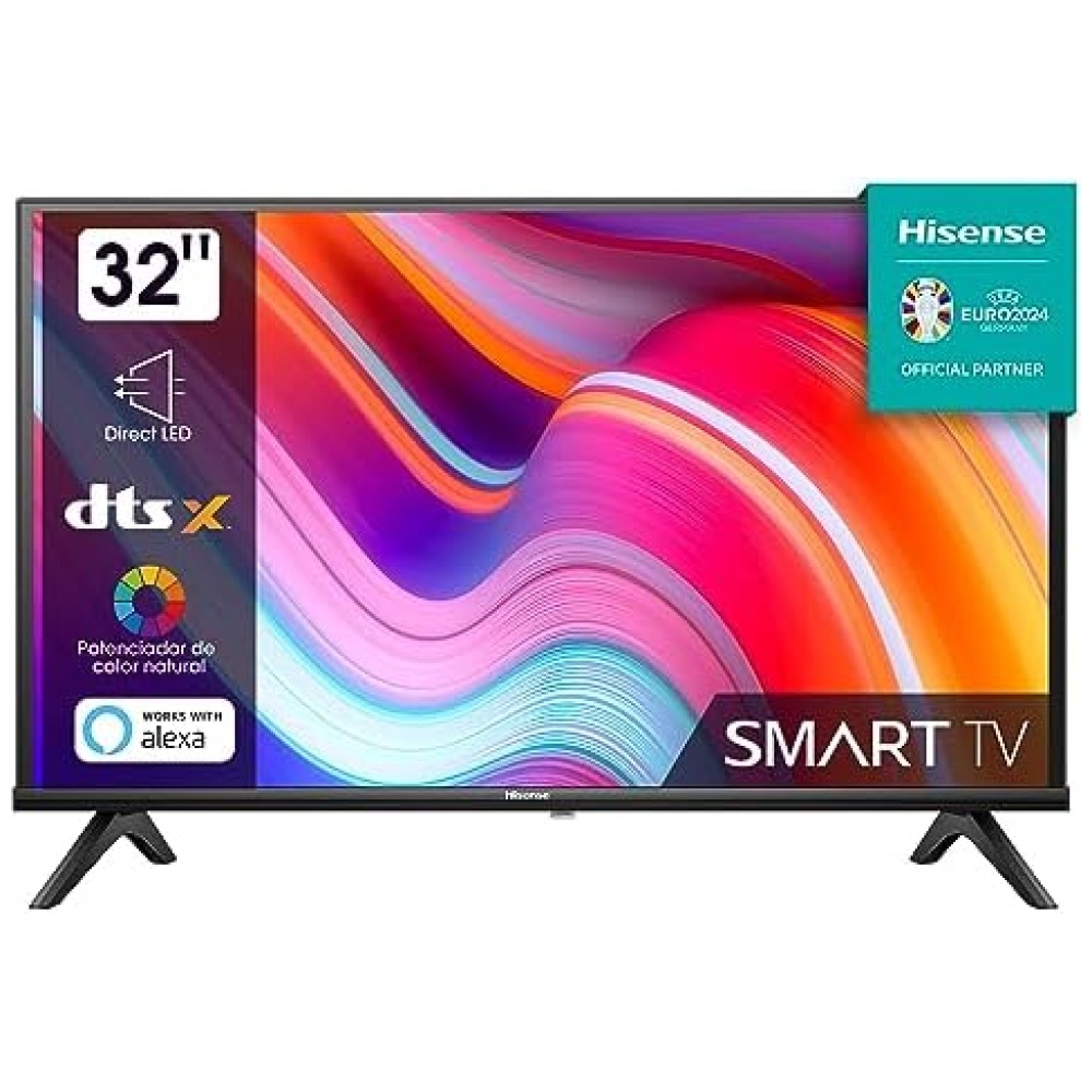
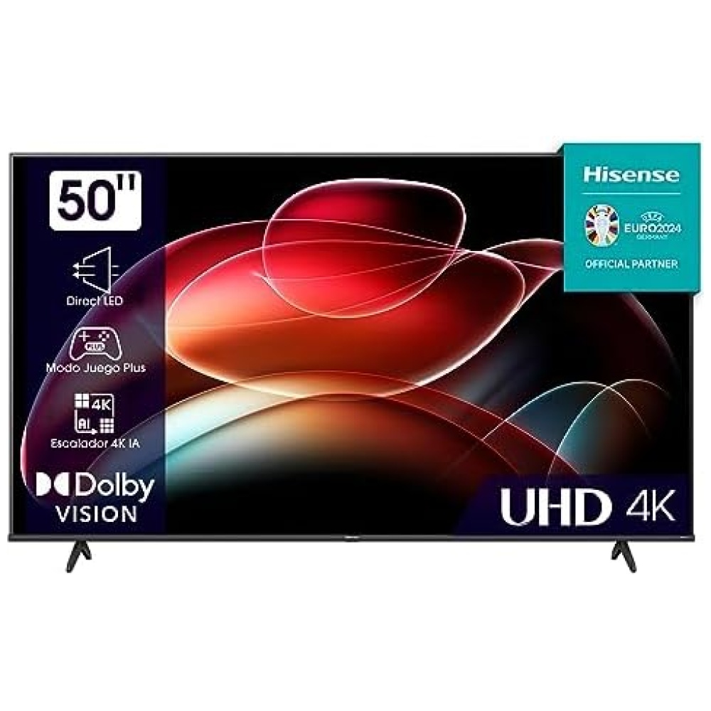
Pulgadas
75"/ 65"/ 55"/50"/ 43"
75" / 65" / 55"/ 50"/ 43"
85”/ 75"/ 65"/ 55"
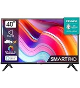
65"/ 55"
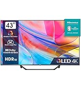
75"/ 65"/ 55"
Sistema Operativo
VIDAA 6
VIDAA 6
VIDAA 7
VIDAA 6
VIDAA 7
Categoría
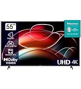
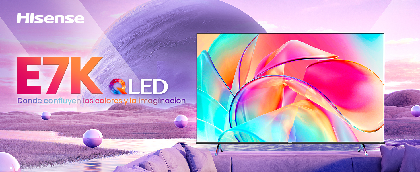
QLED
QLED
QLED
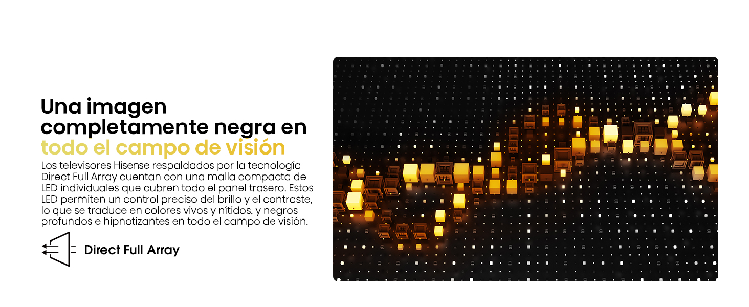
Mini-LED ULED
Mini-LED ULED
Audio
2.0
2.0
2.1 (50 W)
2.0
2.1 (40 W)
Velocidad Panel
60 Hz
60 Hz
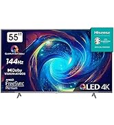
120 Hz / 144 Hz VRR
60 Hz
120 Hz / 144 Hz VRR
Quantum Dot
Sí
Sí
Sí
Sí
Sí
Brillo (nits)
300(75"&65")/275(
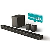
Productos Similares
Pulgadas
75"/ 65"/ 55"/50"/ 43"
75" / 65" / 55"/ 50"/ 43"
85”/ 75"/ 65"/ 55"
65"/ 55"
75"/ 65"/ 55"
Sistema Operativo
VIDAA 6
VIDAA 6
VIDAA 7
VIDAA 6
VIDAA 7
Categoría
QLED
QLED
QLED
Mini-LED ULED
Mini-LED ULED
Audio
2.0
2.0
2.1 (50 W)
2.0
2.1 (40 W)
Velocidad Panel
60 Hz
60 Hz
120 Hz / 144 Hz VRR
60 Hz
120 Hz / 144 Hz VRR
Quantum Dot
Sí
Sí
Sí
Sí
Sí
Brillo (nits)
300(75"&65")/275(

Calidad e Innovación para tu Hogar


En BiTech, ofrecemos , 30 días de Devolución GRATUITA, para que puedas comprar con total tranquilidad. Si no estás satisfecho te devolvemos el dinero. A parte, tienes 3 años de garantía.
Más información
Más información del producto
Productos Similares
Pulgadas
75"/ 65"/ 55"/50"/ 43"
75" / 65" / 55"/ 50"/ 43"
85”/ 75"/ 65"/ 55"
65"/ 55"
75"/ 65"/ 55"
Sistema Operativo
VIDAA 6
VIDAA 6
VIDAA 7
VIDAA 6
VIDAA 7
Categoría
QLED
QLED
QLED
Mini-LED ULED
Mini-LED ULED
Audio
2.0
2.0
2.1 (50 W)
2.0
2.1 (40 W)
Velocidad Panel
60 Hz
60 Hz
120 Hz / 144 Hz VRR
60 Hz
120 Hz / 144 Hz VRR
Quantum Dot
Sí
Sí
Sí
Sí
Sí
Brillo (nits)
300(75"&65")/275(
Calidad e Innovación para tu Hogar