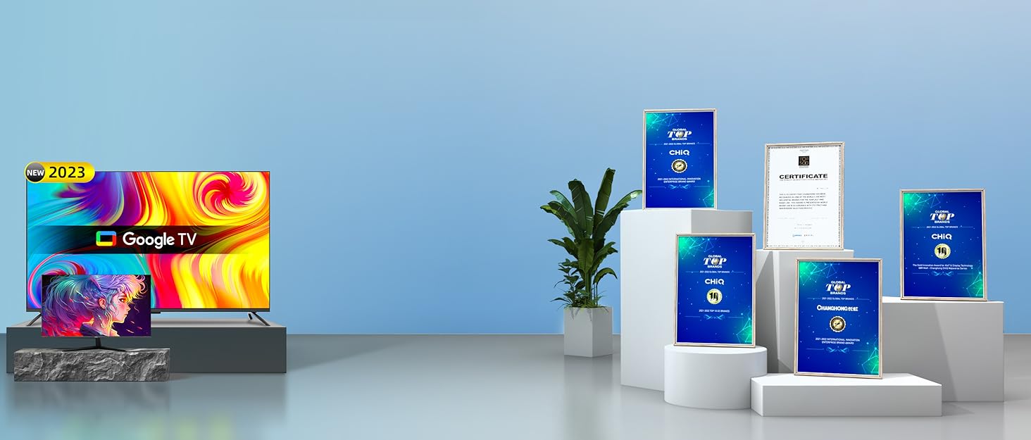
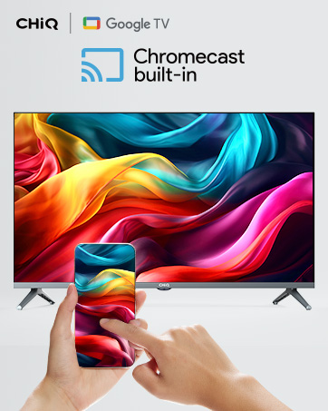
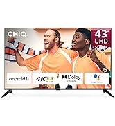
¡Descubre la increíble CHiQ Android 11 TV de 43 pulgadas en Bitech! Esta televisión cuenta con una impresionante resolución 4K UHD y colores verdaderos, lo que garantiza una experiencia visual de alta calidad. Además, viene con Android 11 y Chromecast integrado, lo que te permite acceder a una amplia variedad de aplicaciones y contenido en línea.
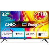
La CHiQ Android 11 TV también ofrece características adicionales como Dolby Audio y HDR10, que mejoran aún más la calidad del sonido y la imagen. Además, puedes controlar la televisión fácilmente con tu voz gracias al asistente de Google integrado en el mando.
Conectividad inteligente es otra ventaja de esta televisión, lo que te permite disfrutar de una experiencia más cómoda y versátil. Además, su diseño elegante y moderno se adapta perfectamente a cualquier espacio.
En Bitech, nos enorgullece ofrecerte productos de alta calidad como la CHiQ Android 11 TV. ¡No pierdas la oportunidad de disfrutar de entretenimiento ilimitado con esta increíble televisión! Visita bitech.es y descubre todas nuestras ofertas en tecnología.


En BiTech, ofrecemos , 30 días de Devolución GRATUITA, para que puedas comprar con total tranquilidad. Si no estás satisfecho te devolvemos el dinero. A parte, tienes 3 años de garantía.
Más información
¡Descubre la increíble CHiQ Android 11 TV de 43 pulgadas en Bitech! Esta televisión cuenta con una impresionante resolución 4K UHD y colores verdaderos, lo que garantiza una experiencia visual de alta calidad. Además, viene con Android 11 y Chromecast integrado, lo que te permite acceder a una amplia variedad de aplicaciones y contenido en línea.
La CHiQ Android 11 TV también ofrece características adicionales como Dolby Audio y HDR10, que mejoran aún más la calidad del sonido y la imagen. Además, puedes controlar la televisión fácilmente con tu voz gracias al asistente de Google integrado en el mando.
Conectividad inteligente es otra ventaja de esta televisión, lo que te permite disfrutar de una experiencia más cómoda y versátil. Además, su diseño elegante y moderno se adapta perfectamente a cualquier espacio.
En Bitech, nos enorgullece ofrecerte productos de alta calidad como la CHiQ Android 11 TV. ¡No pierdas la oportunidad de disfrutar de entretenimiento ilimitado con esta increíble televisión! Visita bitech.es y descubre todas nuestras ofertas en tecnología.