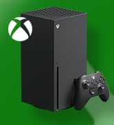
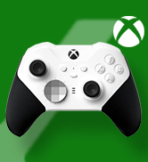
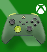
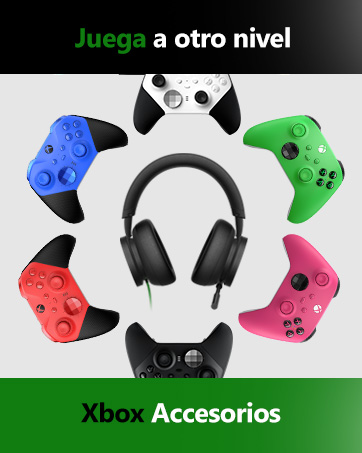
Xbox Elite Wireless Controller Series 2 – Core Edition
Clasificado: Calificación por edades desconocida
Idioma: Inglés
Fecha de lanzamiento: 1 junio 2019
ASIN: B0B9GJLV2D
Número de modelo del producto: 41K-00002
Restricciones de envío: Envío: Este producto se puede enviar a España y a otros países seleccionados.
Conecta de forma inalámbrica o mediante cable USB-C a consolas Xbox; también se conecta de forma inalámbrica a PC, tabletas, dispositivos Windows 10 y Android, y dispositivos iOS mediante Bluetooth o con el cable USB-C incluido. Además, se puede conectar a un PC con Windows 7 u 8.1 mediante el cable USB-C de 2.7m incluido, aunque algunas funciones pueden no ser compatibles.
Compatible con Xbox Serie X, Xbox One X, Xbox One S, Xbox One, Windows 10, Android e iOS, la funcionalidad puede variar según la versión del sistema operativo y del dispositivo compatible.
Requisitos del sistema: Compatible con sistemas Xbox y PC con Windows 7 o posterior, Windows 10/11; se requiere conexión Bluetooth, cable USB incluido o adaptador inalámbrico Xbox (se vende por separado), algunas características pueden no ser compatibles.
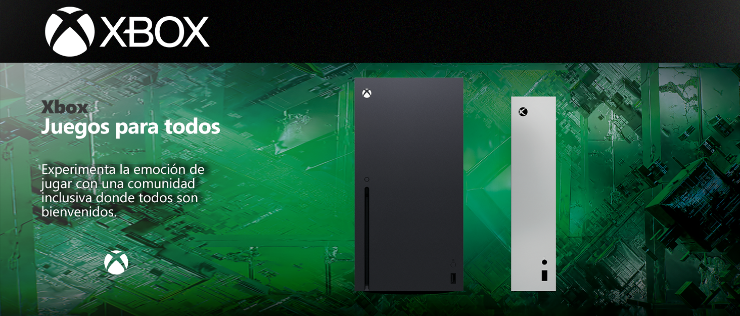
Los videojuegos tienen el poder de unir a las personas como parte de una comunidad y conectarlas a través de experiencias compartidas.
Con casi 400 millones de jugadores con discapacidades en el mundo, es importante crear experiencias de juego que sean inclusivas y accesibles por diseño para tantos jugadores como sea posible. Nuestros Juegos y Consola incluyen características que apoyan la accesibilidad visual, auditiva, de movilidad y cognitiva.


En BiTech, ofrecemos , 30 días de Devolución GRATUITA, para que puedas comprar con total tranquilidad. Si no estás satisfecho te devolvemos el dinero. A parte, tienes 3 años de garantía.
Más información
Xbox Elite Wireless Controller Series 2 – Core Edition
Clasificado: Calificación por edades desconocida
Idioma: Inglés
Fecha de lanzamiento: 1 junio 2019
ASIN: B0B9GJLV2D
Número de modelo del producto: 41K-00002
Restricciones de envío: Envío: Este producto se puede enviar a España y a otros países seleccionados.
Conecta de forma inalámbrica o mediante cable USB-C a consolas Xbox; también se conecta de forma inalámbrica a PC, tabletas, dispositivos Windows 10 y Android, y dispositivos iOS mediante Bluetooth o con el cable USB-C incluido. Además, se puede conectar a un PC con Windows 7 u 8.1 mediante el cable USB-C de 2.7m incluido, aunque algunas funciones pueden no ser compatibles.
Compatible con Xbox Serie X, Xbox One X, Xbox One S, Xbox One, Windows 10, Android e iOS, la funcionalidad puede variar según la versión del sistema operativo y del dispositivo compatible.
Requisitos del sistema: Compatible con sistemas Xbox y PC con Windows 7 o posterior, Windows 10/11; se requiere conexión Bluetooth, cable USB incluido o adaptador inalámbrico Xbox (se vende por separado), algunas características pueden no ser compatibles.
Los videojuegos tienen el poder de unir a las personas como parte de una comunidad y conectarlas a través de experiencias compartidas.
Con casi 400 millones de jugadores con discapacidades en el mundo, es importante crear experiencias de juego que sean inclusivas y accesibles por diseño para tantos jugadores como sea posible. Nuestros Juegos y Consola incluyen características que apoyan la accesibilidad visual, auditiva, de movilidad y cognitiva.