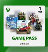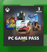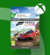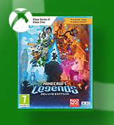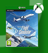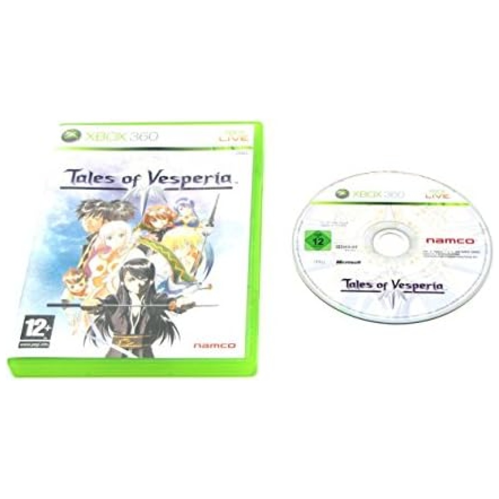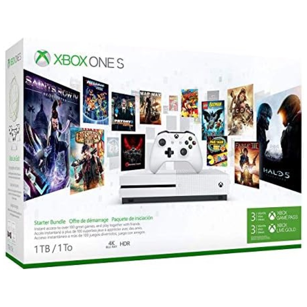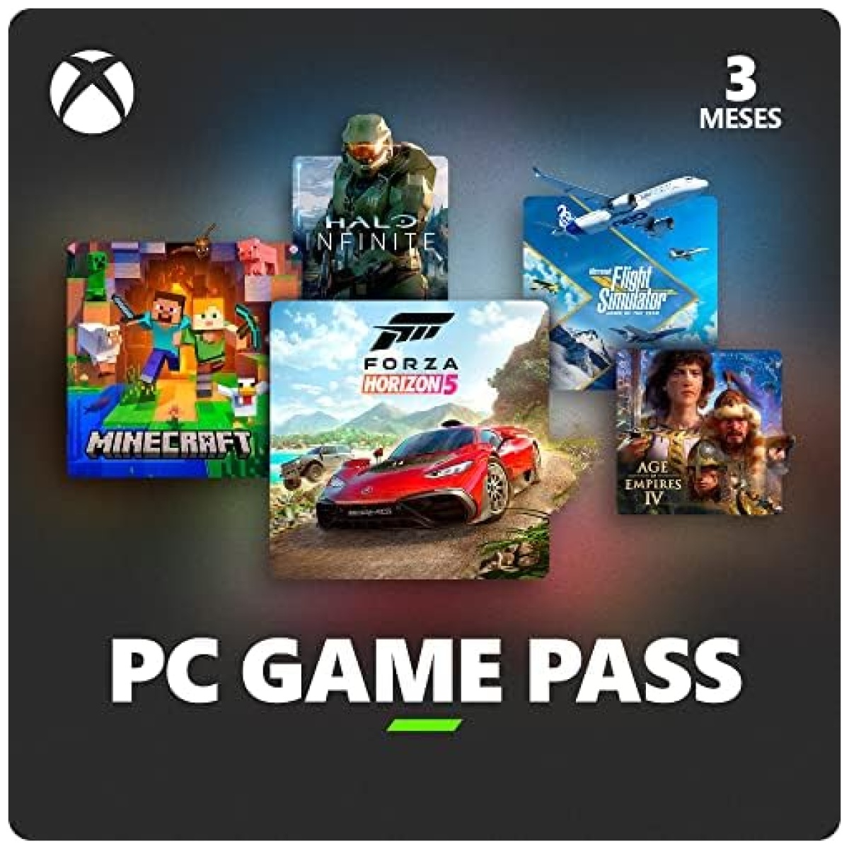
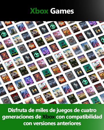
Disfruta de cientos de juegos de alta calidad para PC con tus amigos en Bitech.es, incluidos nuevos títulos disponibles el mismo día de su lanzamiento. Además, consigue una suscripción a EA Play para estar siempre al día. Sé el primero en jugar a emocionantes juegos como Starfield y Forza Motorsport desde el primer día y no te pierdas ninguna novedad. Obtén más de Riot Games con Game Pass; juega los títulos más populares de Riot en PC, como League of Legends y Valorant, y accede a contenido premium exclusivo para miembros de Game Pass. Sumérgete en el mundo de las exclusivas de Xbox, como Halo y Forza Horizon 5 de Xbox Game Studios, o explora títulos de Bethesda Softworks como DOOM, Elder Scrolls y Fallout. Además, no te pierdas la oportunidad de disfrutar de juegos como Mass Effect y STAR WARS con la suscripción a EA Play incluida. En Bitech.es añadimos constantemente nuevos juegos para que siempre tengas algo emocionante a lo que jugar, como Party Animals y Redfall. ¿Quieres tener los juegos que te encantan? Aprovecha los descuentos y ofertas para suscriptores en juegos seleccionados y complementos de juegos en nuestro catálogo de PC Game Pass.
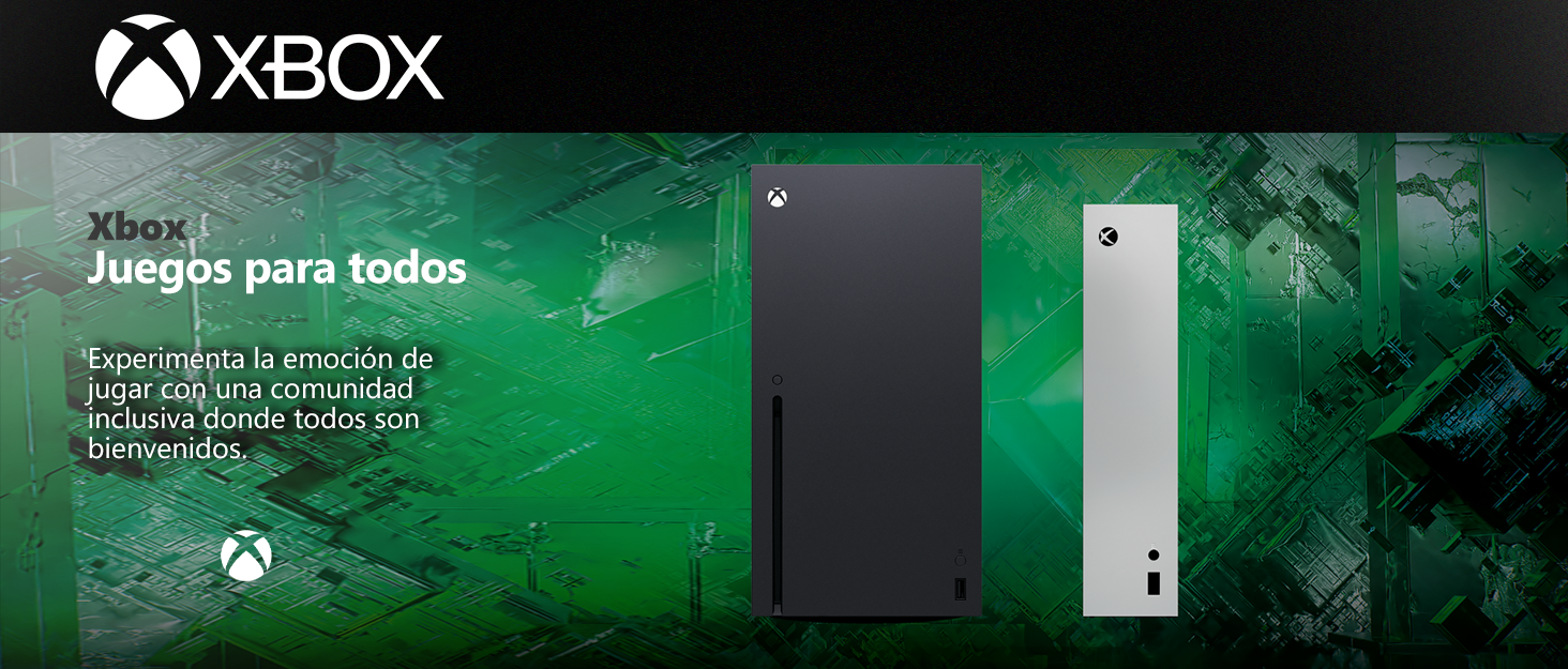


Los videojuegos tienen el poder de unir a las personas como parte de una comunidad y conectarlas a través de experiencias compartidas.
Con casi 400 millones de jugadores con discapacidades en el mundo, es importante crear experiencias de juego que sean inclusivas y accesibles por diseño para tantos jugadores como sea posible. Nuestros Juegos y Consola incluyen características que apoyan la accesibilidad visual, auditiva, de movilidad y cognitiva.


En BiTech, ofrecemos , 30 días de Devolución GRATUITA, para que puedas comprar con total tranquilidad. Si no estás satisfecho te devolvemos el dinero. A parte, tienes 3 años de garantía.
Más información
Disfruta de cientos de juegos de alta calidad para PC con tus amigos en Bitech.es, incluidos nuevos títulos disponibles el mismo día de su lanzamiento. Además, consigue una suscripción a EA Play para estar siempre al día. Sé el primero en jugar a emocionantes juegos como Starfield y Forza Motorsport desde el primer día y no te pierdas ninguna novedad. Obtén más de Riot Games con Game Pass; juega los títulos más populares de Riot en PC, como League of Legends y Valorant, y accede a contenido premium exclusivo para miembros de Game Pass. Sumérgete en el mundo de las exclusivas de Xbox, como Halo y Forza Horizon 5 de Xbox Game Studios, o explora títulos de Bethesda Softworks como DOOM, Elder Scrolls y Fallout. Además, no te pierdas la oportunidad de disfrutar de juegos como Mass Effect y STAR WARS con la suscripción a EA Play incluida. En Bitech.es añadimos constantemente nuevos juegos para que siempre tengas algo emocionante a lo que jugar, como Party Animals y Redfall. ¿Quieres tener los juegos que te encantan? Aprovecha los descuentos y ofertas para suscriptores en juegos seleccionados y complementos de juegos en nuestro catálogo de PC Game Pass.
Los videojuegos tienen el poder de unir a las personas como parte de una comunidad y conectarlas a través de experiencias compartidas.
Con casi 400 millones de jugadores con discapacidades en el mundo, es importante crear experiencias de juego que sean inclusivas y accesibles por diseño para tantos jugadores como sea posible. Nuestros Juegos y Consola incluyen características que apoyan la accesibilidad visual, auditiva, de movilidad y cognitiva.