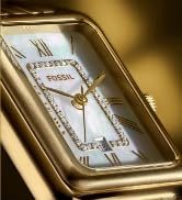
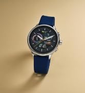
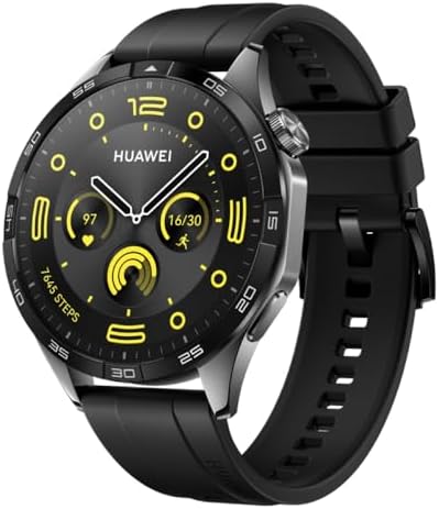
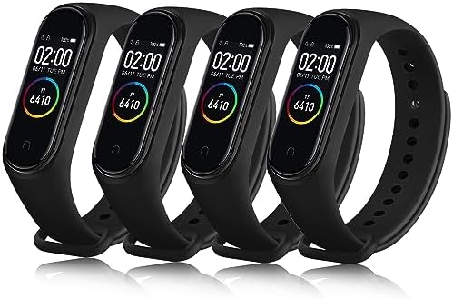
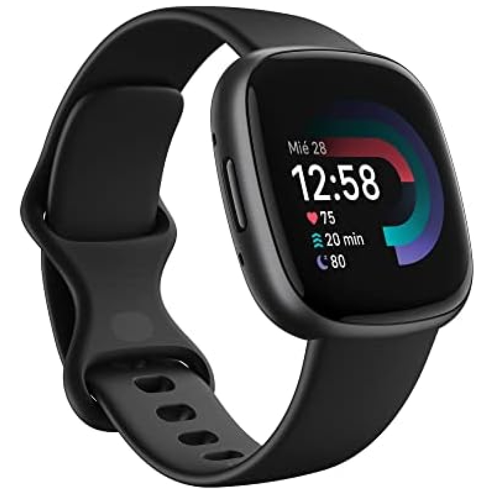
En Bitech, tenemos el smartwatch híbrido HR perfecto para ti. Con este dispositivo, podrás monitorear tu frecuencia cardíaca, actividad y sueño, obteniendo estadísticas detalladas de tu bienestar. Además, podrás recibir y consultar notificaciones y alertas de tu smartphone, acceder a actualizaciones de calendario y clima, controlar tu música y mucho más.
Nuestros smartwatches híbridos HR son compatibles tanto con teléfonos iPhone como con Android, por lo que no importa qué tipo de dispositivo tengas, podrás disfrutar de todas sus funciones.
No esperes más y visita nuestra tienda en línea en bitech.es para adquirir tu smartwatch híbrido HR y llevar tu experiencia tecnológica al siguiente nivel.
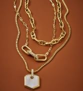
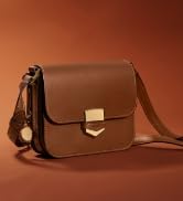
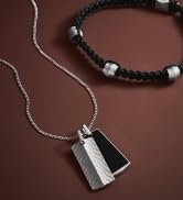
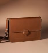
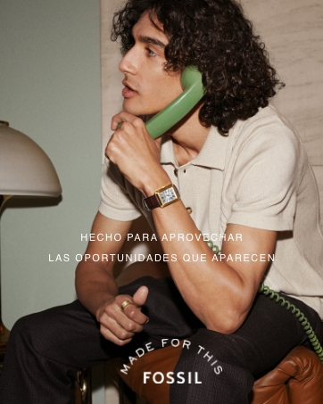
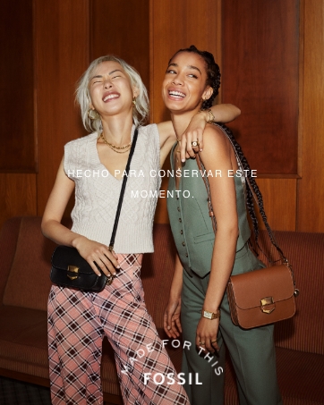
Creemos que la mejor aventura de todas es el camino hacia el autodescubrimiento. Y es nuestra misión crear accesorios distintivos elaborados a la perfección que estarán contigo en cada etapa de tu trayecto. A día de hoy continuamos centrándonos en lo que nos hace ser quienes somos: el optimismo, la autenticidad y, por supuesto, nuestro espíritu creativo. Todo lo que hacemos complementa cualquier estilo y se adapta a todos los estilos de vida.


En BiTech, ofrecemos , 30 días de Devolución GRATUITA, para que puedas comprar con total tranquilidad. Si no estás satisfecho te devolvemos el dinero. A parte, tienes 3 años de garantía.
Más información
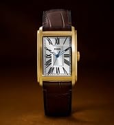
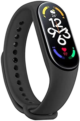
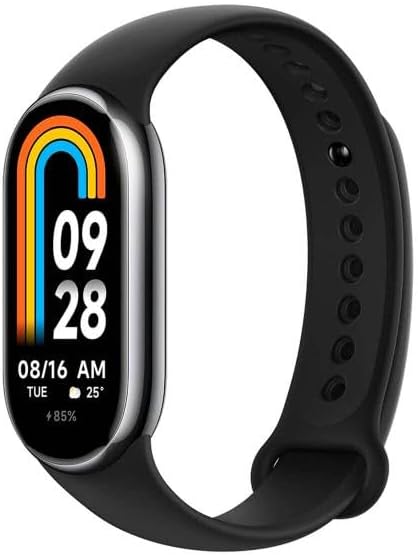
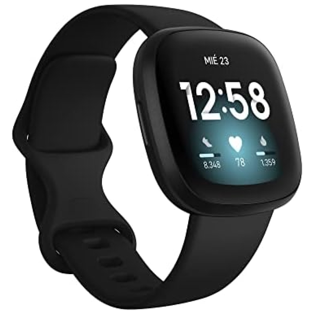
En Bitech, tenemos el smartwatch híbrido HR perfecto para ti. Con este dispositivo, podrás monitorear tu frecuencia cardíaca, actividad y sueño, obteniendo estadísticas detalladas de tu bienestar. Además, podrás recibir y consultar notificaciones y alertas de tu smartphone, acceder a actualizaciones de calendario y clima, controlar tu música y mucho más.
Nuestros smartwatches híbridos HR son compatibles tanto con teléfonos iPhone como con Android, por lo que no importa qué tipo de dispositivo tengas, podrás disfrutar de todas sus funciones.
No esperes más y visita nuestra tienda en línea en bitech.es para adquirir tu smartwatch híbrido HR y llevar tu experiencia tecnológica al siguiente nivel.
Creemos que la mejor aventura de todas es el camino hacia el autodescubrimiento. Y es nuestra misión crear accesorios distintivos elaborados a la perfección que estarán contigo en cada etapa de tu trayecto. A día de hoy continuamos centrándonos en lo que nos hace ser quienes somos: el optimismo, la autenticidad y, por supuesto, nuestro espíritu creativo. Todo lo que hacemos complementa cualquier estilo y se adapta a todos los estilos de vida.