de 80 cm (32\")")


MEDION E13226 (MD 30326) TV HD de 80 cm (32 Pulgadas) (Receptor Triple sintonizador DVB-T2 DVB-C DVB-S2, 2 x HDMI, euroconector, VGA, USB, Temporizador de Apagado automático, Reproductor Multimedia)
En Bitech, tenemos el televisor MEDION E13226 (MD 30326) de 80 cm (32 pulgadas) que te ofrece una experiencia de visualización de alta definición. Con su receptor triple sintonizador DVB-T2 DVB-C DVB-S2, podrás disfrutar de tus programas favoritos sin problemas.
Pero eso no es todo, este televisor también cuenta con un reproductor multimedia integrado, lo que significa que podrás ver tus fotos y vídeos en la gran pantalla de forma sencilla y cómoda.
Además, el MEDION E13226 está listo para recibir señales de cable, satélite y televisión digital por antena DVB-T2 HD. Esto te garantiza que siempre estarás preparado para disfrutar de tus programas favoritos.
Y si eres de los que les gusta ver televisión de pago, no te preocupes, este televisor cuenta con una ranura CI+ que te permite disfrutar de canales codificados con un módulo adecuado y una tarjeta inteligente.
En Bitech, te ofrecemos el MEDION E13226 (MD 30326) con todo lo que necesitas para empezar a disfrutar de tus programas favoritos. Incluye el televisor LCD MD30326, un mando a distancia con pilas incluidas, adaptador AV, pies con tornillos, instrucciones de uso y folleto de garantía.
No esperes más, visita bitech.es y adquiere el MEDION E13226 (MD 30326) para disfrutar de una experiencia de visualización única.

Nos encanta la tecnología, nos volcamos en el servicio técnico y pensamos de forma innovadora. ¡Somos MEDION!
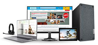
Somos una empresa moderna de Alemania con una orientación internacional y una misión clara: ponemos productos y servicios de última generación al alcance de todos. Siempre estamos buscando nuevas soluciones, nuevas tendencias y productos que hagan tu vida más fácil, más cómoda o simplemente más agradable.

Nuestra especialidad...
desde los inicios de la empresa en 1983 ha sido el desarrollo y la distribución de productos informáticos y multimedia, como portátiles, PCs, Tablets y periféricos. La electrónica de consumo, como los televisores LCD, radios y altavoces Bluetooth, así como los productos para el hogar y la salud, son otros campos en los que tenemos décadas de experiencia. Muchos de nuestros productos ya son inteligentes hoy en día.
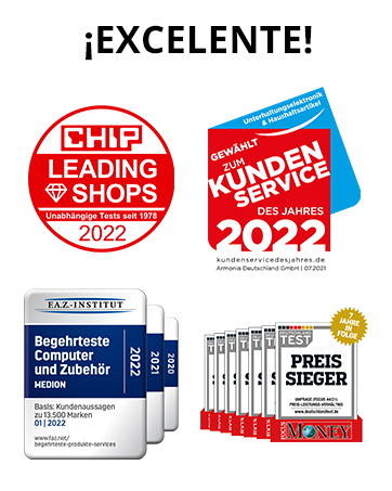


¿Un servicio técnico ejemplar? ¡Por supuesto!
Hacemos todo lo posible para que tu experiencia con nosotros sea positiva desde el inicio hasta el final, ya sea para clientes grandes o privados. Nuestro equipo de atención al cliente está disponible los 365 días del año. Con nosotros, la relación con el cliente no termina con la compra.
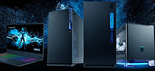
MEDION ERAZER
Con la serie de productos MEDION ERAZER, ofrecemos un potente hardware de alta calidad con las últimas tecnologías y un amplio equipamiento desarrollado especialmente para Gamers exigentes. Ya sea un ordenador de alto rendimiento o un potente portátil: nuestros productos MEDION ERAZER pueden adaptarse de forma óptima a las necesidades individuales gracias a las distintas configuraciones.


En BiTech, ofrecemos , 30 días de Devolución GRATUITA, para que puedas comprar con total tranquilidad. Si no estás satisfecho te devolvemos el dinero. A parte, tienes 3 años de garantía.
Más información
MEDION E13226 (MD 30326) TV HD de 80 cm (32 Pulgadas) (Receptor Triple sintonizador DVB-T2 DVB-C DVB-S2, 2 x HDMI, euroconector, VGA, USB, Temporizador de Apagado automático, Reproductor Multimedia)
En Bitech, tenemos el televisor MEDION E13226 (MD 30326) de 80 cm (32 pulgadas) que te ofrece una experiencia de visualización de alta definición. Con su receptor triple sintonizador DVB-T2 DVB-C DVB-S2, podrás disfrutar de tus programas favoritos sin problemas.
Pero eso no es todo, este televisor también cuenta con un reproductor multimedia integrado, lo que significa que podrás ver tus fotos y vídeos en la gran pantalla de forma sencilla y cómoda.
Además, el MEDION E13226 está listo para recibir señales de cable, satélite y televisión digital por antena DVB-T2 HD. Esto te garantiza que siempre estarás preparado para disfrutar de tus programas favoritos.
Y si eres de los que les gusta ver televisión de pago, no te preocupes, este televisor cuenta con una ranura CI+ que te permite disfrutar de canales codificados con un módulo adecuado y una tarjeta inteligente.
En Bitech, te ofrecemos el MEDION E13226 (MD 30326) con todo lo que necesitas para empezar a disfrutar de tus programas favoritos. Incluye el televisor LCD MD30326, un mando a distancia con pilas incluidas, adaptador AV, pies con tornillos, instrucciones de uso y folleto de garantía.
No esperes más, visita bitech.es y adquiere el MEDION E13226 (MD 30326) para disfrutar de una experiencia de visualización única.
Nos encanta la tecnología, nos volcamos en el servicio técnico y pensamos de forma innovadora. ¡Somos MEDION!
Somos una empresa moderna de Alemania con una orientación internacional y una misión clara: ponemos productos y servicios de última generación al alcance de todos. Siempre estamos buscando nuevas soluciones, nuevas tendencias y productos que hagan tu vida más fácil, más cómoda o simplemente más agradable.
Nuestra especialidad...
desde los inicios de la empresa en 1983 ha sido el desarrollo y la distribución de productos informáticos y multimedia, como portátiles, PCs, Tablets y periféricos. La electrónica de consumo, como los televisores LCD, radios y altavoces Bluetooth, así como los productos para el hogar y la salud, son otros campos en los que tenemos décadas de experiencia. Muchos de nuestros productos ya son inteligentes hoy en día.
¿Un servicio técnico ejemplar? ¡Por supuesto!
Hacemos todo lo posible para que tu experiencia con nosotros sea positiva desde el inicio hasta el final, ya sea para clientes grandes o privados. Nuestro equipo de atención al cliente está disponible los 365 días del año. Con nosotros, la relación con el cliente no termina con la compra.
MEDION ERAZER
Con la serie de productos MEDION ERAZER, ofrecemos un potente hardware de alta calidad con las últimas tecnologías y un amplio equipamiento desarrollado especialmente para Gamers exigentes. Ya sea un ordenador de alto rendimiento o un potente portátil: nuestros productos MEDION ERAZER pueden adaptarse de forma óptima a las necesidades individuales gracias a las distintas configuraciones.