Descripción del producto:
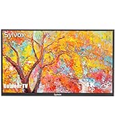
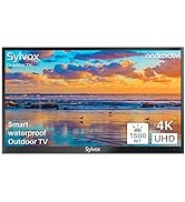
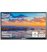
El brillo de la pantalla del televisor para exteriores se ajustará automáticamente en función de las diferentes condiciones de iluminación. Con un brillo máximo de 2000 nits, podrás disfrutar de una imagen de ultra alta definición incluso bajo el sol del verano.
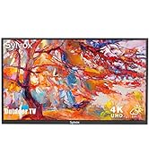
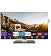
Sylvox Outdoor TV ofrece fascinantes imágenes 4K a 60 fps, cuatro veces mejor que Full HD. Además, con 2000 nits produce seis veces más brillo que un televisor doméstico estándar. Podrás acceder a todas tus aplicaciones favoritas como Netflix, YouTube, Prime Video, Pandora y mucho más.
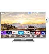
Nuestro televisor para exteriores cuenta con un sintonizador DVB-T/T2/S2 integrado y múltiples opciones de conectividad, incluyendo HDMI, USB, RJ45 y salida de audio. Podrás conectar varios dispositivos para disfrutar de una mejor experiencia.
La superficie de nuestro televisor es resistente a los arañazos gracias a su carcasa totalmente metálica y tratamiento especial. Además, es resistente a la intemperie, con una clasificación IP55 y puede soportar temperaturas extremas.
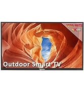
Con Android 9.0 Smart TV, podrás disfrutar de tus aplicaciones favoritas directamente desde la caja. Además, cuenta con WiFi y Bluetooth para una fácil conexión de dispositivos inalámbricos. También incluye Miracast para ver tu entretenimiento favorito en la pantalla grande.
Este televisor 4K UHD ofrece una calidad de imagen impresionante, con una alta resolución de 3840x2160, una amplia gama de colores y detalles de imagen que te sumergirán en un maravilloso disfrute visual.
Con múltiples conexiones, incluyendo HDMI, USB, RJ45 y salida óptica, podrás conectar diferentes fuentes de medios. Este televisor de 55" está diseñado para ser montado en la pared, lo que lo hace perfecto para cualquier lugar al aire libre, como jardines, terrazas, patios y restaurantes al aire libre. ¡No esperes más y disfruta de la mejor tecnología en Bitech.es!


Teniendo en cuenta la complejidad y la variabilidad de los ambientes interiores y exteriores, el Sr. Golden ha creado la marca de TV Sylvox con creatividad y determinación, que se centra en hacer que la televisión se adapte perfectamente a diversos entornos especiales, y ha creado productos de TV que cubren casi todos los ámbitos de la vida humana
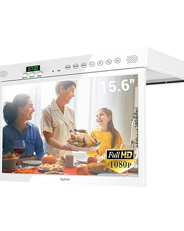
Diseñado para cocinas, pisos pequeños, caravanas


En BiTech, ofrecemos , 30 días de Devolución GRATUITA, para que puedas comprar con total tranquilidad. Si no estás satisfecho te devolvemos el dinero. A parte, tienes 3 años de garantía.
Más información
Descripción del producto:
El brillo de la pantalla del televisor para exteriores se ajustará automáticamente en función de las diferentes condiciones de iluminación. Con un brillo máximo de 2000 nits, podrás disfrutar de una imagen de ultra alta definición incluso bajo el sol del verano.
Sylvox Outdoor TV ofrece fascinantes imágenes 4K a 60 fps, cuatro veces mejor que Full HD. Además, con 2000 nits produce seis veces más brillo que un televisor doméstico estándar. Podrás acceder a todas tus aplicaciones favoritas como Netflix, YouTube, Prime Video, Pandora y mucho más.
Nuestro televisor para exteriores cuenta con un sintonizador DVB-T/T2/S2 integrado y múltiples opciones de conectividad, incluyendo HDMI, USB, RJ45 y salida de audio. Podrás conectar varios dispositivos para disfrutar de una mejor experiencia.
La superficie de nuestro televisor es resistente a los arañazos gracias a su carcasa totalmente metálica y tratamiento especial. Además, es resistente a la intemperie, con una clasificación IP55 y puede soportar temperaturas extremas.
Con Android 9.0 Smart TV, podrás disfrutar de tus aplicaciones favoritas directamente desde la caja. Además, cuenta con WiFi y Bluetooth para una fácil conexión de dispositivos inalámbricos. También incluye Miracast para ver tu entretenimiento favorito en la pantalla grande.
Este televisor 4K UHD ofrece una calidad de imagen impresionante, con una alta resolución de 3840x2160, una amplia gama de colores y detalles de imagen que te sumergirán en un maravilloso disfrute visual.
Con múltiples conexiones, incluyendo HDMI, USB, RJ45 y salida óptica, podrás conectar diferentes fuentes de medios. Este televisor de 55" está diseñado para ser montado en la pared, lo que lo hace perfecto para cualquier lugar al aire libre, como jardines, terrazas, patios y restaurantes al aire libre. ¡No esperes más y disfruta de la mejor tecnología en Bitech.es!
Teniendo en cuenta la complejidad y la variabilidad de los ambientes interiores y exteriores, el Sr. Golden ha creado la marca de TV Sylvox con creatividad y determinación, que se centra en hacer que la televisión se adapte perfectamente a diversos entornos especiales, y ha creado productos de TV que cubren casi todos los ámbitos de la vida humana
Diseñado para cocinas, pisos pequeños, caravanas