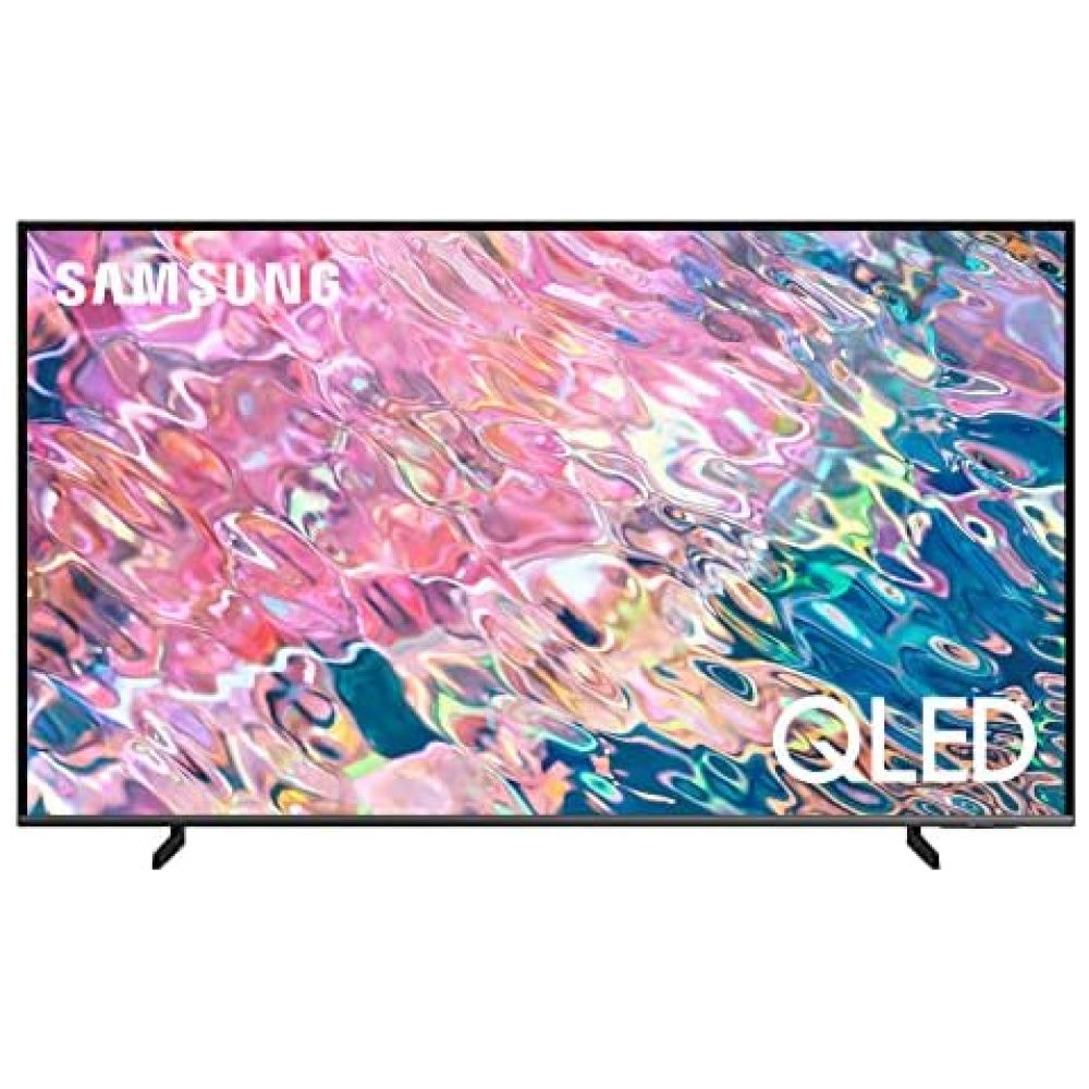
¡Descubre el TV Cecotec V1+ series en Bitech!
Disfruta de una explosión de colores con QLED V1+ en cada imagen.
Resolución 4k UHD para una experiencia única con imágenes cuatro veces más nítidas. Envía contenido desde tu móvil o tablet al televisor con Chromecast integrado.
Conéctate con tus dispositivos a través de HDMI, USB, y otras opciones.
Accede a un mundo de contenido con Android TV v.11 y disfruta de series, películas, juegos y aplicaciones.
Vive la máxima fluidez en tus películas y eventos deportivos con la tecnología MEMC.
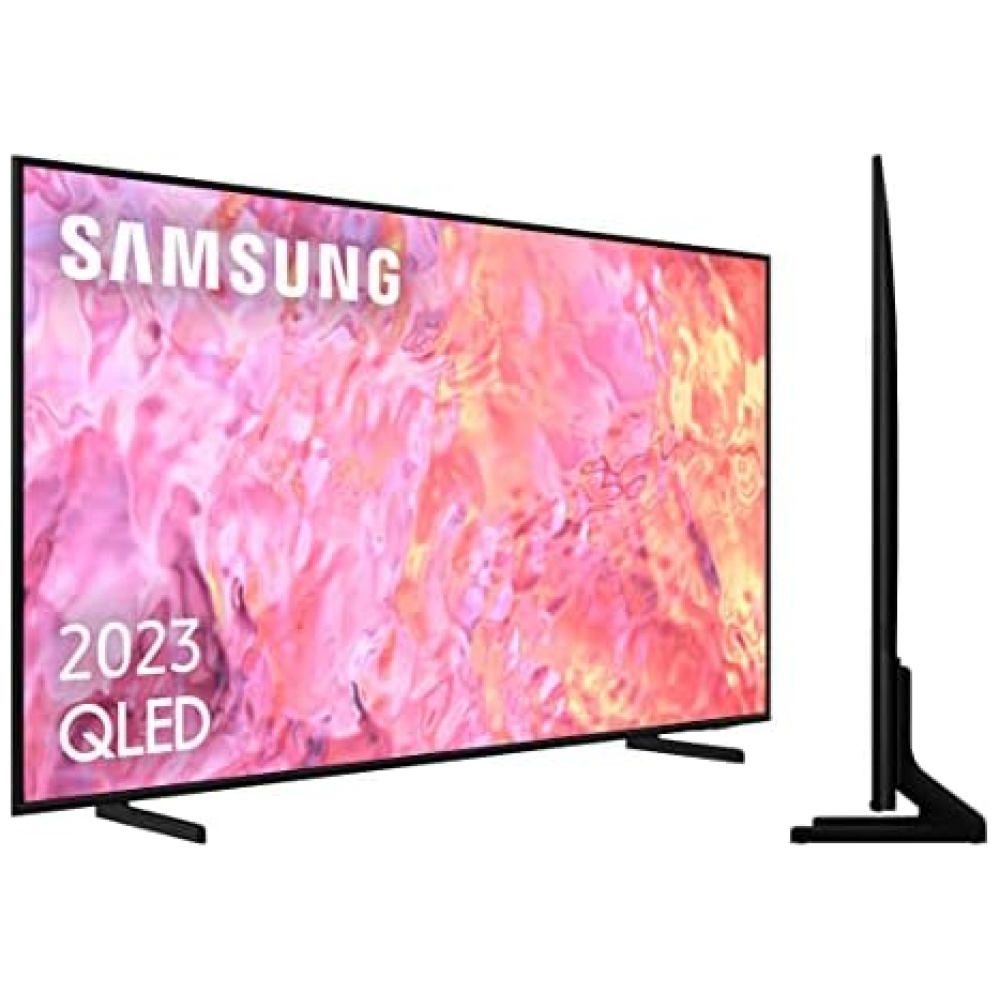
Disfruta de una experiencia visual sin distracciones gracias al diseño Frameless.
Sumérgete en una experiencia de audio única con Dolby Atmos y un subwoofer integrado.
Experimenta la mejor calidad de imagen con Dolby Vision y HDR 10.
Protege tus ojos con la tecnología Eye Safe y disfruta de una conexión descomunal con HDMI 2.1.
Descubre una explosión de color con la pantalla de 10 bits y Wide Color Gamut.
Disfruta de imágenes más puras y detalladas con Pure Dimming, Pure Outline y Pure Move.
¡Hazte con el TV Cecotec V1+ series en Bitech y lleva tu experiencia de entretenimiento al siguiente nivel!


Tecnología para todos
Cecotec es el líder español de electrodomésticos, presente en más de 50 países.
Fabricante y distribuidor de más de 1800 productos, muchos de ellos top ventas en Amazon España, cuya misión es facilitar tecnología a un coste honesto a millones de hogares de todo el mundo.

CONGA es un referente mundial en aspiración con tecnologías únicas.

Cafeteras de todo tipo y para todos. Una democratización del placer.

Comer bien es cada día más fácil con las innovaciones en cocina.

Belleza al alcance de todos con secadores iónicos y moldeadores premium.

Gracias por confiar en nosotros. El equipo de CecoCare le ayudará en lo que necesite.


En BiTech, ofrecemos , 30 días de Devolución GRATUITA, para que puedas comprar con total tranquilidad. Si no estás satisfecho te devolvemos el dinero. A parte, tienes 3 años de garantía.
Más información
¡Descubre el TV Cecotec V1+ series en Bitech!
Disfruta de una explosión de colores con QLED V1+ en cada imagen.
Resolución 4k UHD para una experiencia única con imágenes cuatro veces más nítidas. Envía contenido desde tu móvil o tablet al televisor con Chromecast integrado.
Conéctate con tus dispositivos a través de HDMI, USB, y otras opciones.
Accede a un mundo de contenido con Android TV v.11 y disfruta de series, películas, juegos y aplicaciones.
Vive la máxima fluidez en tus películas y eventos deportivos con la tecnología MEMC.
Disfruta de una experiencia visual sin distracciones gracias al diseño Frameless.
Sumérgete en una experiencia de audio única con Dolby Atmos y un subwoofer integrado.
Experimenta la mejor calidad de imagen con Dolby Vision y HDR 10.
Protege tus ojos con la tecnología Eye Safe y disfruta de una conexión descomunal con HDMI 2.1.
Descubre una explosión de color con la pantalla de 10 bits y Wide Color Gamut.
Disfruta de imágenes más puras y detalladas con Pure Dimming, Pure Outline y Pure Move.
¡Hazte con el TV Cecotec V1+ series en Bitech y lleva tu experiencia de entretenimiento al siguiente nivel!
Tecnología para todos
Cecotec es el líder español de electrodomésticos, presente en más de 50 países.
Fabricante y distribuidor de más de 1800 productos, muchos de ellos top ventas en Amazon España, cuya misión es facilitar tecnología a un coste honesto a millones de hogares de todo el mundo.
CONGA es un referente mundial en aspiración con tecnologías únicas.
Cafeteras de todo tipo y para todos. Una democratización del placer.
Comer bien es cada día más fácil con las innovaciones en cocina.
Belleza al alcance de todos con secadores iónicos y moldeadores premium.
Gracias por confiar en nosotros. El equipo de CecoCare le ayudará en lo que necesite.