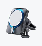
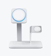
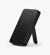
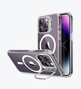
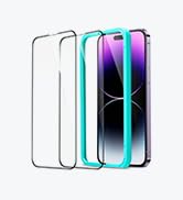
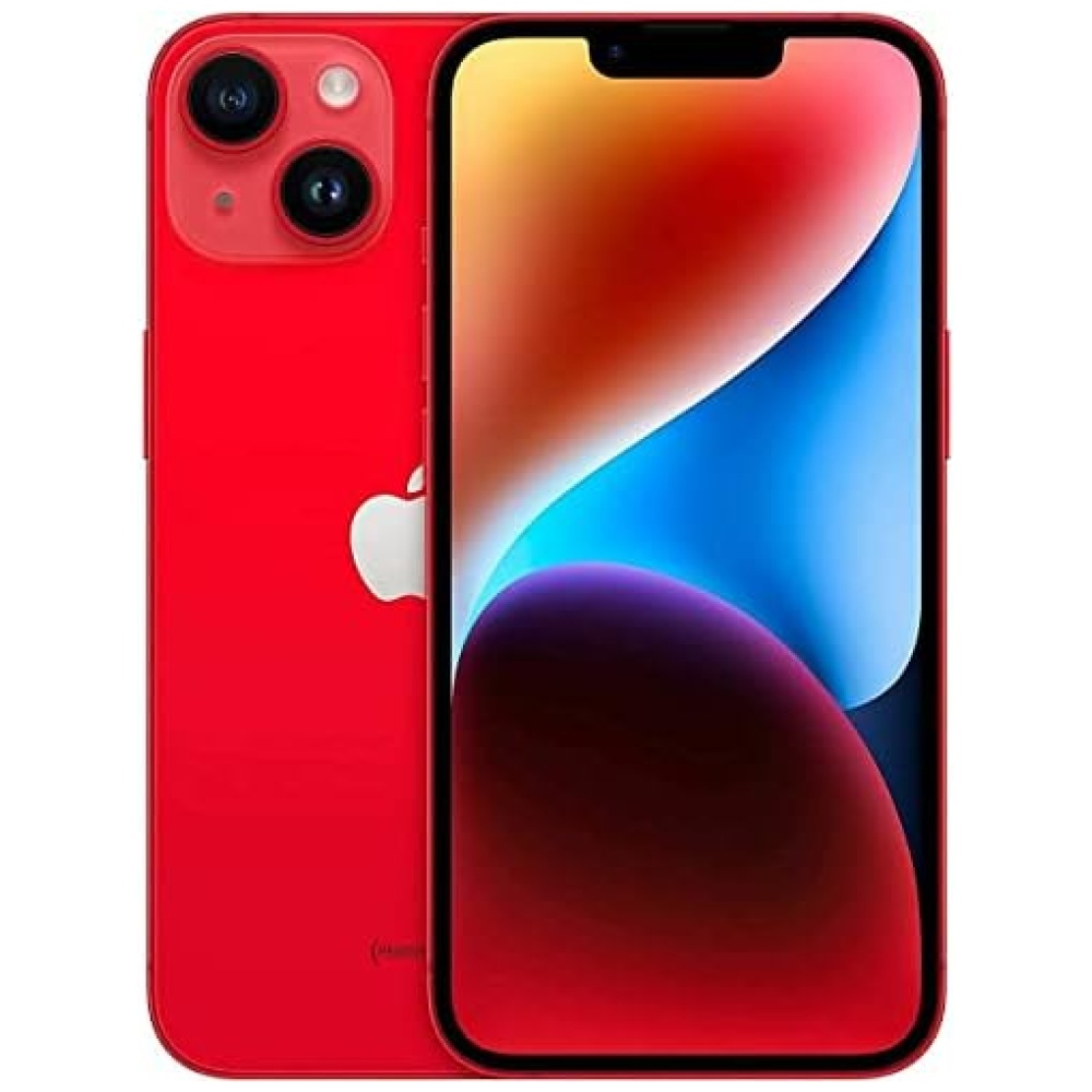
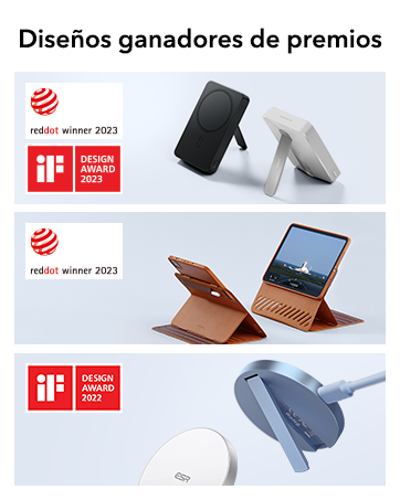
En Bitech, te ofrecemos una funda híbrida con un bloqueo magnético más fuerte gracias a sus potentes imanes integrados. Con una fuerza de sujeción de 1500g, podrás disfrutar de una carga inalámbrica más rápida y segura con cualquier accesorio MagSafe. Además, esta funda ha sido rigurosamente testada para ofrecerte una protección de grado militar contra caídas. Sus esquinas Air Guard absorben los golpes, evitando que tu teléfono sufra daños. También cuenta con bordes elevados que protegen la pantalla y la lente de la cámara contra arañazos. La parte trasera de acrílico transparente y resistente a arañazos permite lucir el estilo original de tu iPhone 15 Pro Max, manteniendo su elegante diseño. ¡No esperes más y protege tu teléfono con estilo en bitech.es!


En BiTech, ofrecemos , 30 días de Devolución GRATUITA, para que puedas comprar con total tranquilidad. Si no estás satisfecho te devolvemos el dinero. A parte, tienes 3 años de garantía.
Más información
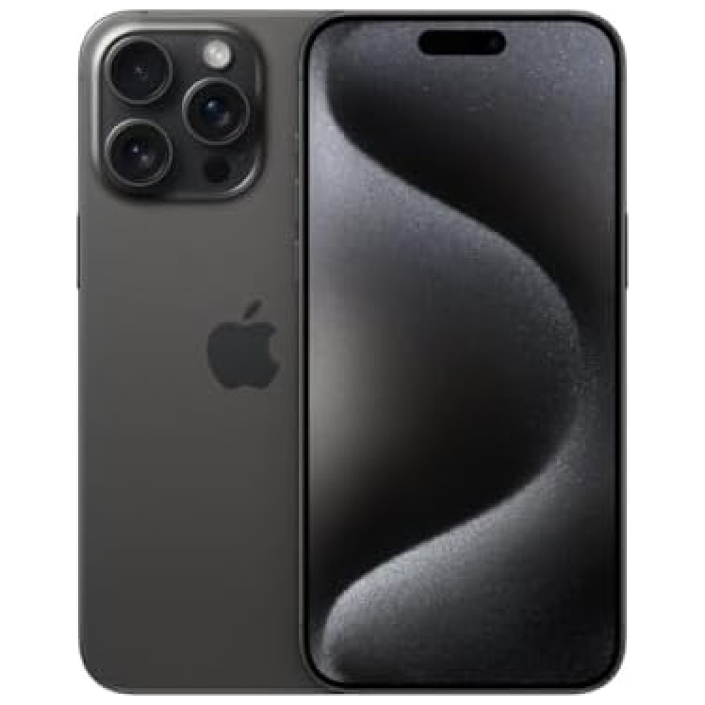
En Bitech, te ofrecemos una funda híbrida con un bloqueo magnético más fuerte gracias a sus potentes imanes integrados. Con una fuerza de sujeción de 1500g, podrás disfrutar de una carga inalámbrica más rápida y segura con cualquier accesorio MagSafe. Además, esta funda ha sido rigurosamente testada para ofrecerte una protección de grado militar contra caídas. Sus esquinas Air Guard absorben los golpes, evitando que tu teléfono sufra daños. También cuenta con bordes elevados que protegen la pantalla y la lente de la cámara contra arañazos. La parte trasera de acrílico transparente y resistente a arañazos permite lucir el estilo original de tu iPhone 15 Pro Max, manteniendo su elegante diseño. ¡No esperes más y protege tu teléfono con estilo en bitech.es!