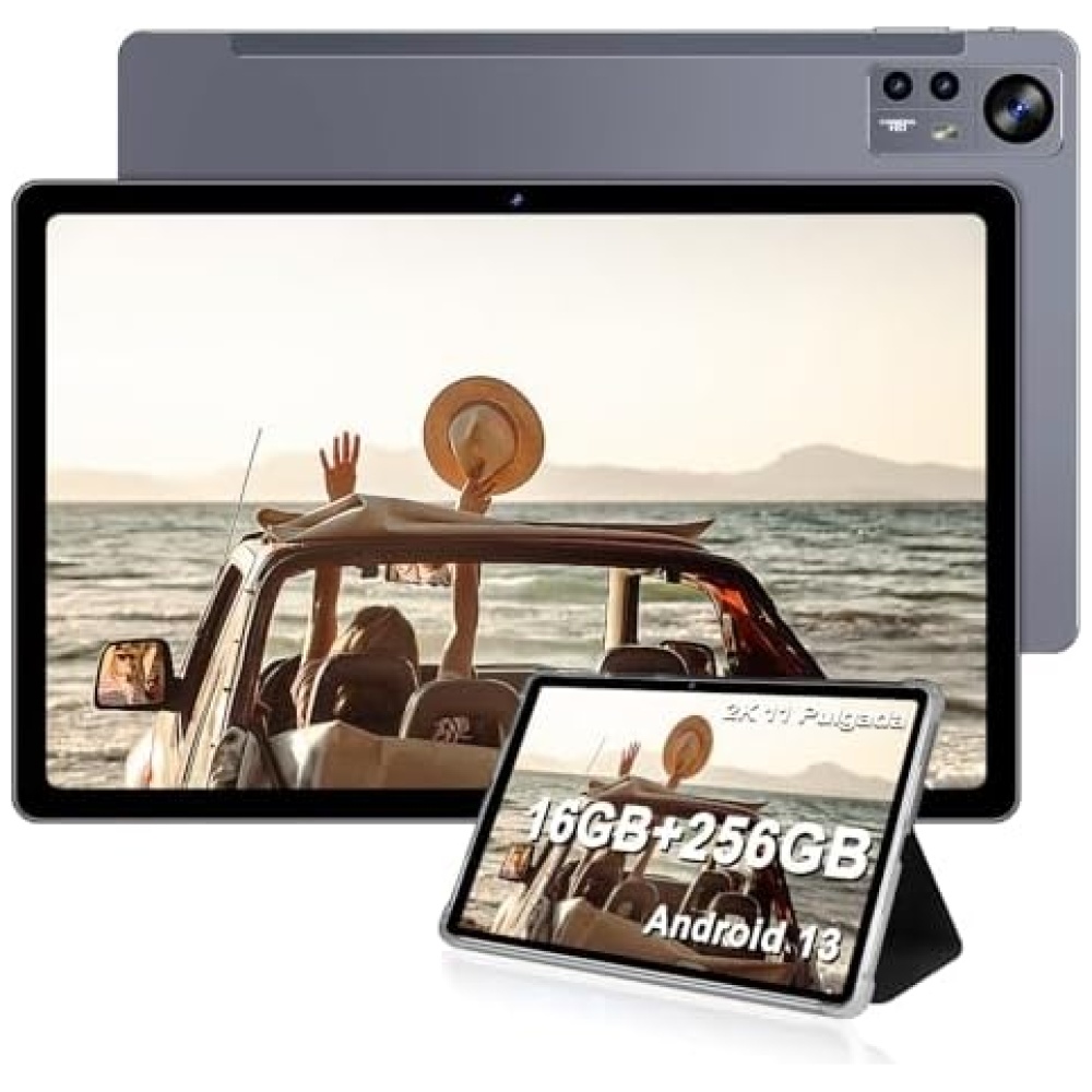
Producto:
• Marca: YOTOPT
• Sistema: Android 9.0
• Procesador: Quad-Core 1.3GHz
Memoria:
• RAM: 4 GB
• ROM: 64 GB
• Tarjeta de memoria: ampliable hasta 128G
Exhibir
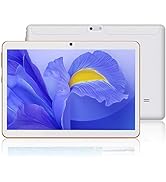
• Tamaño de la pantalla: 10.1 pulgadas
• Resolución: 800 × 1280 píxeles
Cámara
• Cámara de inversión: 5.0MP
• Cámara frontal: 2.0MP
WIFI / Bluetooth
• Bluetooth: 4.0
• WIFI: IEEE 802.11 b / g / n
Fuente de alimentación
• Batería: 5000mAh /3.7V
• Cargador: 5 V / 2A
•la vida media de la batería en modo de espera (en horas): 72 horas
• Batería de litio: Batería contenida en el equipo
• Tiempo de recarga de la batería: 2.5 horas.
Otros
• MIC: Sí
• Altavoz: síG
• OTG: Sí
• GPS: Sí
• Banda SIM: 4G
Embalajes
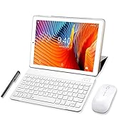
• 1 * Tablet PC
• 1* cargador
• 1 * cable USB
• 1* cable OTG
• 1 * manual de usuario
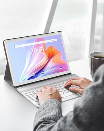
• 1* teclado
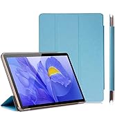
• 1 * Caso de la cubierta
• 1 * ratón
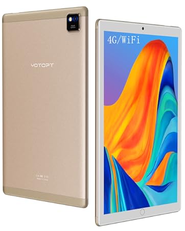
【Redes Poderosas】 4G y Wifi. Tiene dos ranuras de tarjeta SIM. Se puede llamar por teléfono o conectar por internet donde y cuando quiere.
【Memoria Grande】4GB de RAM + 64 GB ROM, puede descargar muchas App desde Google Play. Además, puede añadir una tarjeta Micro SD de hasta 128 GB para guardar canciones, videos, fotos y archivos. Cámara delantera de 5MP y trasera de 2MP.
【Características Potentes】Procesador Quad-Core potente con función de ahorro de energía para realizar múltiples tareas de manera ultrarrápida. Se puede conectar rápidamente al teclado y a otros dispositivos vía Bluetooth. Además, cuenta con GPS para viajar.
【Experiencia de Compra Agradable】Incluye estuches de cuero, teclado, cargador y cable OTG. Si la tableta presenta problemas en un año, le brindaremos asistencia para la reparación (daño no artificial). Puede comprar con confianza en nuestra tienda de tecnología, Bitech (bitech.es).

Le ofrecemos la mejor experiencia
YOTOPT es una marca que se centra en lo óptimo y lo práctico. El fundador lleva investigando la tecnología de las tabletas desde 2010 o incluso más tiempo y tiene una visión personal y única de las CPU, la calidad de imagen de la pantalla, las redes y la memoria operativa, además de ser un ingeniero muy profesional. Hasta la fecha, el equipo técnico de la empresa sigue creciendo y madurando.


En BiTech, ofrecemos , 30 días de Devolución GRATUITA, para que puedas comprar con total tranquilidad. Si no estás satisfecho te devolvemos el dinero. A parte, tienes 3 años de garantía.
Más información
Producto:
• Marca: YOTOPT
• Sistema: Android 9.0
• Procesador: Quad-Core 1.3GHz
Memoria:
• RAM: 4 GB
• ROM: 64 GB
• Tarjeta de memoria: ampliable hasta 128G
Exhibir
• Tamaño de la pantalla: 10.1 pulgadas
• Resolución: 800 × 1280 píxeles
Cámara
• Cámara de inversión: 5.0MP
• Cámara frontal: 2.0MP
WIFI / Bluetooth
• Bluetooth: 4.0
• WIFI: IEEE 802.11 b / g / n
Fuente de alimentación
• Batería: 5000mAh /3.7V
• Cargador: 5 V / 2A
•la vida media de la batería en modo de espera (en horas): 72 horas
• Batería de litio: Batería contenida en el equipo
• Tiempo de recarga de la batería: 2.5 horas.
Otros
• MIC: Sí
• Altavoz: síG
• OTG: Sí
• GPS: Sí
• Banda SIM: 4G
Embalajes
• 1 * Tablet PC
• 1* cargador
• 1 * cable USB
• 1* cable OTG
• 1 * manual de usuario
• 1* teclado
• 1 * Caso de la cubierta
• 1 * ratón
【Redes Poderosas】 4G y Wifi. Tiene dos ranuras de tarjeta SIM. Se puede llamar por teléfono o conectar por internet donde y cuando quiere.
【Memoria Grande】4GB de RAM + 64 GB ROM, puede descargar muchas App desde Google Play. Además, puede añadir una tarjeta Micro SD de hasta 128 GB para guardar canciones, videos, fotos y archivos. Cámara delantera de 5MP y trasera de 2MP.
【Características Potentes】Procesador Quad-Core potente con función de ahorro de energía para realizar múltiples tareas de manera ultrarrápida. Se puede conectar rápidamente al teclado y a otros dispositivos vía Bluetooth. Además, cuenta con GPS para viajar.
【Experiencia de Compra Agradable】Incluye estuches de cuero, teclado, cargador y cable OTG. Si la tableta presenta problemas en un año, le brindaremos asistencia para la reparación (daño no artificial). Puede comprar con confianza en nuestra tienda de tecnología, Bitech (bitech.es).
Le ofrecemos la mejor experiencia
YOTOPT es una marca que se centra en lo óptimo y lo práctico. El fundador lleva investigando la tecnología de las tabletas desde 2010 o incluso más tiempo y tiene una visión personal y única de las CPU, la calidad de imagen de la pantalla, las redes y la memoria operativa, además de ser un ingeniero muy profesional. Hasta la fecha, el equipo técnico de la empresa sigue creciendo y madurando.