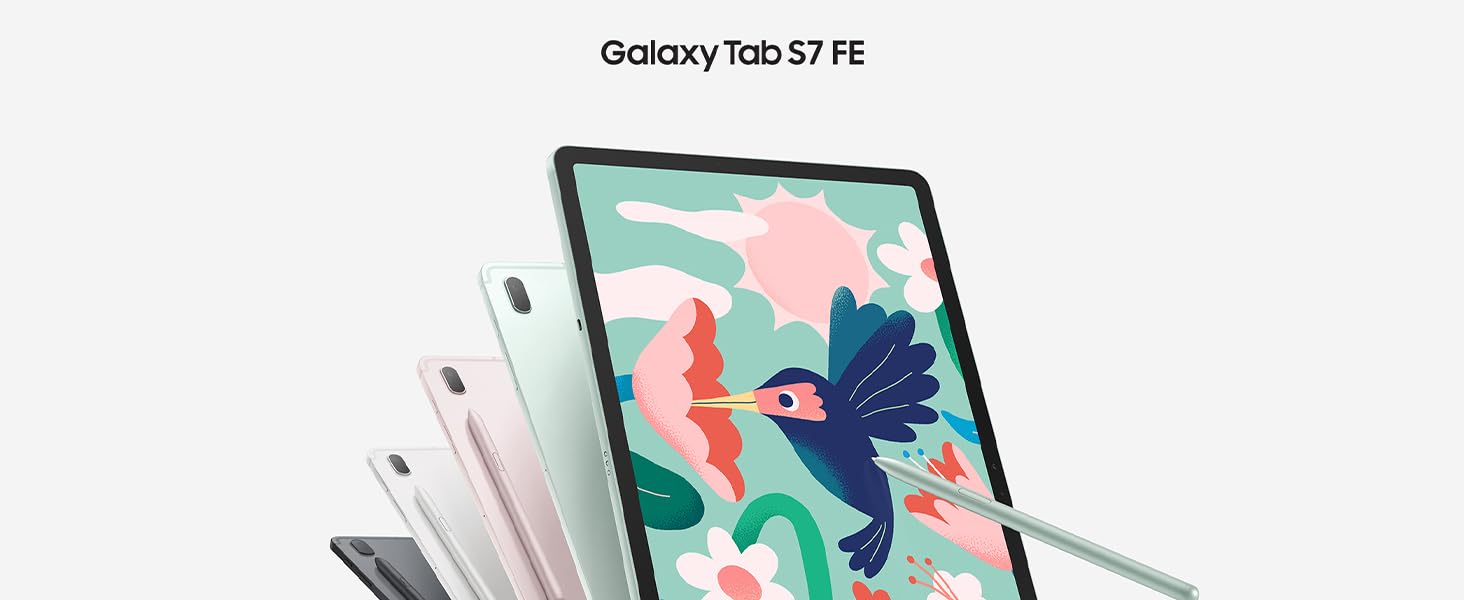
 La belleza está en la simplicidad
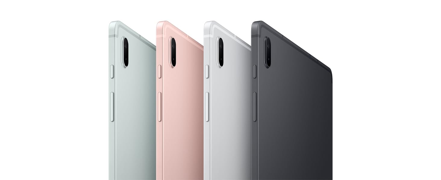
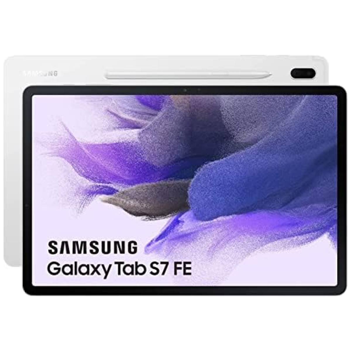
Disfruta de la elegancia de la tablet Samsung Galaxy Tab S7 FE en tus manos. El aspecto de diseño sencillo y singular, refinado con un espacio mínimo para la cámara en la parte trasera, y el formato delgado aportan un cómodo agarre.
Disfruta de vistas y sonidos envolventes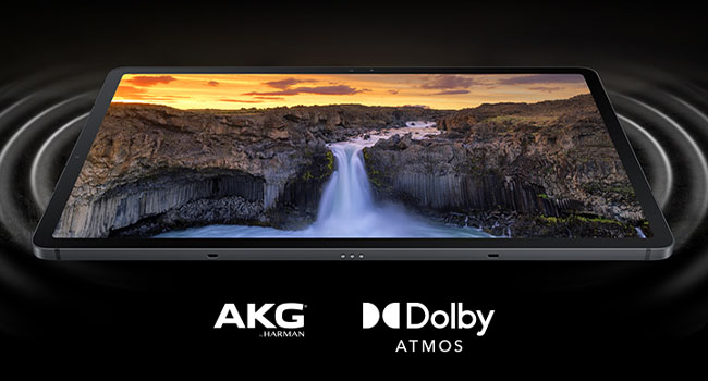 Disfruta de dinámicos colores en la pantalla de 12,4 pulgadas de la tablet Samsung Galaxy Tab S7 FE. Gracias al increíble sonido de AKG, los altavoces duales y Dolby Atmos, se crea un sonido surround envolvente que te sitúa en el centro de la escena en pantalla.
Sube tu experiencia de juego de nivel
Disfruta de dinámicos colores en la pantalla de 12,4 pulgadas de la tablet Samsung Galaxy Tab S7 FE. Gracias al increíble sonido de AKG, los altavoces duales y Dolby Atmos, se crea un sonido surround envolvente que te sitúa en el centro de la escena en pantalla.
Sube tu experiencia de juego de nivel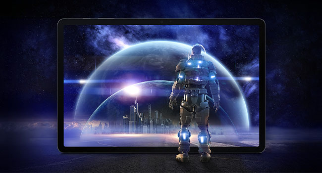 Equipada con un chipset de alto rendimiento Snapdragon 750G, esta tablet Android Samsung Galaxy Tab S7 FE hace que tus retransmisiones y tu juego sean fluidos y rápidos. Podrás realizar multitarea con facilidad con hasta tres aplicaciones a la vez.
La batería para aguantar tus días ocupados
Equipada con un chipset de alto rendimiento Snapdragon 750G, esta tablet Android Samsung Galaxy Tab S7 FE hace que tus retransmisiones y tu juego sean fluidos y rápidos. Podrás realizar multitarea con facilidad con hasta tres aplicaciones a la vez.
La batería para aguantar tus días ocupados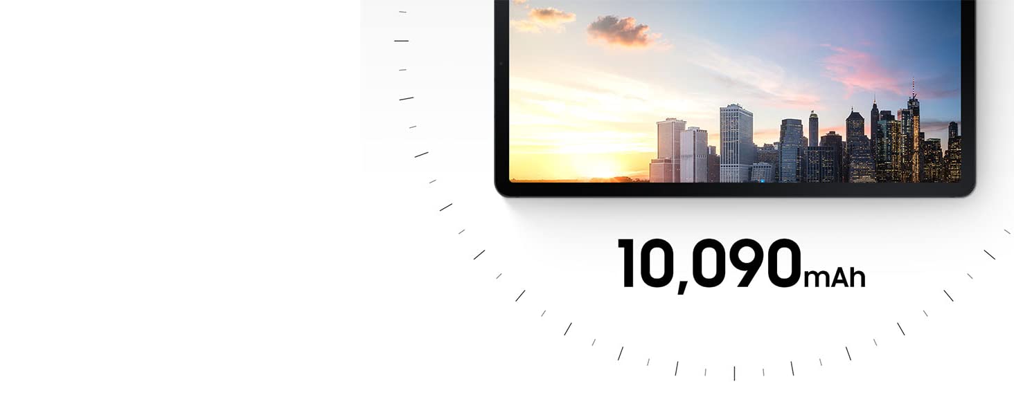 Pasarán horas y horas antes de tener que cargar la batería (normal) de 10 090 mAh de tu tablet. Tendrás hasta 13 horas para ver vídeos; un tiempo más que suficiente para maratones de retransmisiones.
Despejado y centrado en la cámara
Pasarán horas y horas antes de tener que cargar la batería (normal) de 10 090 mAh de tu tablet. Tendrás hasta 13 horas para ver vídeos; un tiempo más que suficiente para maratones de retransmisiones.
Despejado y centrado en la cámara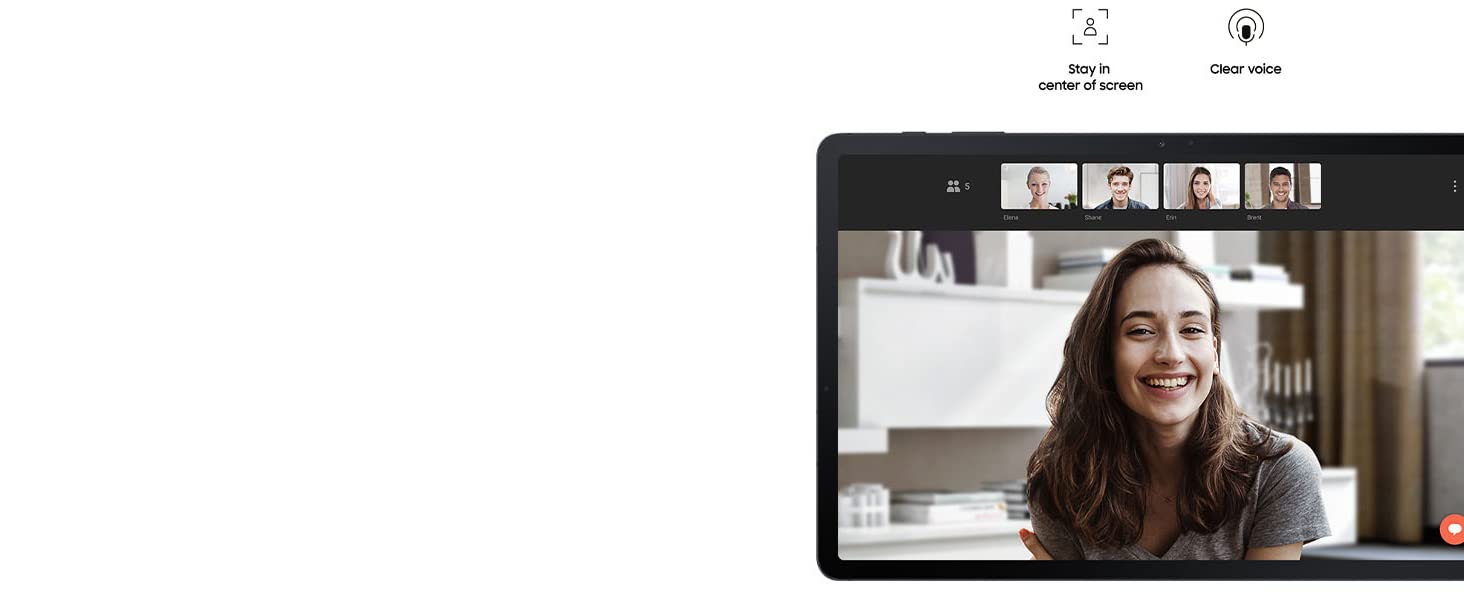 Pon tu tablet Android Tab en horizontal para hacer una videollamada y la cámara frontal te mantendrá en el centro de la pantalla. Al hablar, tu voz se oirá despejada con los 3 micrófonos integrados.
Parece un lápiz auténtico pero es mucho más
Pon tu tablet Android Tab en horizontal para hacer una videollamada y la cámara frontal te mantendrá en el centro de la pantalla. Al hablar, tu voz se oirá despejada con los 3 micrófonos integrados.
Parece un lápiz auténtico pero es mucho más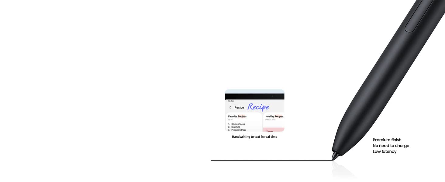 Con una baja latencia y una punta suave, el S Pen incluido te da una experiencia de escritura natural. Digitaliza tus palabras en tiempo real y edítalas con sencillos gestos.
Digitaliza tus manuscritos en textos en orden
Con una baja latencia y una punta suave, el S Pen incluido te da una experiencia de escritura natural. Digitaliza tus palabras en tiempo real y edítalas con sencillos gestos.
Digitaliza tus manuscritos en textos en orden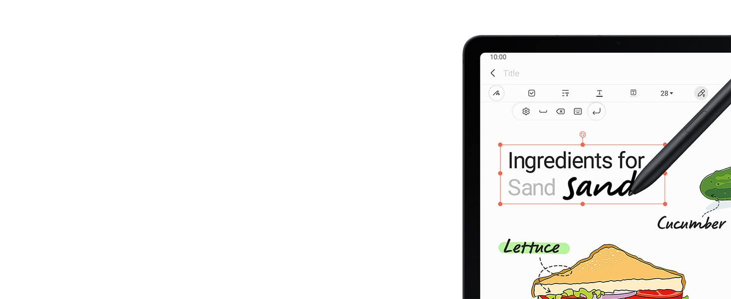 Tu escritura se convierte automáticamente en texto. Escribe en una barra de búsqueda o en la barra de título de Samsung Notes con el S Pen y luego toma notas y conviértelas en texto con un solo toque.
Ponles un título y una etiqueta
Tu escritura se convierte automáticamente en texto. Escribe en una barra de búsqueda o en la barra de título de Samsung Notes con el S Pen y luego toma notas y conviértelas en texto con un solo toque.
Ponles un título y una etiqueta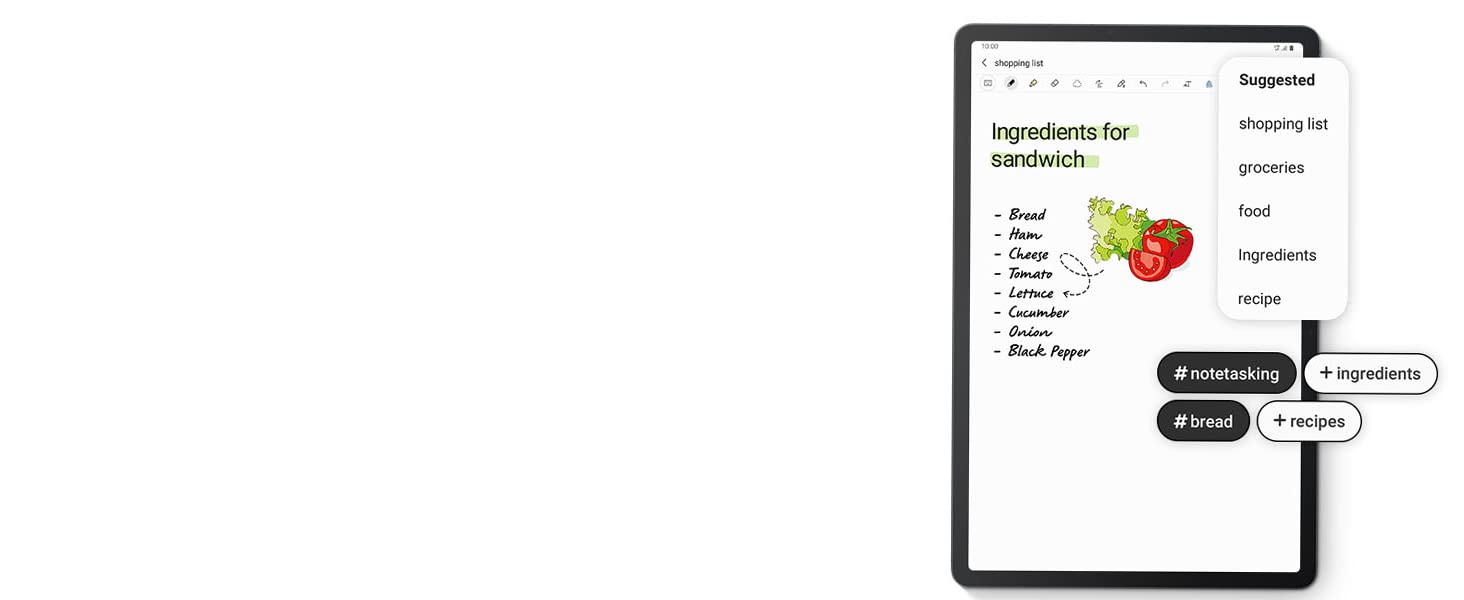 Mientras tomas notas, la aplicación te recomienda títulos de forma automática al analizar el contenido y te recomienda etiquetas para tener tus notas bien organizadas en tu tablet de 12 pulgadas.
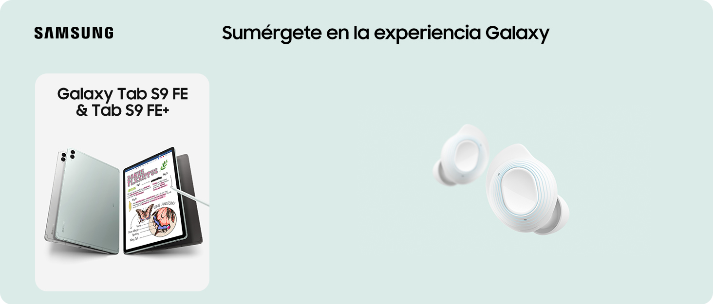


En BiTech, ofrecemos , 30 días de Devolución GRATUITA, para que puedas comprar con total tranquilidad. Si no estás satisfecho te devolvemos el dinero. A parte, tienes 3 años de garantía.
Más información
La belleza está en la simplicidad
Disfruta de la elegancia de la tablet Samsung Galaxy Tab S7 FE en tus manos. El aspecto de diseño sencillo y singular, refinado con un espacio mínimo para la cámara en la parte trasera, y el formato delgado aportan un cómodo agarre.
Disfruta de vistas y sonidos envolventes Disfruta de dinámicos colores en la pantalla de 12,4 pulgadas de la tablet Samsung Galaxy Tab S7 FE. Gracias al increíble sonido de AKG, los altavoces duales y Dolby Atmos, se crea un sonido surround envolvente que te sitúa en el centro de la escena en pantalla.
Sube tu experiencia de juego de nivel Equipada con un chipset de alto rendimiento Snapdragon 750G, esta tablet Android Samsung Galaxy Tab S7 FE hace que tus retransmisiones y tu juego sean fluidos y rápidos. Podrás realizar multitarea con facilidad con hasta tres aplicaciones a la vez.
La batería para aguantar tus días ocupados Pasarán horas y horas antes de tener que cargar la batería (normal) de 10 090 mAh de tu tablet. Tendrás hasta 13 horas para ver vídeos; un tiempo más que suficiente para maratones de retransmisiones.
Despejado y centrado en la cámara Pon tu tablet Android Tab en horizontal para hacer una videollamada y la cámara frontal te mantendrá en el centro de la pantalla. Al hablar, tu voz se oirá despejada con los 3 micrófonos integrados.
Parece un lápiz auténtico pero es mucho más Con una baja latencia y una punta suave, el S Pen incluido te da una experiencia de escritura natural. Digitaliza tus palabras en tiempo real y edítalas con sencillos gestos.
Digitaliza tus manuscritos en textos en orden Tu escritura se convierte automáticamente en texto. Escribe en una barra de búsqueda o en la barra de título de Samsung Notes con el S Pen y luego toma notas y conviértelas en texto con un solo toque.
Ponles un título y una etiqueta Mientras tomas notas, la aplicación te recomienda títulos de forma automática al analizar el contenido y te recomienda etiquetas para tener tus notas bien organizadas en tu tablet de 12 pulgadas.