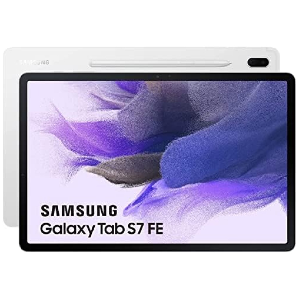
en tu tablet de 12 pulgadas. Además, podrás convertir tus manuscritos en texto con un solo toque, lo que facilita la búsqueda y organización de tus notas.
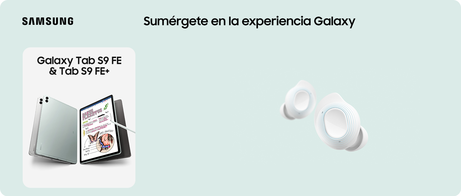
La tablet Samsung Galaxy Tab S7 FE también ofrece una experiencia inmersiva con su pantalla de 12,4 pulgadas y sonido envolvente gracias a los altavoces duales y Dolby Atmos. Además, su diseño elegante y delgado te brinda un agarre cómodo.
No te preocupes por quedarte sin batería, ya que la tablet cuenta con una batería de 10 090 mAh que te brinda hasta 13 horas de reproducción de video. Y para las videollamadas, la cámara frontal te mantendrá en el centro de la pantalla.
El S Pen incluido te permite escribir de forma natural y digitalizar tus palabras en tiempo real. Además, se adhiere magnéticamente a la tablet y no necesita carga.
No pierdas la oportunidad de mejorar tu experiencia de juego y productividad con la tablet Samsung Galaxy Tab S7 FE. ¡Visita nuestra tienda en línea, Bitech.es, y adquiérela ahora mismo!


En BiTech, ofrecemos , 30 días de Devolución GRATUITA, para que puedas comprar con total tranquilidad. Si no estás satisfecho te devolvemos el dinero. A parte, tienes 3 años de garantía.
Más información
en tu tablet de 12 pulgadas. Además, podrás convertir tus manuscritos en texto con un solo toque, lo que facilita la búsqueda y organización de tus notas.
La tablet Samsung Galaxy Tab S7 FE también ofrece una experiencia inmersiva con su pantalla de 12,4 pulgadas y sonido envolvente gracias a los altavoces duales y Dolby Atmos. Además, su diseño elegante y delgado te brinda un agarre cómodo.
No te preocupes por quedarte sin batería, ya que la tablet cuenta con una batería de 10 090 mAh que te brinda hasta 13 horas de reproducción de video. Y para las videollamadas, la cámara frontal te mantendrá en el centro de la pantalla.
El S Pen incluido te permite escribir de forma natural y digitalizar tus palabras en tiempo real. Además, se adhiere magnéticamente a la tablet y no necesita carga.
No pierdas la oportunidad de mejorar tu experiencia de juego y productividad con la tablet Samsung Galaxy Tab S7 FE. ¡Visita nuestra tienda en línea, Bitech.es, y adquiérela ahora mismo!