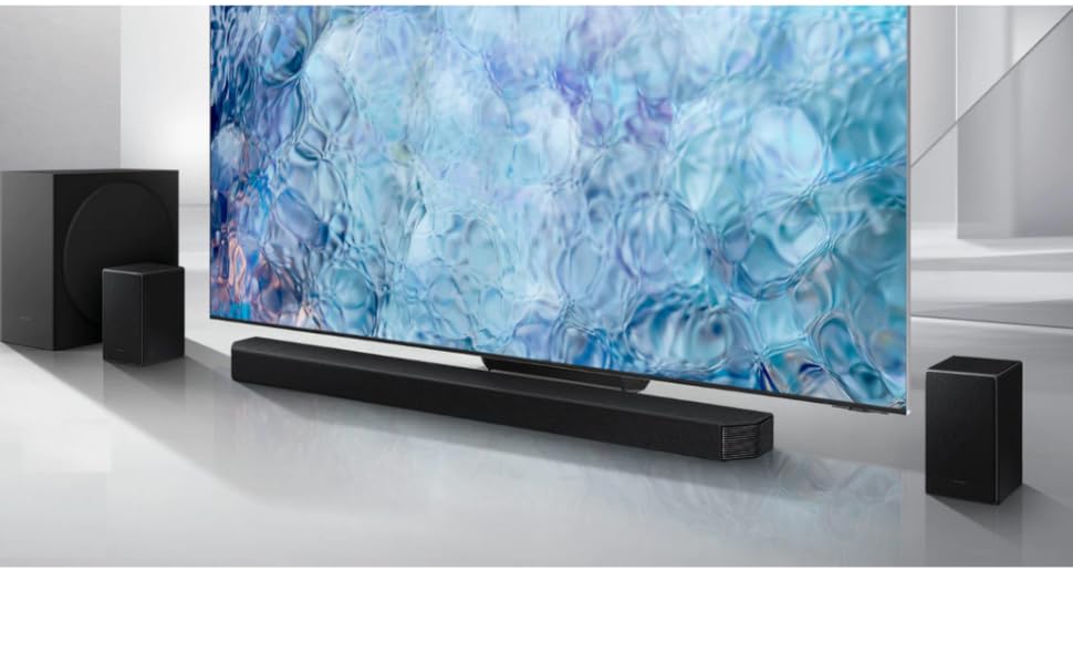
Con la barra de sonido de 2.1 canales y el subwoofer de 6.5 pulgadas, podrás disfrutar de unos graves potentes y profundos mientras te sumerges en un sonido envolvente y completo. Además, la expansión del sonido envolvente amplía el área de audición para una experiencia más inmersiva.
Controla todas las funciones de tu barra de sonido, incluyendo la alimentación, el volumen y los efectos de sonido, con un solo mando y directamente desde tu televisor Samsung. Olvídate de tener varios mandos a distancia y disfruta de una experiencia más cómoda y sencilla.


En BiTech, ofrecemos , 30 días de Devolución GRATUITA, para que puedas comprar con total tranquilidad. Si no estás satisfecho te devolvemos el dinero. A parte, tienes 3 años de garantía.
Más información
Con la barra de sonido de 2.1 canales y el subwoofer de 6.5 pulgadas, podrás disfrutar de unos graves potentes y profundos mientras te sumerges en un sonido envolvente y completo. Además, la expansión del sonido envolvente amplía el área de audición para una experiencia más inmersiva.
Controla todas las funciones de tu barra de sonido, incluyendo la alimentación, el volumen y los efectos de sonido, con un solo mando y directamente desde tu televisor Samsung. Olvídate de tener varios mandos a distancia y disfruta de una experiencia más cómoda y sencilla.