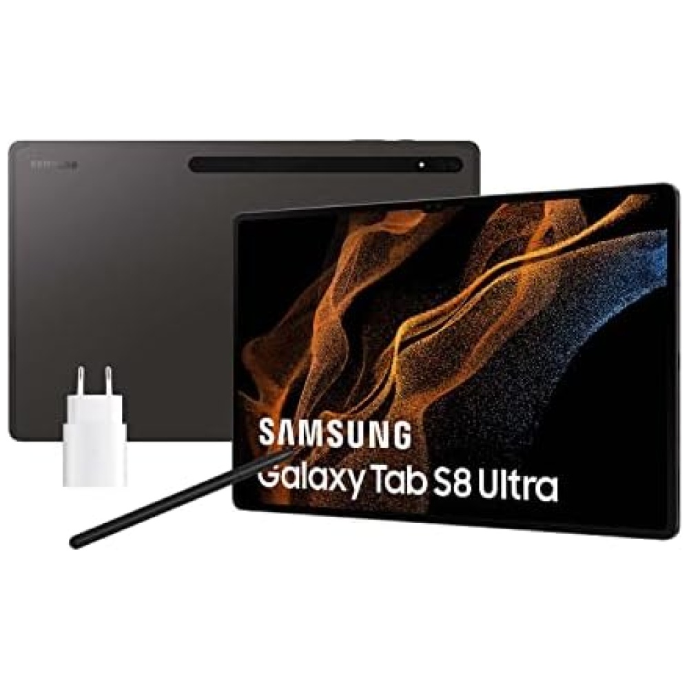
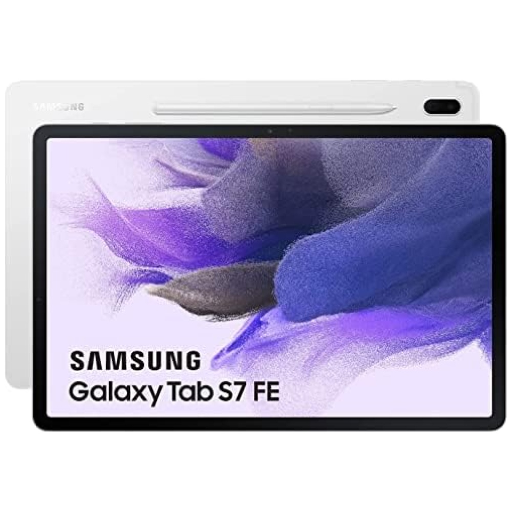
Potencia tu toma de notas con S Pen. Escribe, esboza y dibuja en tu aplicación de notas favorita con el S Pen incluido, ahora resistente al agua y al polvo. Además, se acopla magnéticamente a la parte posterior de tu dispositivo, dándole un toque de estilo. En Bitech, nuestra tienda de tecnología, también puedes encontrar el S Pen Creator Edition para liberar todo tu potencial creativo.
Disfruta de tonos vivos y una visión impresionante en la pantalla de alta resolución de 12,4 o 10,9 pulgadas. Los detalles son nítidos y los colores vivos gracias a la gama cromática DCI-P3 y al brillo mejorado. En Bitech, te garantizamos una experiencia visual espectacular.
Protege tus ojos mientras disfrutas de contenidos, creas y juegas. La pantalla de Galaxy Tab S9 FE y Tab S9 FE+ ha sido diseñada con una emisión reducida de luz azul, brindándote una experiencia visual cómoda. En Bitech, nos preocupamos por tu bienestar.
Libera tu creatividad con Samsung Notes y Goodnotes, optimizados para ofrecerte una experiencia fluida con el S Pen. Toma notas a nivel profesional, esboza en vista vertical y edita en horizontal. En Bitech, te ofrecemos las herramientas para que des rienda suelta a tu imaginación.
Descubre la primera tablet Galaxy S FE resistente al agua y al polvo. El elegante diseño de la tablet se complementa con un robusto marco metálico y la certificación IP68. En Bitech, te ofrecemos productos duraderos y de calidad.
Aumenta tu productividad con el chipset Exynos 1380 de alto rendimiento. Las Galaxy Tab S9 FE y Tab S9 FE+ te ofrecen multitarea, streaming y juegos fluidos y rápidos. Además, puedes elegir un almacenamiento interno de hasta 256 GB y añadir una tarjeta microSD para más espacio. En Bitech, te ofrecemos las mejores opciones para satisfacer tus necesidades.
Mantente conectado en cualquier lugar con Dual SIM en la Galaxy Tab S9 FE y Tab S9 FE+. Cambia de red fácilmente y lleva tus contactos contigo. En Bitech, te ofrecemos la mejor conectividad.
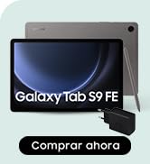
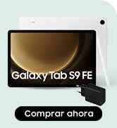
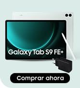
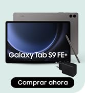
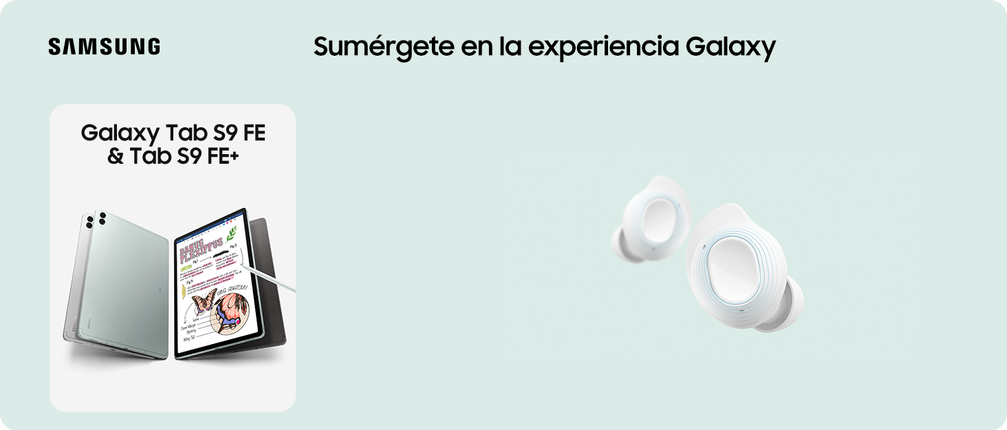
Descubre la gama Galaxy Tab S9, Tab S9 FE y Tab S9 FE+ en Bitech. Elige la pantalla, el peso, el grosor, la red y la batería que se adapten a tus necesidades. En Bitech, tenemos todo lo que necesitas para disfrutar de la tecnología al máximo.


En BiTech, ofrecemos , 30 días de Devolución GRATUITA, para que puedas comprar con total tranquilidad. Si no estás satisfecho te devolvemos el dinero. A parte, tienes 3 años de garantía.
Más información
Potencia tu toma de notas con S Pen. Escribe, esboza y dibuja en tu aplicación de notas favorita con el S Pen incluido, ahora resistente al agua y al polvo. Además, se acopla magnéticamente a la parte posterior de tu dispositivo, dándole un toque de estilo. En Bitech, nuestra tienda de tecnología, también puedes encontrar el S Pen Creator Edition para liberar todo tu potencial creativo.
Disfruta de tonos vivos y una visión impresionante en la pantalla de alta resolución de 12,4 o 10,9 pulgadas. Los detalles son nítidos y los colores vivos gracias a la gama cromática DCI-P3 y al brillo mejorado. En Bitech, te garantizamos una experiencia visual espectacular.
Protege tus ojos mientras disfrutas de contenidos, creas y juegas. La pantalla de Galaxy Tab S9 FE y Tab S9 FE+ ha sido diseñada con una emisión reducida de luz azul, brindándote una experiencia visual cómoda. En Bitech, nos preocupamos por tu bienestar.
Libera tu creatividad con Samsung Notes y Goodnotes, optimizados para ofrecerte una experiencia fluida con el S Pen. Toma notas a nivel profesional, esboza en vista vertical y edita en horizontal. En Bitech, te ofrecemos las herramientas para que des rienda suelta a tu imaginación.
Descubre la primera tablet Galaxy S FE resistente al agua y al polvo. El elegante diseño de la tablet se complementa con un robusto marco metálico y la certificación IP68. En Bitech, te ofrecemos productos duraderos y de calidad.
Aumenta tu productividad con el chipset Exynos 1380 de alto rendimiento. Las Galaxy Tab S9 FE y Tab S9 FE+ te ofrecen multitarea, streaming y juegos fluidos y rápidos. Además, puedes elegir un almacenamiento interno de hasta 256 GB y añadir una tarjeta microSD para más espacio. En Bitech, te ofrecemos las mejores opciones para satisfacer tus necesidades.
Mantente conectado en cualquier lugar con Dual SIM en la Galaxy Tab S9 FE y Tab S9 FE+. Cambia de red fácilmente y lleva tus contactos contigo. En Bitech, te ofrecemos la mejor conectividad.
Descubre la gama Galaxy Tab S9, Tab S9 FE y Tab S9 FE+ en Bitech. Elige la pantalla, el peso, el grosor, la red y la batería que se adapten a tus necesidades. En Bitech, tenemos todo lo que necesitas para disfrutar de la tecnología al máximo.