, S Pen, 10.4\" LCD")


La aplicación Samsung Notes mejora tu productividad: amplía hasta un 300% para una escritura precisa, resalta el texto y convierte el texto en formato digital con un toque
Ligereza y agarre cómodo para un uso prolongado. El s Pen con 4.096 niveles de presión y una punta fina y precisa, ofrece una experiencia de escritura como la de un bolígrafo real
Disfruta de una experiencia Smart Home completa. Recibe llamadas y manda mensajes con tu Galaxy Tab S6 Lite incluso si la tableta y el teléfono están conectados a diferentes redes
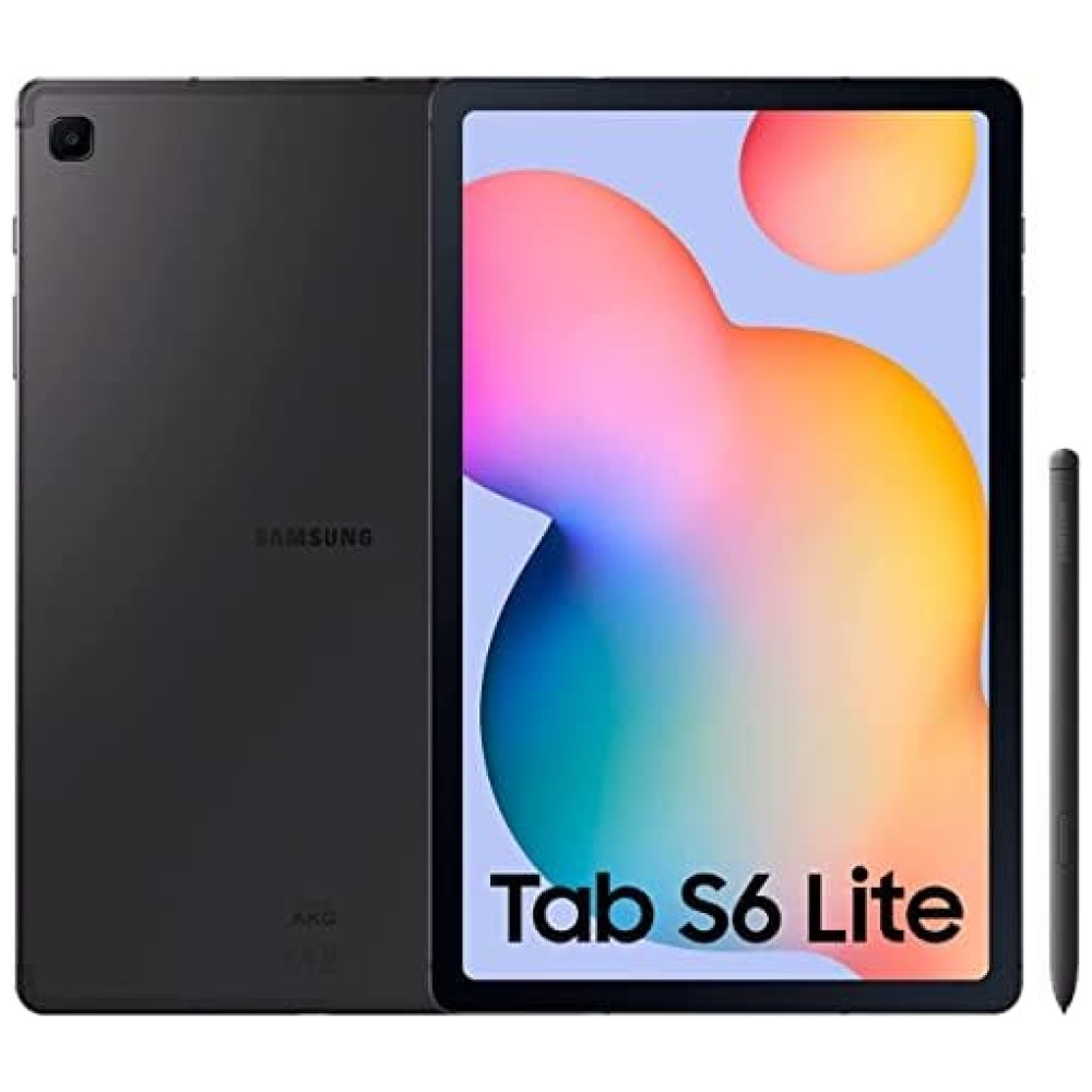
Galaxy Tab S6 Lite cuenta con una gran pantalla de 10,4 pulgadas para una visualización dinámica e inmersiva. Mira contenidos YouTube Premium o Netflix* y compártelos con toda tu familia. Doble altavoz con Dolby Atmos & Sound by AKG para una reproducción de audio potente y bien equilibrada. Reproduci musica senza interruzioni sul tuo Galaxy Tab S6 Lite con Spotify**.Galaxy Tab S6 Lite è dotato di una batteria a Ricarica Rapida da 7.040 mAh.
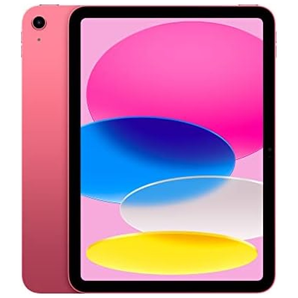
¡Descubre el Galaxy Tab S6 Lite en Bitech.es! La aplicación Samsung Notes te ayudará a ser más productivo, permitiéndote ampliar hasta un 300% para una escritura precisa, resaltar texto y convertirlo en formato digital con un solo toque. Además, su ligereza y agarre cómodo te brindarán una experiencia de uso prolongada. El s Pen con 4.096 niveles de presión y una punta fina y precisa te ofrecerá una experiencia de escritura similar a la de un bolígrafo real.
No te pierdas la experiencia completa de Smart Home con el Galaxy Tab S6 Lite. Podrás recibir llamadas y enviar mensajes incluso si tu tableta y tu teléfono están conectados a diferentes redes. Su pantalla de 10,4 pulgadas te brindará una visualización dinámica e inmersiva, perfecta para disfrutar de contenidos en YouTube Premium o Netflix junto a tu familia. Además, cuenta con un doble altavoz con Dolby Atmos & Sound by AKG para una reproducción de audio potente y bien equilibrada. ¡Y no te preocupes por la batería, ya que el Galaxy Tab S6 Lite viene con una batería de carga rápida de 7.040 mAh!
No esperes más y adquiere el Galaxy Tab S6 Lite en Bitech.es para disfrutar de todas estas increíbles características y funcionalidades. ¡No te arrepentirás!


En BiTech, ofrecemos , 30 días de Devolución GRATUITA, para que puedas comprar con total tranquilidad. Si no estás satisfecho te devolvemos el dinero. A parte, tienes 3 años de garantía.
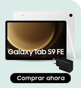
Más información
La aplicación Samsung Notes mejora tu productividad: amplía hasta un 300% para una escritura precisa, resalta el texto y convierte el texto en formato digital con un toque
Ligereza y agarre cómodo para un uso prolongado. El s Pen con 4.096 niveles de presión y una punta fina y precisa, ofrece una experiencia de escritura como la de un bolígrafo real
Disfruta de una experiencia Smart Home completa. Recibe llamadas y manda mensajes con tu Galaxy Tab S6 Lite incluso si la tableta y el teléfono están conectados a diferentes redes
Galaxy Tab S6 Lite cuenta con una gran pantalla de 10,4 pulgadas para una visualización dinámica e inmersiva. Mira contenidos YouTube Premium o Netflix* y compártelos con toda tu familia. Doble altavoz con Dolby Atmos & Sound by AKG para una reproducción de audio potente y bien equilibrada. Reproduci musica senza interruzioni sul tuo Galaxy Tab S6 Lite con Spotify**.Galaxy Tab S6 Lite è dotato di una batteria a Ricarica Rapida da 7.040 mAh.
¡Descubre el Galaxy Tab S6 Lite en Bitech.es! La aplicación Samsung Notes te ayudará a ser más productivo, permitiéndote ampliar hasta un 300% para una escritura precisa, resaltar texto y convertirlo en formato digital con un solo toque. Además, su ligereza y agarre cómodo te brindarán una experiencia de uso prolongada. El s Pen con 4.096 niveles de presión y una punta fina y precisa te ofrecerá una experiencia de escritura similar a la de un bolígrafo real.
No te pierdas la experiencia completa de Smart Home con el Galaxy Tab S6 Lite. Podrás recibir llamadas y enviar mensajes incluso si tu tableta y tu teléfono están conectados a diferentes redes. Su pantalla de 10,4 pulgadas te brindará una visualización dinámica e inmersiva, perfecta para disfrutar de contenidos en YouTube Premium o Netflix junto a tu familia. Además, cuenta con un doble altavoz con Dolby Atmos & Sound by AKG para una reproducción de audio potente y bien equilibrada. ¡Y no te preocupes por la batería, ya que el Galaxy Tab S6 Lite viene con una batería de carga rápida de 7.040 mAh!
No esperes más y adquiere el Galaxy Tab S6 Lite en Bitech.es para disfrutar de todas estas increíbles características y funcionalidades. ¡No te arrepentirás!