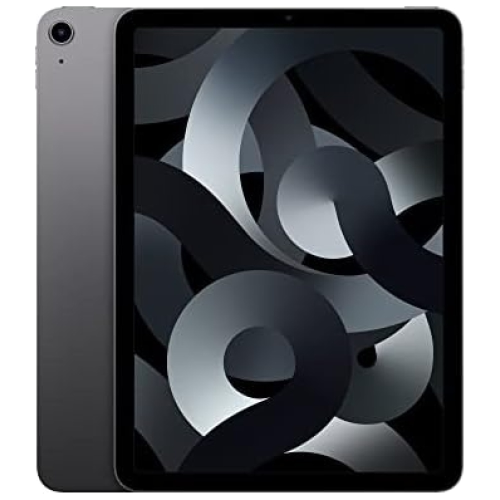
REY 2X Protector de Pantalla para ASUS ZENPAD 10" / 10.1" Z300C - Z330C - Z300M, Cristal Vidrio Templado Premium, Táblet
¡Protege tu ASUS ZENPAD 10" / 10.1" Z300C - Z330C - Z300M con el REY 2X Protector de Pantalla! Este cristal vidrio templado de alta calidad garantiza una dureza de 9H, resistente a arañazos y golpes. Además, cuenta con un revestimiento oleofóbico que repele la grasa, manteniendo tu táblet siempre limpia.
No solo protege, sino que también mejora el tacto de la pantalla original de tu táblet, brindando una experiencia de uso más agradable. Su transparencia total y alto contraste aseguran una excelente visibilidad en todo momento.
La aplicación del protector es sencilla y no deja residuos, gracias a su sistema de adherencia sin complicaciones. ¡No pierdas más tiempo y protege tu ASUS ZENPAD 10" / 10.1" Z300C - Z330C - Z300M con el REY 2X Protector de Pantalla!
Consíguelo ahora en Bitech.es, tu tienda de tecnología de confianza.


Somos una empresa española que vende accesorios para móviles y tablets, de forma que nuestros clientes puedan mejorar su experiencia con sus dispositivos electrónicos.


En BiTech, ofrecemos , 30 días de Devolución GRATUITA, para que puedas comprar con total tranquilidad. Si no estás satisfecho te devolvemos el dinero. A parte, tienes 3 años de garantía.
Más información
REY 2X Protector de Pantalla para ASUS ZENPAD 10" / 10.1" Z300C - Z330C - Z300M, Cristal Vidrio Templado Premium, Táblet
¡Protege tu ASUS ZENPAD 10" / 10.1" Z300C - Z330C - Z300M con el REY 2X Protector de Pantalla! Este cristal vidrio templado de alta calidad garantiza una dureza de 9H, resistente a arañazos y golpes. Además, cuenta con un revestimiento oleofóbico que repele la grasa, manteniendo tu táblet siempre limpia.
No solo protege, sino que también mejora el tacto de la pantalla original de tu táblet, brindando una experiencia de uso más agradable. Su transparencia total y alto contraste aseguran una excelente visibilidad en todo momento.
La aplicación del protector es sencilla y no deja residuos, gracias a su sistema de adherencia sin complicaciones. ¡No pierdas más tiempo y protege tu ASUS ZENPAD 10" / 10.1" Z300C - Z330C - Z300M con el REY 2X Protector de Pantalla!
Consíguelo ahora en Bitech.es, tu tienda de tecnología de confianza.
Somos una empresa española que vende accesorios para móviles y tablets, de forma que nuestros clientes puedan mejorar su experiencia con sus dispositivos electrónicos.