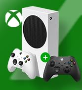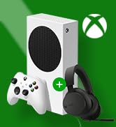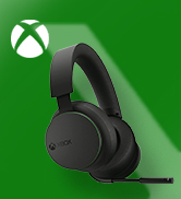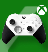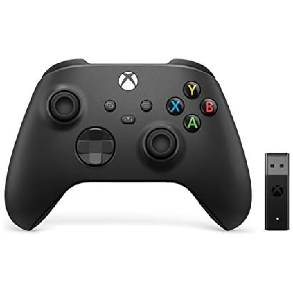
Manette Xbox avec adaptateur
Descatalogado por el fabricante: No disponible en el mercado
Pilas: Incluye 2 pilas AA
Clasificado: No tiene clasificación PEGI
Idioma: Disponible en inglés
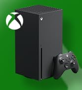
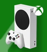
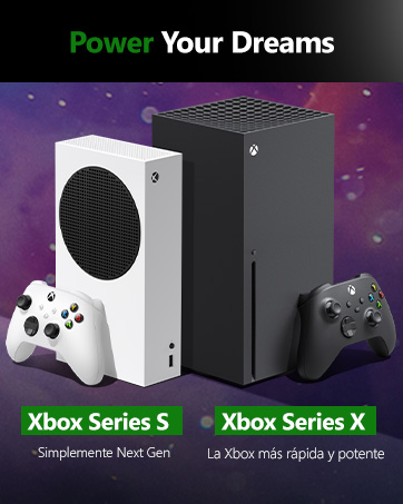
Dimensiones del producto: 17,8 x 7,2 x 17,7 cm; 287 gramos
Fecha de lanzamiento: Disponible desde el 1 de enero de 2022
ASIN: B08JW5DR79
Número de modelo del producto: 1VA-00002
Restricciones de envío: Envío disponible a España y otros países seleccionados.
Actualizaciones de software garantizadas hasta: No aplicable
País de origen: No aplicable
Producto disponible en nuestra tienda de tecnología Bitech. ¡Compra ahora en bitech.es!
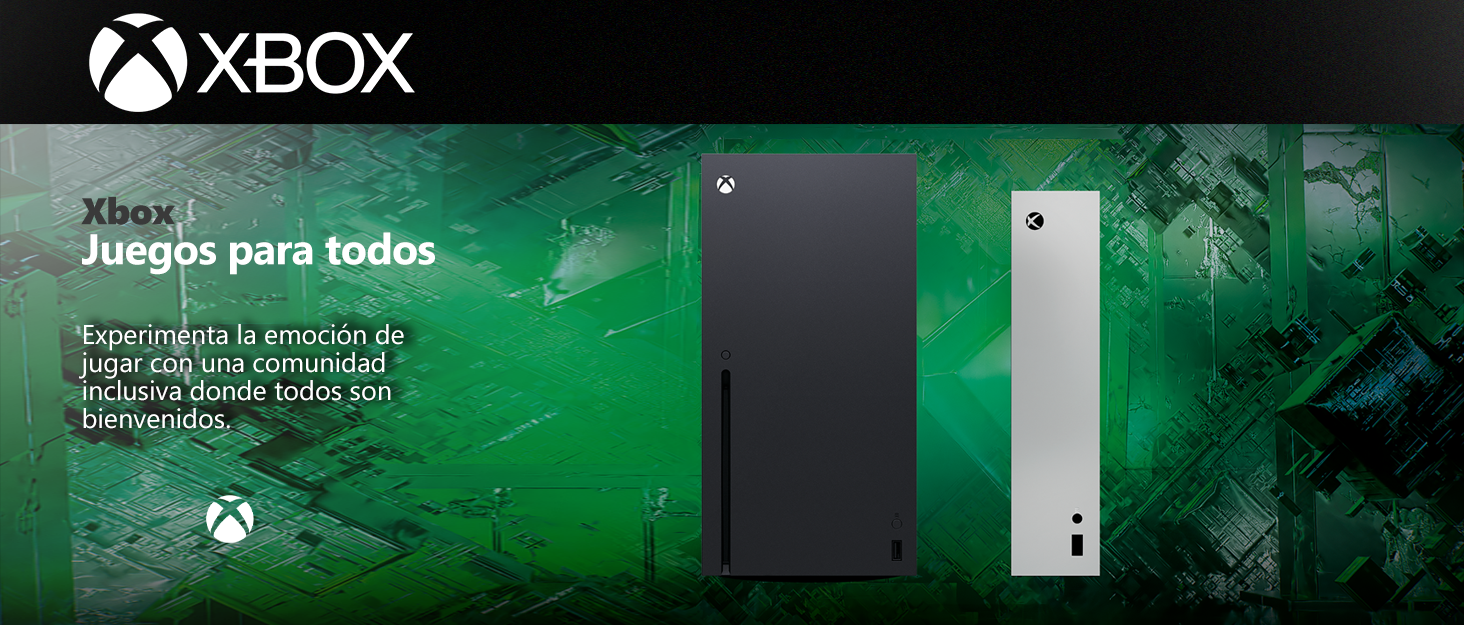
Los videojuegos tienen el poder de unir a las personas como parte de una comunidad y conectarlas a través de experiencias compartidas.
Con casi 400 millones de jugadores con discapacidades en el mundo, es importante crear experiencias de juego que sean inclusivas y accesibles por diseño para tantos jugadores como sea posible. Nuestros Juegos y Consola incluyen características que apoyan la accesibilidad visual, auditiva, de movilidad y cognitiva.


En BiTech, ofrecemos , 30 días de Devolución GRATUITA, para que puedas comprar con total tranquilidad. Si no estás satisfecho te devolvemos el dinero. A parte, tienes 3 años de garantía.
Más información
Manette Xbox avec adaptateur
Descatalogado por el fabricante: No disponible en el mercado
Pilas: Incluye 2 pilas AA
Clasificado: No tiene clasificación PEGI
Idioma: Disponible en inglés
Dimensiones del producto: 17,8 x 7,2 x 17,7 cm; 287 gramos
Fecha de lanzamiento: Disponible desde el 1 de enero de 2022
ASIN: B08JW5DR79
Número de modelo del producto: 1VA-00002
Restricciones de envío: Envío disponible a España y otros países seleccionados.
Actualizaciones de software garantizadas hasta: No aplicable
País de origen: No aplicable
Producto disponible en nuestra tienda de tecnología Bitech. ¡Compra ahora en bitech.es!
Los videojuegos tienen el poder de unir a las personas como parte de una comunidad y conectarlas a través de experiencias compartidas.
Con casi 400 millones de jugadores con discapacidades en el mundo, es importante crear experiencias de juego que sean inclusivas y accesibles por diseño para tantos jugadores como sea posible. Nuestros Juegos y Consola incluyen características que apoyan la accesibilidad visual, auditiva, de movilidad y cognitiva.