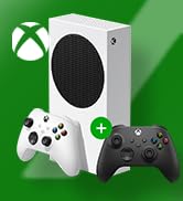
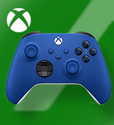
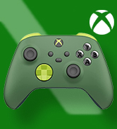
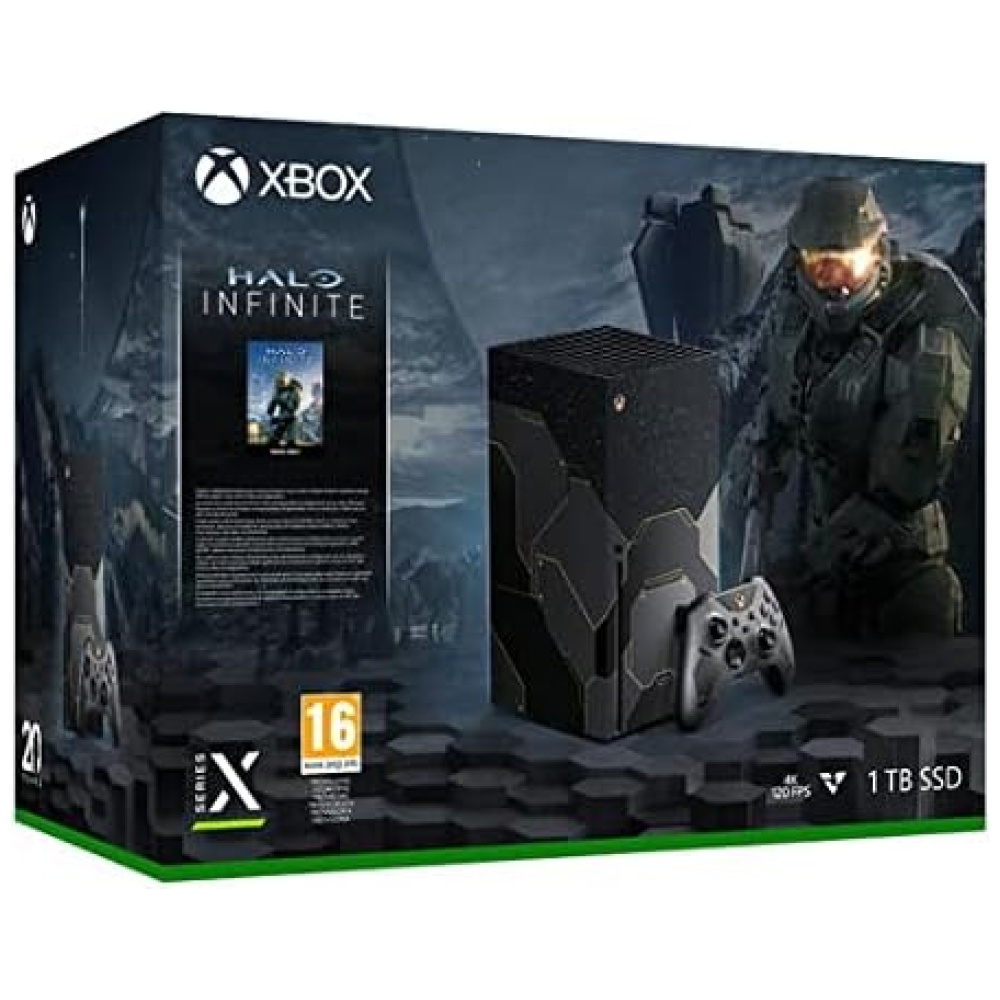
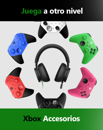
Disfruta del moderno diseño del Mando Inalámbrico Xbox Carbon Black, con superficies esculpidas y geometría refinada para aumentar la comodidad mientras juegas. *Compatible con determinados dispositivos y versiones de sistemas operativos. Algunas funciones no son compatibles con Android, o vía Bluetooth. Ve a xbox.com/controller-compatibility para más información. Mapeo de botones disponible a través de la aplicación Accesorios de Xbox para Xbox Series X, Xbox One, y Windows 10.
Este mando, que puedes encontrar en Bitech.es, ha sido descatalogado por el fabricante, pero no te preocupes, aún puedes conseguirlo. Viene con 2 pilas AA incluidas, y su tamaño es de 17 x 17 x 6 cm, con un peso de 460 gramos. Fue lanzado el 10 de noviembre de 2020 y su número de modelo es QAT-00009. Además, es compatible con envío a España y otros países seleccionados.
Personaliza el mando al cambiar la asignación de botones con la app Accesorios de Xbox. También puedes conectar cualquier auricular compatible en el conector de audio para auriculares de 3,5 mm. Captura y comparte contenido sin problemas, como capturas de pantalla, grabaciones y mucho más con el nuevo botón Compartir. Además, puedes emparejar rápidamente, jugar y cambiar entre dispositivos como Xbox Series X|S, Xbox One, PC Windows, Android e iOS. Y lo mejor de todo, este mando cuenta con tecnología inalámbrica de Xbox y Bluetooth, lo que te permite jugar sin cables en consolas, PC, teléfonos iOS y Android, y tabletas compatibles. ¡No te quedes sin el tuyo en Bitech.es!
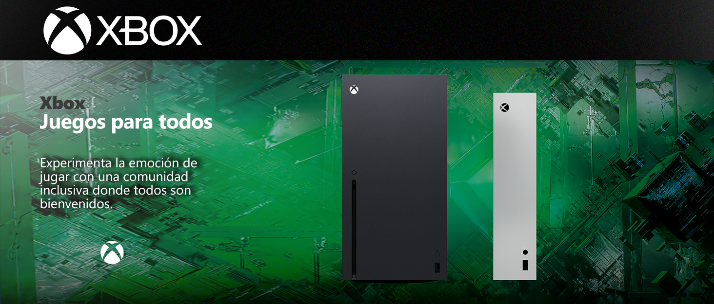
Los videojuegos tienen el poder de unir a las personas como parte de una comunidad y conectarlas a través de experiencias compartidas.
Con casi 400 millones de jugadores con discapacidades en el mundo, es importante crear experiencias de juego que sean inclusivas y accesibles por diseño para tantos jugadores como sea posible. Nuestros Juegos y Consola incluyen características que apoyan la accesibilidad visual, auditiva, de movilidad y cognitiva.


En BiTech, ofrecemos , 30 días de Devolución GRATUITA, para que puedas comprar con total tranquilidad. Si no estás satisfecho te devolvemos el dinero. A parte, tienes 3 años de garantía.
Más información
Disfruta del moderno diseño del Mando Inalámbrico Xbox Carbon Black, con superficies esculpidas y geometría refinada para aumentar la comodidad mientras juegas. *Compatible con determinados dispositivos y versiones de sistemas operativos. Algunas funciones no son compatibles con Android, o vía Bluetooth. Ve a xbox.com/controller-compatibility para más información. Mapeo de botones disponible a través de la aplicación Accesorios de Xbox para Xbox Series X, Xbox One, y Windows 10.
Este mando, que puedes encontrar en Bitech.es, ha sido descatalogado por el fabricante, pero no te preocupes, aún puedes conseguirlo. Viene con 2 pilas AA incluidas, y su tamaño es de 17 x 17 x 6 cm, con un peso de 460 gramos. Fue lanzado el 10 de noviembre de 2020 y su número de modelo es QAT-00009. Además, es compatible con envío a España y otros países seleccionados.
Personaliza el mando al cambiar la asignación de botones con la app Accesorios de Xbox. También puedes conectar cualquier auricular compatible en el conector de audio para auriculares de 3,5 mm. Captura y comparte contenido sin problemas, como capturas de pantalla, grabaciones y mucho más con el nuevo botón Compartir. Además, puedes emparejar rápidamente, jugar y cambiar entre dispositivos como Xbox Series X|S, Xbox One, PC Windows, Android e iOS. Y lo mejor de todo, este mando cuenta con tecnología inalámbrica de Xbox y Bluetooth, lo que te permite jugar sin cables en consolas, PC, teléfonos iOS y Android, y tabletas compatibles. ¡No te quedes sin el tuyo en Bitech.es!
Los videojuegos tienen el poder de unir a las personas como parte de una comunidad y conectarlas a través de experiencias compartidas.
Con casi 400 millones de jugadores con discapacidades en el mundo, es importante crear experiencias de juego que sean inclusivas y accesibles por diseño para tantos jugadores como sea posible. Nuestros Juegos y Consola incluyen características que apoyan la accesibilidad visual, auditiva, de movilidad y cognitiva.