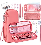
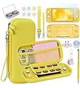
Descripción del producto
 Modelo Aplicable: Switch Lite
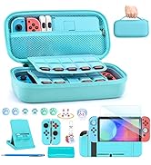
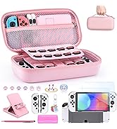
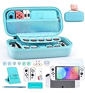
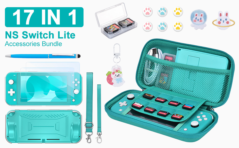
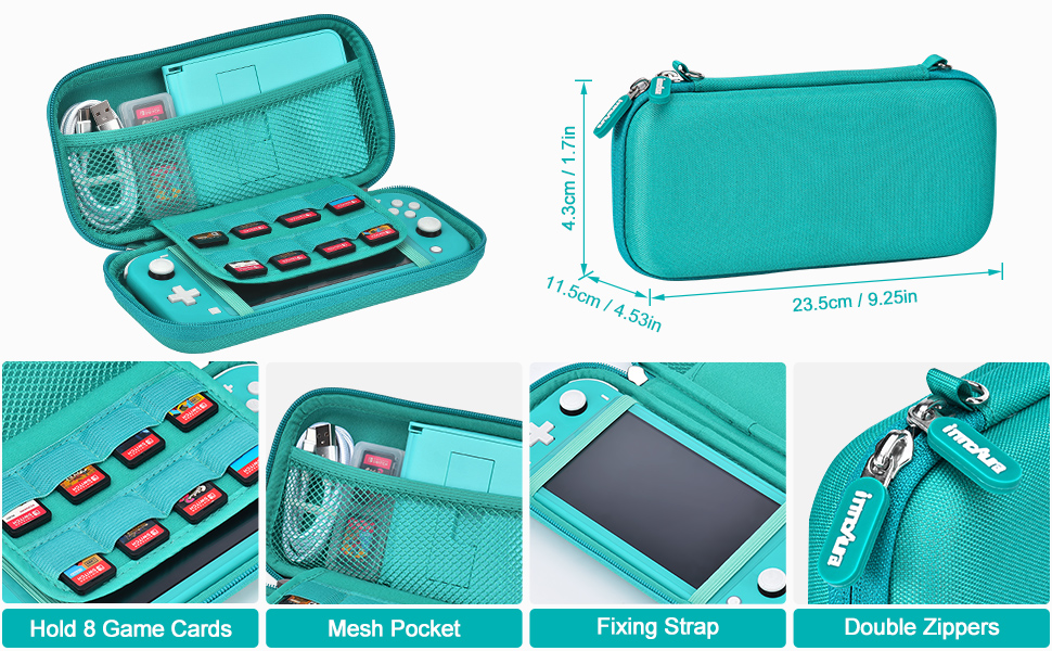
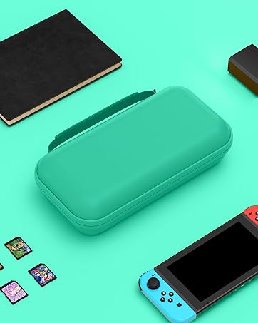
¡Protege y lleva tu Switch Lite a todas partes con este increíble bundle de accesorios! La carcasa dura de Switch Lite está diseñada para resistir golpes y caídas, manteniendo tu consola segura en todo momento. Además, cuenta con 8 ranuras para tarjetas de videojuegos y un compartimento de malla para guardar tus auriculares y cable de carga.
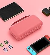
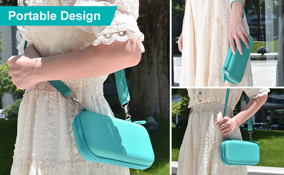
La carcasa de viaje de Switch Lite es fácil de transportar gracias a su correa para hombro y muñequera. Puedes ajustar la longitud para usarla como bolso de hombro o utilizar la muñequera como bolso de mano. Las correas elásticas interiores mantienen tu consola en su lugar sin riesgo de caídas.
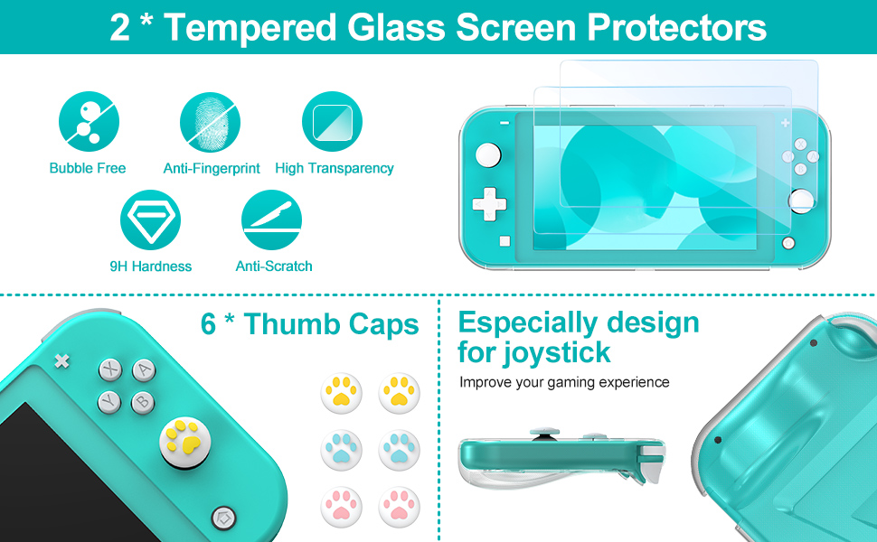
La carcasa protectora de Switch Lite tiene un agarre ergonómico que te permite jugar cómodamente en modo portátil. Además, el protector de pantalla de dureza 9H ofrece una definición clara y una alta transparencia para una experiencia de visualización óptima.
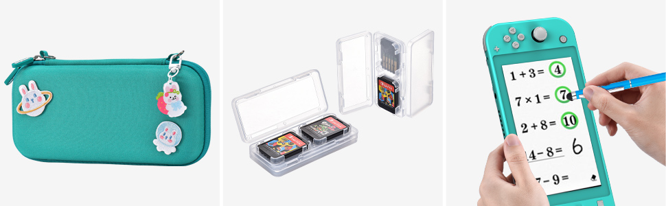
Este bundle de Switch Lite es el regalo perfecto para los usuarios de esta consola. Incluye accesorios básicos de protección, como un stylus, y te permite mantener todos tus accesorios organizados. ¡No incluye la consola ni las tarjetas de videojuegos!
¡Compra ahora en Bitech.es y lleva tu experiencia de juego al siguiente nivel con este increíble bundle de accesorios para Switch Lite!
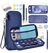
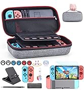
Modelo Aplicable: Switch Lite
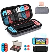
¡Protege y lleva tu Switch Lite a todas partes con este increíble bundle de accesorios! La carcasa dura de Switch Lite está diseñada para resistir golpes y caídas, manteniendo tu consola segura en todo momento. Además, cuenta con 8 ranuras para tarjetas de videojuegos y un compartimento de malla para guardar tus auriculares y cable de carga.
La carcasa de viaje de Switch Lite es fácil de transportar gracias a su correa para hombro y muñequera. Puedes ajustar la longitud para usarla como bolso de hombro o utilizar la muñequera como bolso de mano. Las correas elásticas interiores mantienen tu consola en su lugar sin riesgo de caídas.
La carcasa protectora de Switch Lite tiene un agarre ergonómico que te permite jugar cómodamente en modo portátil. Además, el protector de pantalla de dureza 9H ofrece una definición clara y una alta transparencia para una experiencia de visualización óptima.
Este bundle de Switch Lite es el regalo perfecto para los usuarios de esta consola. Incluye accesorios básicos de protección, como un stylus, y te permite mantener todos tus accesorios organizados. ¡No incluye la consola ni las tarjetas de videojuegos!
¡Compra ahora en Bitech.es y lleva tu experiencia de juego al siguiente nivel con este increíble bundle de accesorios para Switch Lite!


En BiTech, ofrecemos , 30 días de Devolución GRATUITA, para que puedas comprar con total tranquilidad. Si no estás satisfecho te devolvemos el dinero. A parte, tienes 3 años de garantía.
Más información
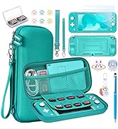
Descripción del producto
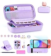
Modelo Aplicable: Switch Lite
¡Protege y lleva tu Switch Lite a todas partes con este increíble bundle de accesorios! La carcasa dura de Switch Lite está diseñada para resistir golpes y caídas, manteniendo tu consola segura en todo momento. Además, cuenta con 8 ranuras para tarjetas de videojuegos y un compartimento de malla para guardar tus auriculares y cable de carga.
La carcasa de viaje de Switch Lite es fácil de transportar gracias a su correa para hombro y muñequera. Puedes ajustar la longitud para usarla como bolso de hombro o utilizar la muñequera como bolso de mano. Las correas elásticas interiores mantienen tu consola en su lugar sin riesgo de caídas.
La carcasa protectora de Switch Lite tiene un agarre ergonómico que te permite jugar cómodamente en modo portátil. Además, el protector de pantalla de dureza 9H ofrece una definición clara y una alta transparencia para una experiencia de visualización óptima.
Este bundle de Switch Lite es el regalo perfecto para los usuarios de esta consola. Incluye accesorios básicos de protección, como un stylus, y te permite mantener todos tus accesorios organizados. ¡No incluye la consola ni las tarjetas de videojuegos!
¡Compra ahora en Bitech.es y lleva tu experiencia de juego al siguiente nivel con este increíble bundle de accesorios para Switch Lite!