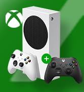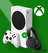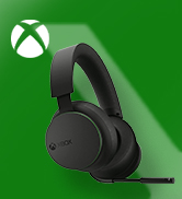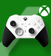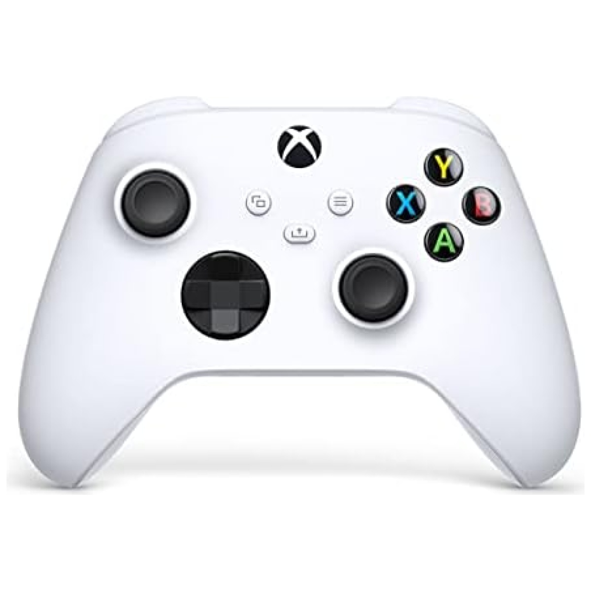
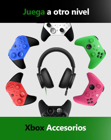
Disfruta del moderno diseño del Mando Inalámbrico Xbox Robot White, con superficies esculpidas y geometría refinada para aumentar la comodidad mientras juegas. *Compatible con determinados dispositivos y versiones de sistemas operativos. Algunas funciones no son compatibles con Android, o vía Bluetooth. Ve a xbox.com/controller-compatibility para más información. Mapeo de botones disponible a través de la aplicación Accesorios de Xbox para Xbox Series X, Xbox One, y Windows 10
Pilas: 2 AA (Tipo de pila necesaria)
Clasificado: Not PEGI rated
Manténgase en el objetivo con la superficie de agarre texturizada y el D-Pad híbrido
Puede personalizar el controlador para que se adapte a sus necesidades y reasignar los botones como desee con la aplicación Accesorios de Xbox.
Puede conectar auriculares y auriculares compatibles al conector para auriculares estéreo de 3,5 mm
Cuenta con tecnología Xbox Wireless y Bluetooth para juegos inalámbricos en consolas compatibles, PC con Windows 10 y teléfonos inteligentes y tabletas con Android
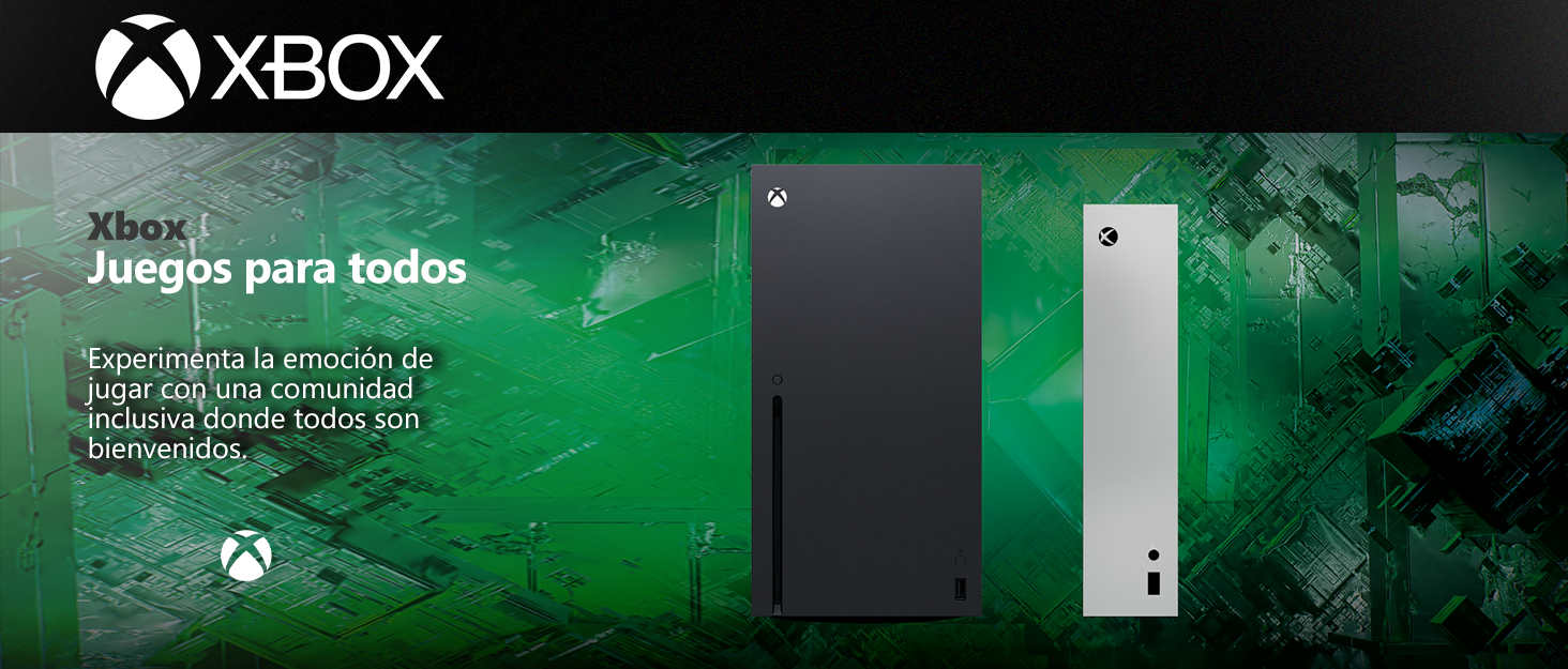
Los videojuegos tienen el poder de unir a las personas como parte de una comunidad y conectarlas a través de experiencias compartidas.
Con casi 400 millones de jugadores con discapacidades en el mundo, es importante crear experiencias de juego que sean inclusivas y accesibles por diseño para tantos jugadores como sea posible. Nuestros Juegos y Consola incluyen características que apoyan la accesibilidad visual, auditiva, de movilidad y cognitiva.


En BiTech, ofrecemos , 30 días de Devolución GRATUITA, para que puedas comprar con total tranquilidad. Si no estás satisfecho te devolvemos el dinero. A parte, tienes 3 años de garantía.
Más información
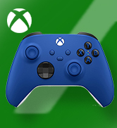
Disfruta del moderno diseño del Mando Inalámbrico Xbox Robot White, con superficies esculpidas y geometría refinada para aumentar la comodidad mientras juegas. *Compatible con determinados dispositivos y versiones de sistemas operativos. Algunas funciones no son compatibles con Android, o vía Bluetooth. Ve a xbox.com/controller-compatibility para más información. Mapeo de botones disponible a través de la aplicación Accesorios de Xbox para Xbox Series X, Xbox One, y Windows 10
Pilas: 2 AA (Tipo de pila necesaria)
Clasificado: Not PEGI rated
Manténgase en el objetivo con la superficie de agarre texturizada y el D-Pad híbrido
Puede personalizar el controlador para que se adapte a sus necesidades y reasignar los botones como desee con la aplicación Accesorios de Xbox.
Puede conectar auriculares y auriculares compatibles al conector para auriculares estéreo de 3,5 mm
Cuenta con tecnología Xbox Wireless y Bluetooth para juegos inalámbricos en consolas compatibles, PC con Windows 10 y teléfonos inteligentes y tabletas con Android
Los videojuegos tienen el poder de unir a las personas como parte de una comunidad y conectarlas a través de experiencias compartidas.
Con casi 400 millones de jugadores con discapacidades en el mundo, es importante crear experiencias de juego que sean inclusivas y accesibles por diseño para tantos jugadores como sea posible. Nuestros Juegos y Consola incluyen características que apoyan la accesibilidad visual, auditiva, de movilidad y cognitiva.