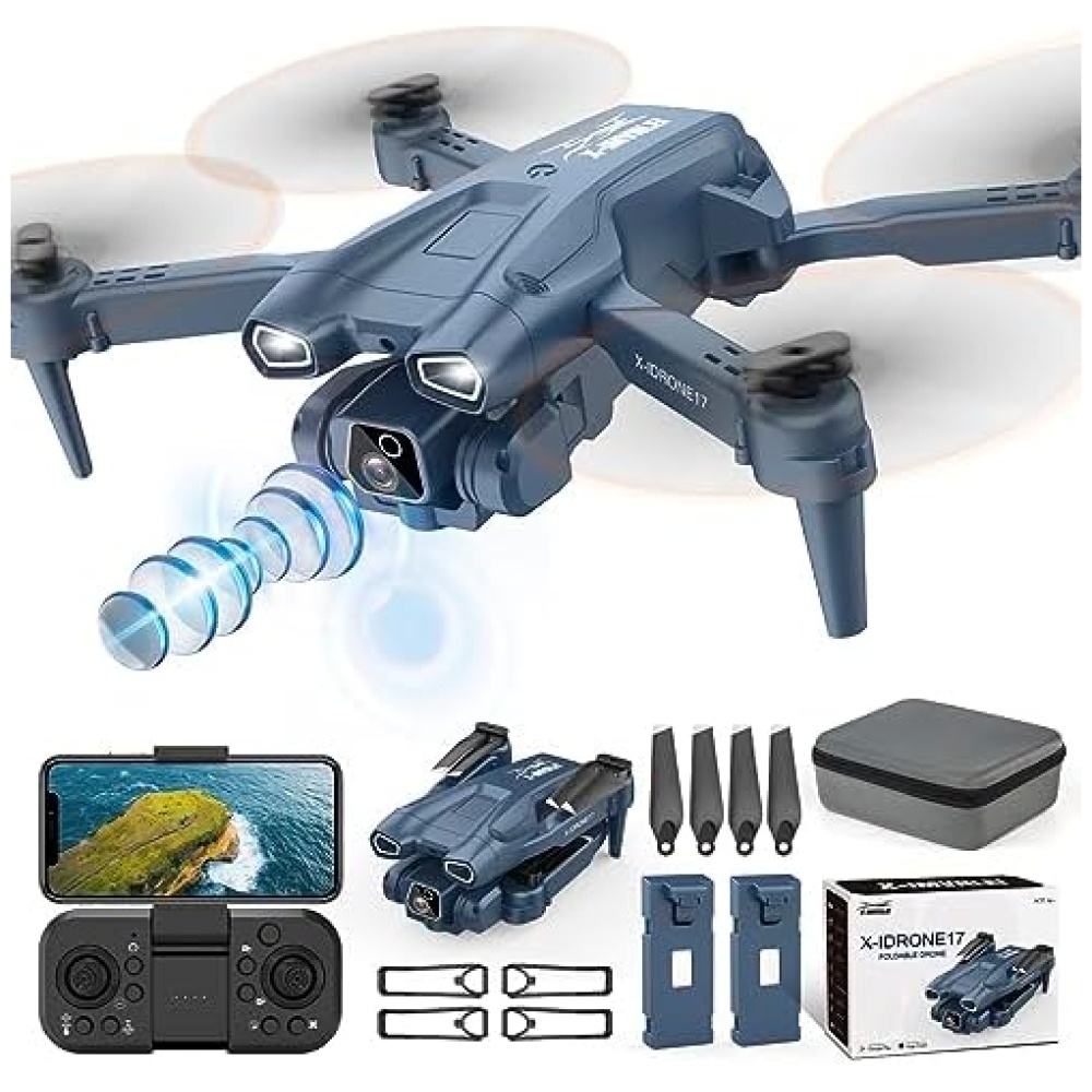
Descripción del producto
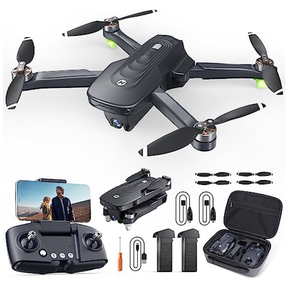
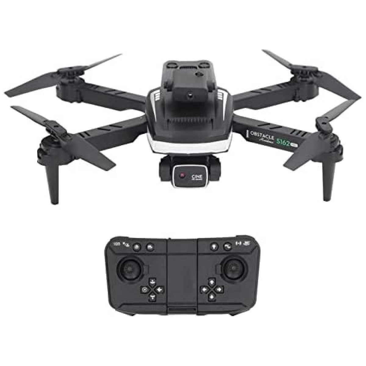
En Bitech, tenemos el dron perfecto para ti. Nuestro dron S162 combina estética y tecnología para brindarte una experiencia de vuelo única. Con su diseño plegable y cómodo almacenamiento, podrás llevarlo contigo a donde quieras. Además, su sensor infrarrojo de evitación de obstáculos garantiza vuelos seguros y sin contratiempos.
Pero eso no es todo, nuestro dron S162 cuenta con una lente 4K HD que te ofrece imágenes nítidas y detalladas. Además, podrás disfrutar de una visión más amplia gracias a su conmutación de doble lente. Y lo mejor de todo, podrás ver las imágenes en tiempo real a través de tu teléfono móvil.
Con el dron S162, el control es más fácil que nunca. Podrás ajustar la velocidad según tus preferencias y controlarlo de acuerdo a tu autoridad individual. ¡No más maniobras difíciles! Además, su batería de larga duración te permitirá disfrutar de hasta 10 minutos de vuelo continuo.
En Bitech, nos preocupamos por tu satisfacción. Por eso, te ofrecemos el dron S162 junto con todos los accesorios que necesitas, como el mando a distancia, el destornillador, el cable de carga, las palas, el marco de protección, el manual de instrucciones y la bolsa de almacenamiento.
No pierdas la oportunidad de tener el dron S162 en tus manos. Visita nuestra tienda en línea en bitech.es y descubre todo lo que tenemos para ofrecerte. ¡Te esperamos con los brazos abiertos para que vivas la mejor experiencia de vuelo con nuestros drones de última generación!


En BiTech, ofrecemos , 30 días de Devolución GRATUITA, para que puedas comprar con total tranquilidad. Si no estás satisfecho te devolvemos el dinero. A parte, tienes 3 años de garantía.
Más información
Descripción del producto
En Bitech, tenemos el dron perfecto para ti. Nuestro dron S162 combina estética y tecnología para brindarte una experiencia de vuelo única. Con su diseño plegable y cómodo almacenamiento, podrás llevarlo contigo a donde quieras. Además, su sensor infrarrojo de evitación de obstáculos garantiza vuelos seguros y sin contratiempos.
Pero eso no es todo, nuestro dron S162 cuenta con una lente 4K HD que te ofrece imágenes nítidas y detalladas. Además, podrás disfrutar de una visión más amplia gracias a su conmutación de doble lente. Y lo mejor de todo, podrás ver las imágenes en tiempo real a través de tu teléfono móvil.
Con el dron S162, el control es más fácil que nunca. Podrás ajustar la velocidad según tus preferencias y controlarlo de acuerdo a tu autoridad individual. ¡No más maniobras difíciles! Además, su batería de larga duración te permitirá disfrutar de hasta 10 minutos de vuelo continuo.
En Bitech, nos preocupamos por tu satisfacción. Por eso, te ofrecemos el dron S162 junto con todos los accesorios que necesitas, como el mando a distancia, el destornillador, el cable de carga, las palas, el marco de protección, el manual de instrucciones y la bolsa de almacenamiento.
No pierdas la oportunidad de tener el dron S162 en tus manos. Visita nuestra tienda en línea en bitech.es y descubre todo lo que tenemos para ofrecerte. ¡Te esperamos con los brazos abiertos para que vivas la mejor experiencia de vuelo con nuestros drones de última generación!