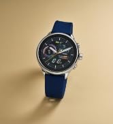
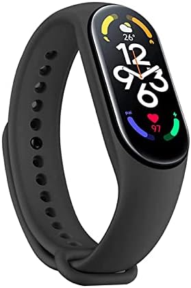
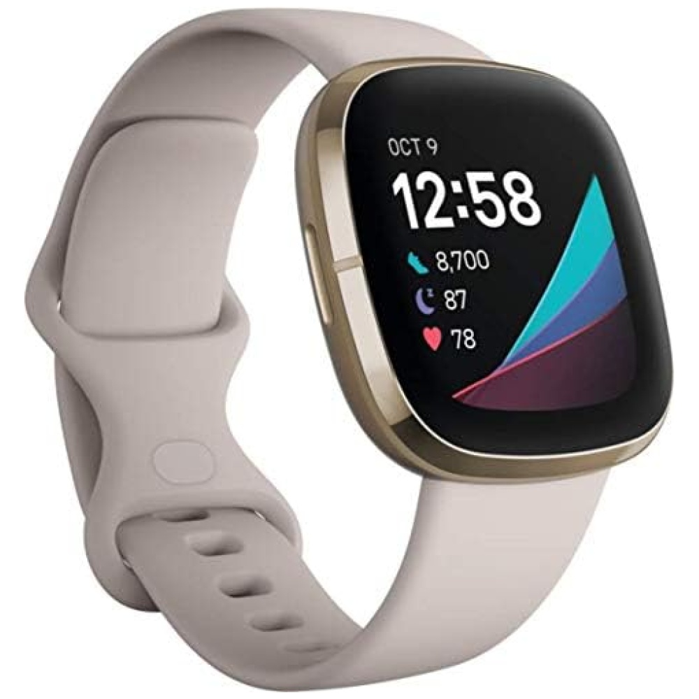
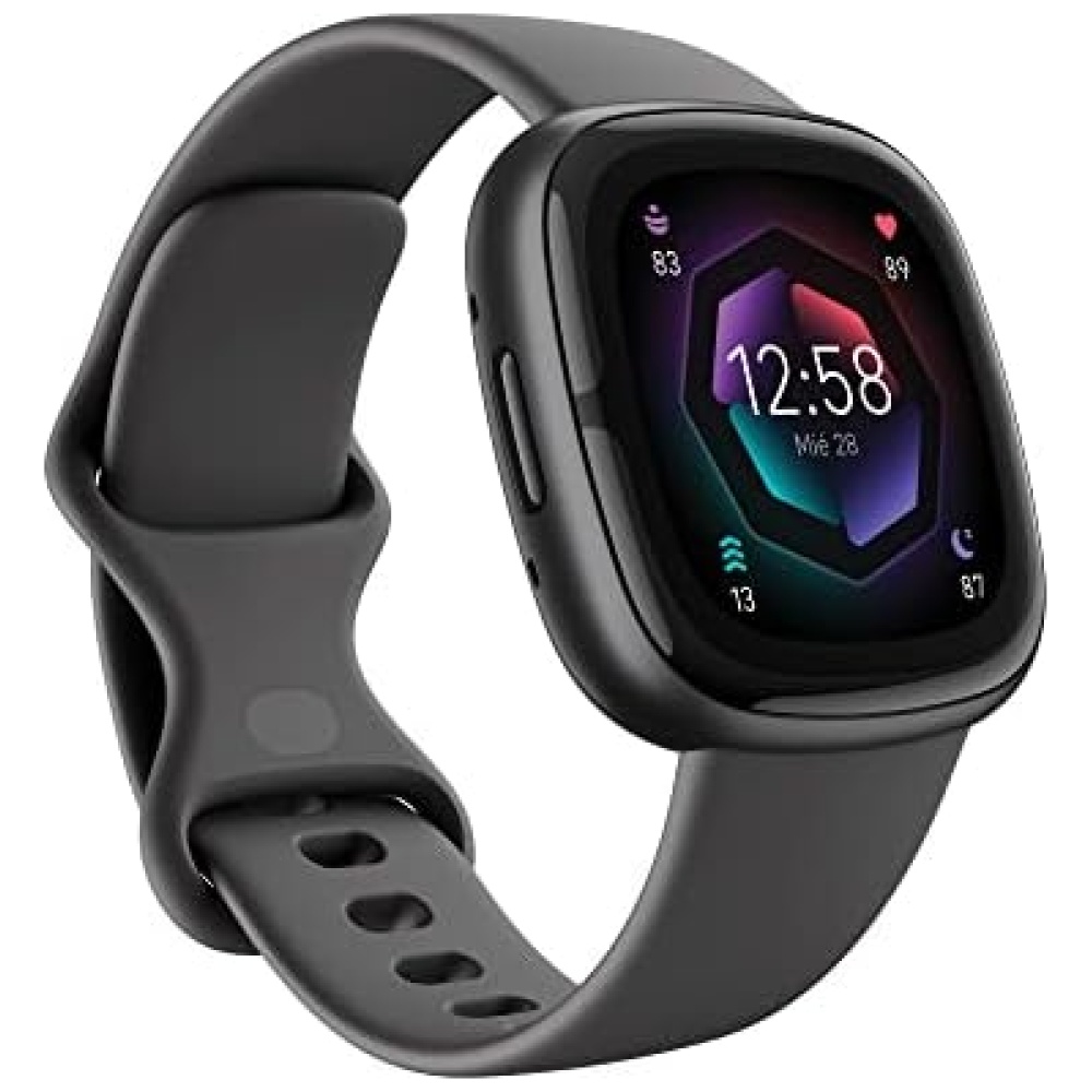
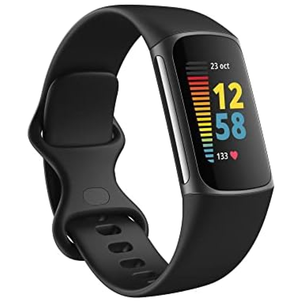
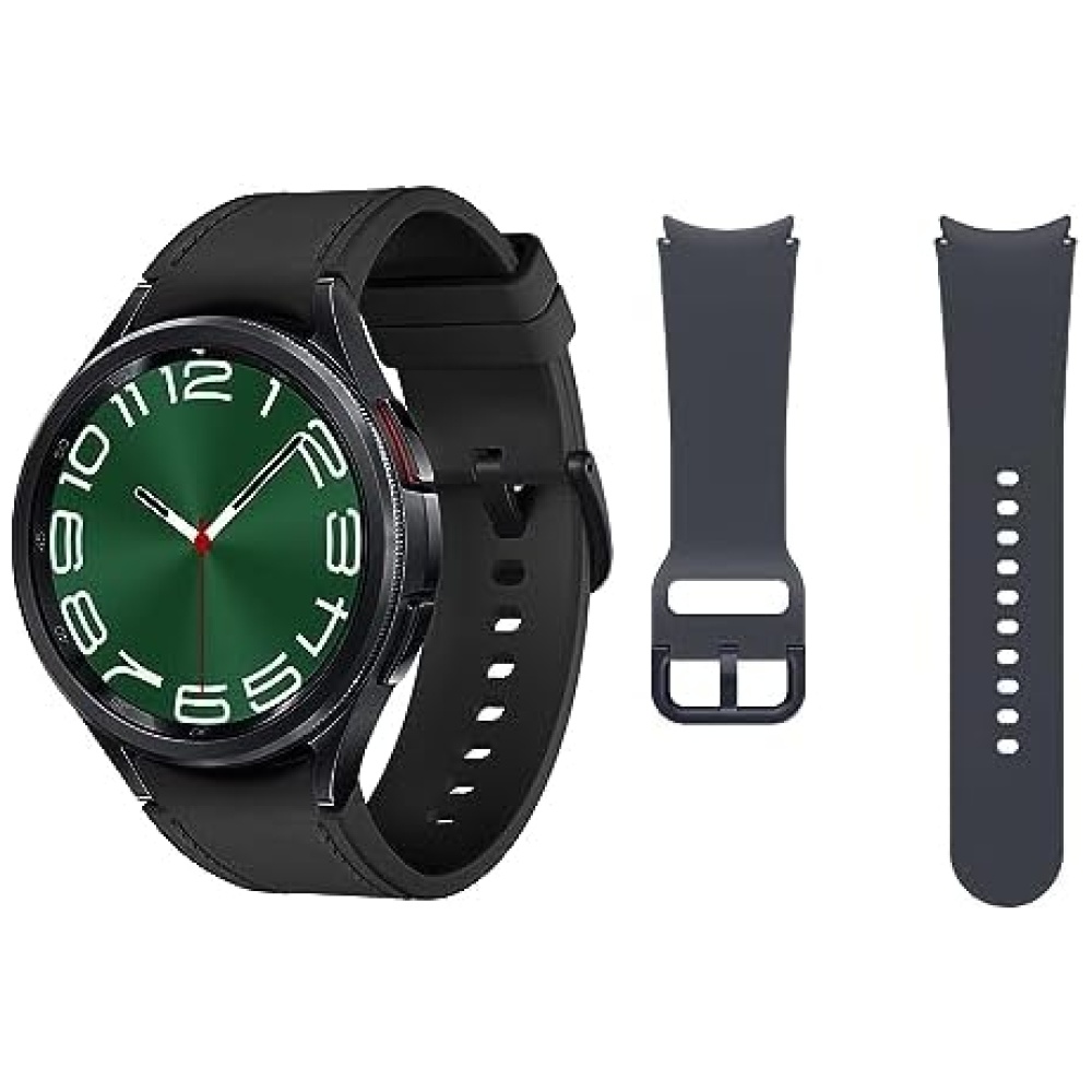
Este smartwatch Falster Gen 6 con pantalla táctil de 41 mm es perfecto para aquellos que buscan estilo y funcionalidad. Con una elegante correa de malla de acero inoxidable en tono oro rosa, este reloj inteligente se adapta a cualquier ocasión. Además, es compatible tanto con teléfonos iPhone como con Android, gracias a la tecnología Wear OS by Google.
Wear OS by Google es compatible con los teléfonos más recientes que utilizan iOS o Android (excepto aquellos que utilizan la edición Go o no tienen Google Play Store). Ten en cuenta que las funciones disponibles pueden variar según la plataforma y el país, y la compatibilidad está sujeta a cambios.
En Bitech, tu tienda de tecnología de confianza, te ofrecemos este smartwatch Falster Gen 6 con todas sus características y garantías. Además, al comprar en bitech.es, te aseguras de obtener un producto de calidad y un excelente servicio al cliente. ¡No esperes más y adquiere este increíble smartwatch ahora mismo!


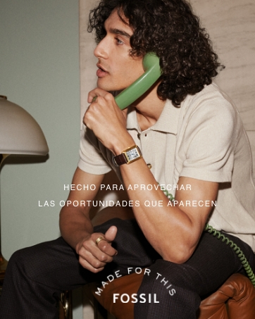
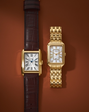
Creemos que la mejor aventura de todas es el camino hacia el autodescubrimiento. Y es nuestra misión crear accesorios distintivos elaborados a la perfección que estarán contigo en cada etapa de tu trayecto. A día de hoy continuamos centrándonos en lo que nos hace ser quienes somos: el optimismo, la autenticidad y, por supuesto, nuestro espíritu creativo. Todo lo que hacemos complementa cualquier estilo y se adapta a todos los estilos de vida.


En BiTech, ofrecemos , 30 días de Devolución GRATUITA, para que puedas comprar con total tranquilidad. Si no estás satisfecho te devolvemos el dinero. A parte, tienes 3 años de garantía.
Más información
Este smartwatch Falster Gen 6 con pantalla táctil de 41 mm es perfecto para aquellos que buscan estilo y funcionalidad. Con una elegante correa de malla de acero inoxidable en tono oro rosa, este reloj inteligente se adapta a cualquier ocasión. Además, es compatible tanto con teléfonos iPhone como con Android, gracias a la tecnología Wear OS by Google.
Wear OS by Google es compatible con los teléfonos más recientes que utilizan iOS o Android (excepto aquellos que utilizan la edición Go o no tienen Google Play Store). Ten en cuenta que las funciones disponibles pueden variar según la plataforma y el país, y la compatibilidad está sujeta a cambios.
En Bitech, tu tienda de tecnología de confianza, te ofrecemos este smartwatch Falster Gen 6 con todas sus características y garantías. Además, al comprar en bitech.es, te aseguras de obtener un producto de calidad y un excelente servicio al cliente. ¡No esperes más y adquiere este increíble smartwatch ahora mismo!
Creemos que la mejor aventura de todas es el camino hacia el autodescubrimiento. Y es nuestra misión crear accesorios distintivos elaborados a la perfección que estarán contigo en cada etapa de tu trayecto. A día de hoy continuamos centrándonos en lo que nos hace ser quienes somos: el optimismo, la autenticidad y, por supuesto, nuestro espíritu creativo. Todo lo que hacemos complementa cualquier estilo y se adapta a todos los estilos de vida.