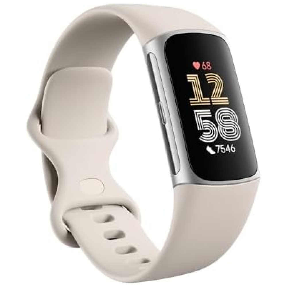
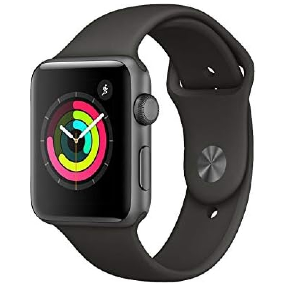
En Bitech, nuestra misión es acompañarte en cada etapa de tu trayecto hacia el autodescubrimiento. Por eso, creamos accesorios distintivos elaborados a la perfección que se adaptan a tu estilo de vida. Nuestro enfoque se basa en el optimismo, la autenticidad y nuestro espíritu creativo.
Nuestros productos están diseñados para complementar cualquier estilo y están fabricados con los mejores materiales. Además, en Bitech nos aseguramos de ofrecerte la mejor calidad y rendimiento.
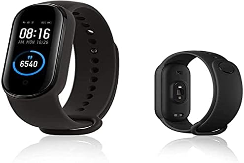
Nuestro reloj cuenta con una batería de Litio Ion incluida, para que puedas disfrutarlo desde el primer momento. Su tamaño compacto de 9,6 x 8,8 x 8,3 cm y su peso de 320 gramos lo hacen perfecto para llevarlo contigo a donde quiera que vayas.
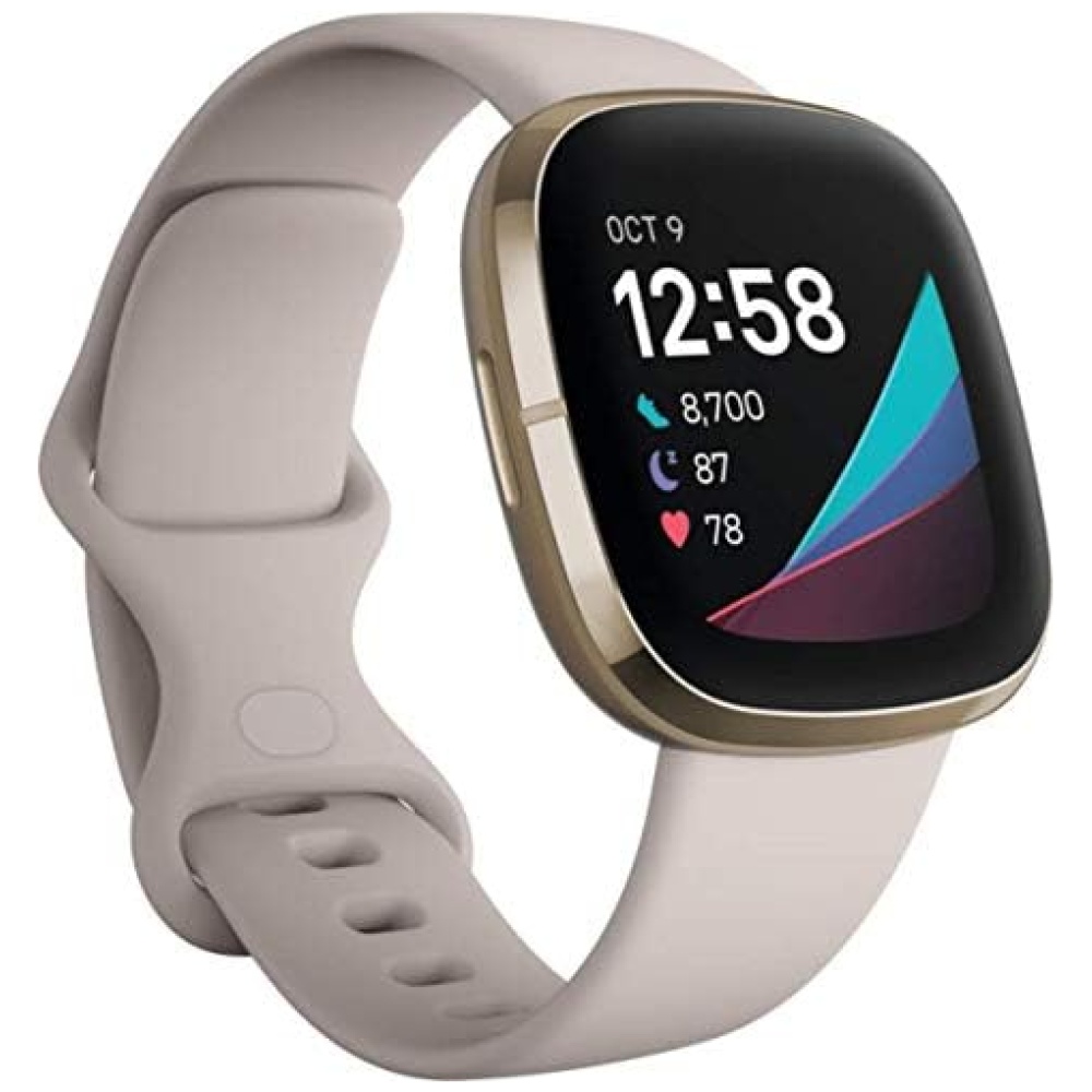
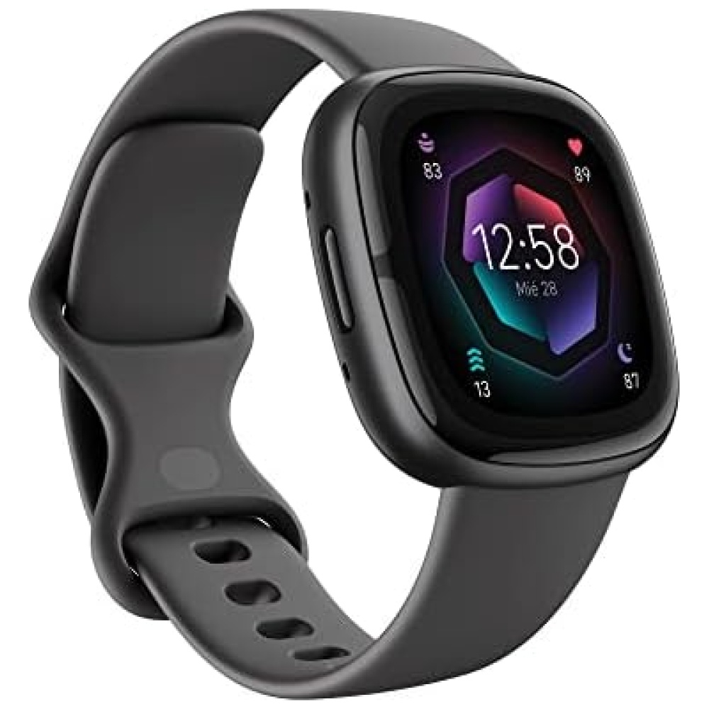
En Bitech, nos enorgullece ofrecerte productos de marcas reconocidas como Fossil. Este reloj en particular tiene el número de modelo FTW7070 y está disponible en nuestra tienda online.
No importa si eres hombre o mujer, en Bitech tenemos opciones para todos los gustos. Descubre nuestra amplia selección de accesorios y encuentra el complemento perfecto para ti.
¡Visita nuestra tienda en línea en bitech.es y comienza tu aventura de autodescubrimiento con nosotros!


Creemos que la mejor aventura de todas es el camino hacia el autodescubrimiento. Y es nuestra misión crear accesorios distintivos elaborados a la perfección que estarán contigo en cada etapa de tu trayecto. A día de hoy continuamos centrándonos en lo que nos hace ser quienes somos: el optimismo, la autenticidad y, por supuesto, nuestro espíritu creativo. Todo lo que hacemos complementa cualquier estilo y se adapta a todos los estilos de vida.


En BiTech, ofrecemos , 30 días de Devolución GRATUITA, para que puedas comprar con total tranquilidad. Si no estás satisfecho te devolvemos el dinero. A parte, tienes 3 años de garantía.
Más información
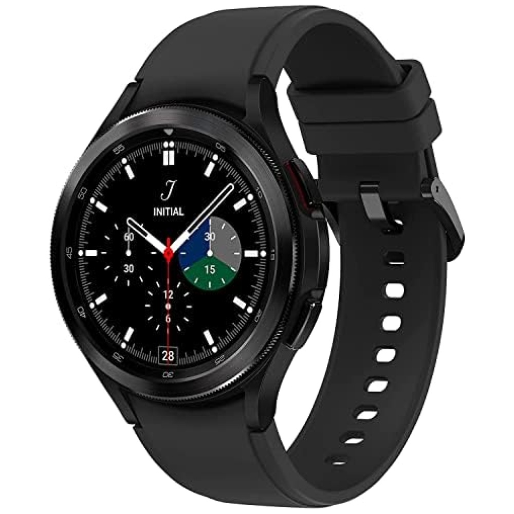
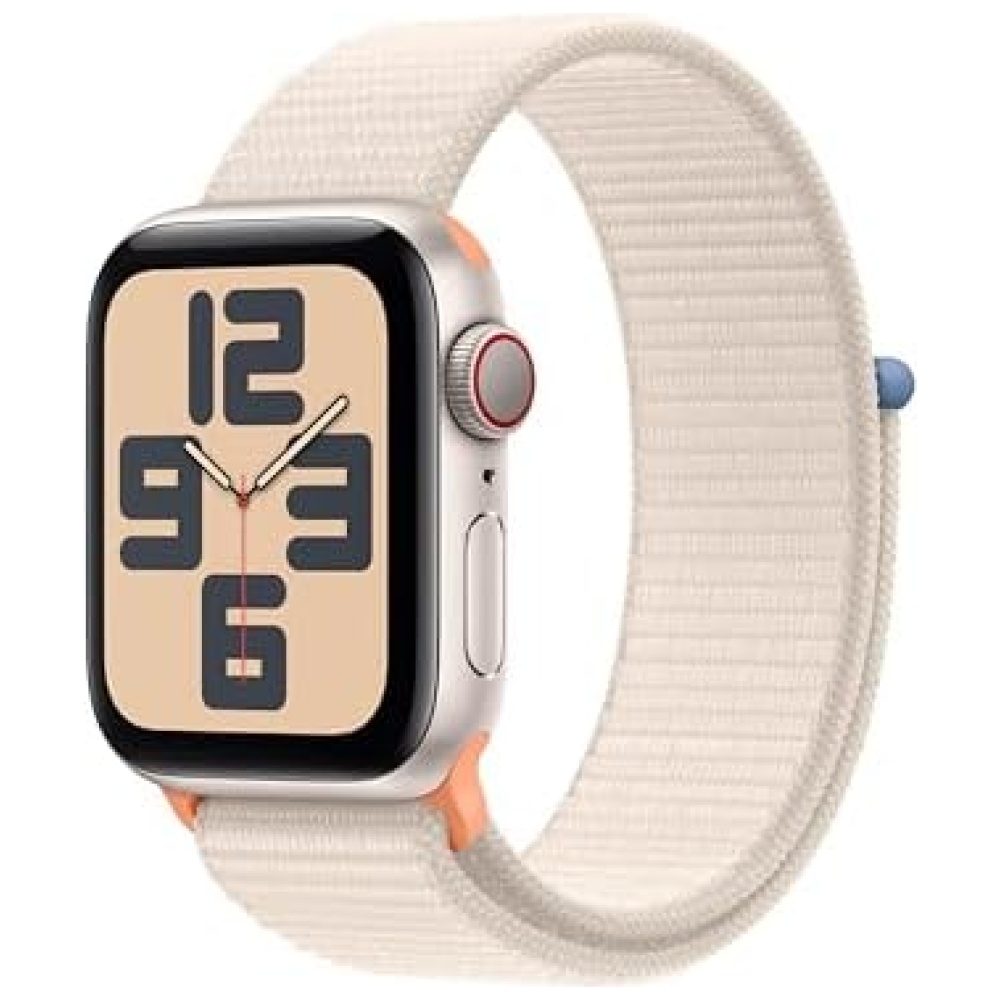
En Bitech, nuestra misión es acompañarte en cada etapa de tu trayecto hacia el autodescubrimiento. Por eso, creamos accesorios distintivos elaborados a la perfección que se adaptan a tu estilo de vida. Nuestro enfoque se basa en el optimismo, la autenticidad y nuestro espíritu creativo.
Nuestros productos están diseñados para complementar cualquier estilo y están fabricados con los mejores materiales. Además, en Bitech nos aseguramos de ofrecerte la mejor calidad y rendimiento.
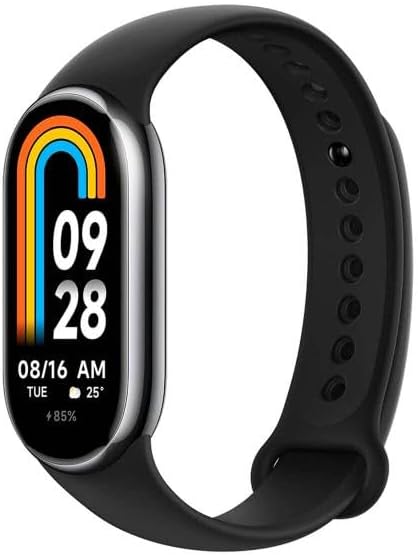
Nuestro reloj cuenta con una batería de Litio Ion incluida, para que puedas disfrutarlo desde el primer momento. Su tamaño compacto de 9,6 x 8,8 x 8,3 cm y su peso de 320 gramos lo hacen perfecto para llevarlo contigo a donde quiera que vayas.
En Bitech, nos enorgullece ofrecerte productos de marcas reconocidas como Fossil. Este reloj en particular tiene el número de modelo FTW7070 y está disponible en nuestra tienda online.
No importa si eres hombre o mujer, en Bitech tenemos opciones para todos los gustos. Descubre nuestra amplia selección de accesorios y encuentra el complemento perfecto para ti.
¡Visita nuestra tienda en línea en bitech.es y comienza tu aventura de autodescubrimiento con nosotros!
Creemos que la mejor aventura de todas es el camino hacia el autodescubrimiento. Y es nuestra misión crear accesorios distintivos elaborados a la perfección que estarán contigo en cada etapa de tu trayecto. A día de hoy continuamos centrándonos en lo que nos hace ser quienes somos: el optimismo, la autenticidad y, por supuesto, nuestro espíritu creativo. Todo lo que hacemos complementa cualquier estilo y se adapta a todos los estilos de vida.