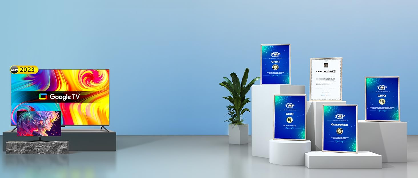
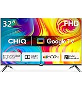
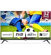
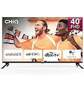
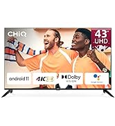
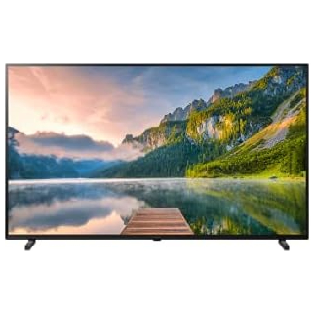
¡Descubre la increíble Android TV serie H7A en Bitech! Disfruta del entretenimiento a pantalla completa en casa con esta impresionante televisión. Con una resolución de 4K UHD, obtendrás detalles nítidos y una experiencia visual realista. Además, el sistema operativo Android 11 te brinda un funcionamiento simple y fluido.
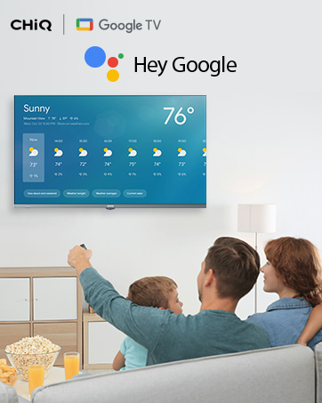
Con el mando a distancia Bluetooth, podrás acceder al Asistente de Google y controlar tu TV de forma fácil y rápida. Además, CHiQ se ha asociado con Dolby Professional para ofrecerte un sonido potente y claro.
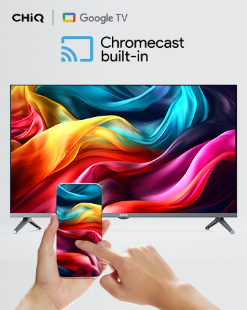
Esta TV cuenta con características increíbles, como compartir pantalla, un diseño sin marcos y la posibilidad de hablar con el Asistente de Google. Además, podrás disfrutar de un cine en casa con la resolución UHD y el sistema HDR 10. También incluye aplicaciones populares como Google Store, Prime Video, Netflix, YouTube y más.
En Bitech, nos preocupamos por tu satisfacción. Si tienes algún problema post-venta o necesitas ayuda con la garantía, no dudes en contactarnos. Estaremos encantados de ayudarte. ¡No esperes más y adquiere esta increíble Android TV serie H7A en bitech.es!


En BiTech, ofrecemos , 30 días de Devolución GRATUITA, para que puedas comprar con total tranquilidad. Si no estás satisfecho te devolvemos el dinero. A parte, tienes 3 años de garantía.
Más información
¡Descubre la increíble Android TV serie H7A en Bitech! Disfruta del entretenimiento a pantalla completa en casa con esta impresionante televisión. Con una resolución de 4K UHD, obtendrás detalles nítidos y una experiencia visual realista. Además, el sistema operativo Android 11 te brinda un funcionamiento simple y fluido.
Con el mando a distancia Bluetooth, podrás acceder al Asistente de Google y controlar tu TV de forma fácil y rápida. Además, CHiQ se ha asociado con Dolby Professional para ofrecerte un sonido potente y claro.
Esta TV cuenta con características increíbles, como compartir pantalla, un diseño sin marcos y la posibilidad de hablar con el Asistente de Google. Además, podrás disfrutar de un cine en casa con la resolución UHD y el sistema HDR 10. También incluye aplicaciones populares como Google Store, Prime Video, Netflix, YouTube y más.
En Bitech, nos preocupamos por tu satisfacción. Si tienes algún problema post-venta o necesitas ayuda con la garantía, no dudes en contactarnos. Estaremos encantados de ayudarte. ¡No esperes más y adquiere esta increíble Android TV serie H7A en bitech.es!