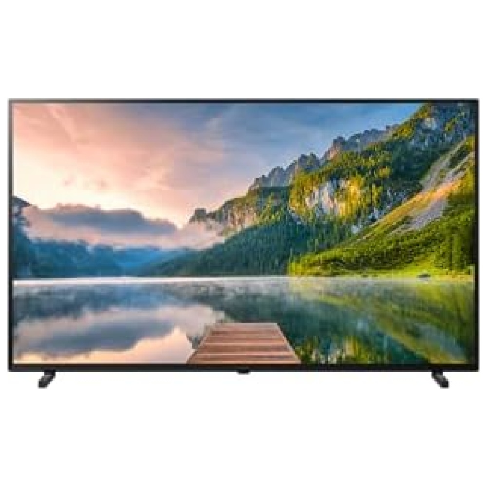
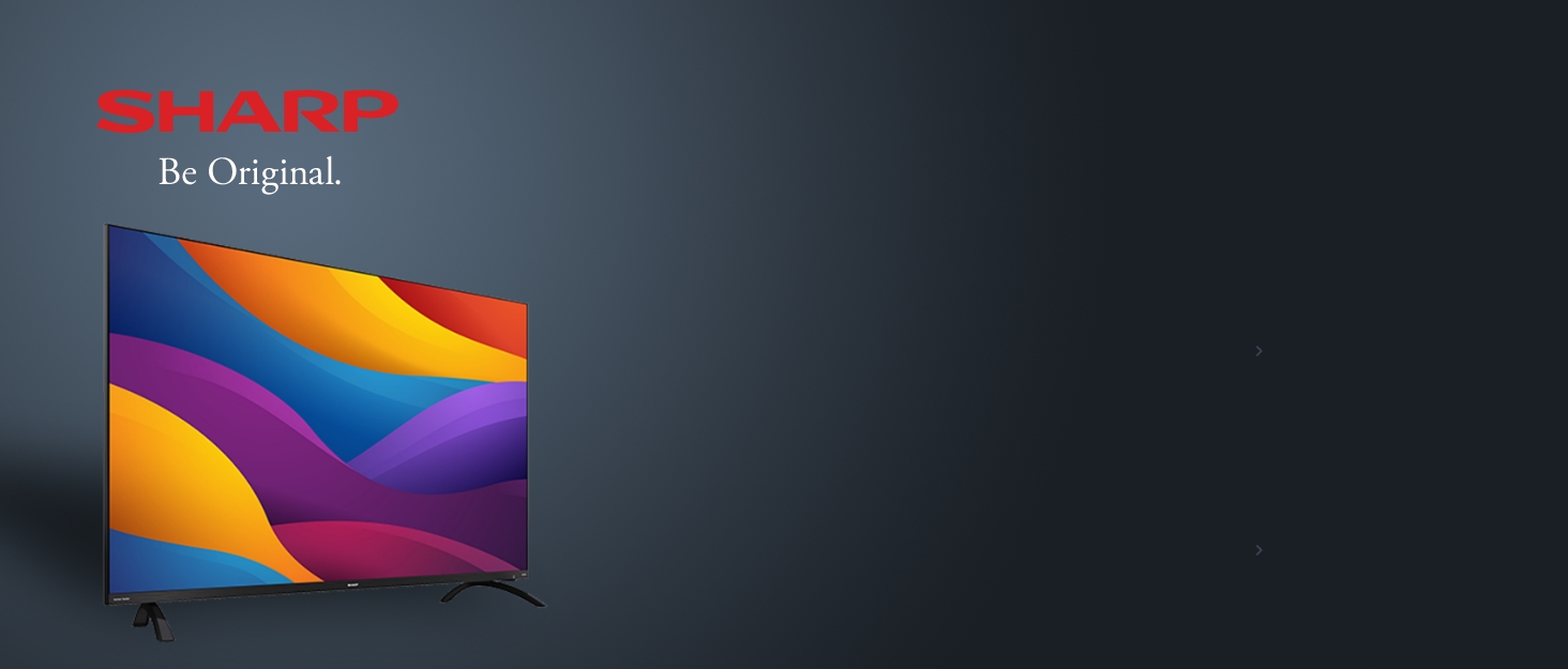
¡Descubre el increíble SHARP EQ3EA en Bitech.es! Este televisor sin marco combina un rendimiento excepcional con un diseño elegante. Con Quantum Dot y Dolby Vision, disfrutarás de imágenes impresionantes en 4K, mientras que el sistema de sonido Harman/Kardon con Dolby Atmos te sumergirá en un sonido envolvente.
Experimenta colores fascinantes y realistas con la tecnología Quantum Color. Además, el brillo alto de 450-500 nits garantiza una reproducción HDR impresionante. Con Dolby Vision, cada imagen se representa de manera óptima, y gracias a Aquos Motion, disfrutarás de movimientos fluidos en escenas rápidas. El sensor de luz ajusta dinámicamente el brillo según las condiciones de iluminación.
El sonido perfecto está asegurado con el sistema de audio bidireccional de Harman/Kardon, que ofrece diálogos nítidos y graves profundos. Además, Dolby Atmos y DTS:X proporcionan un sonido envolvente 3D para una experiencia televisiva inmersiva.
El diseño sin marco de aluminio de alta calidad se integra perfectamente en cualquier ambiente, y con las 4 puertas HDMI 2.1 y el bajo retardo de entrada, este televisor es perfecto para los amantes de los videojuegos. Además, con el soporte de Google Stadia, podrás disfrutar de una increíble plataforma de juegos en tu televisor.
En resumen, el SHARP EQ3EA en Bitech.es ofrece un rendimiento excepcional, un diseño elegante y todas las características que necesitas para disfrutar de una experiencia de visualización y sonido de alta calidad. ¡No te lo pierdas!

En SHARP, estamos aquí para nuestros clientes. Nuestro trabajo tiene que ver con usted: sus necesidades, deseos e ideas.
Ya sea para su hogar o para la empresa, le ofrecemos las soluciones que está buscando. Las personas tienen metas, visiones e ideas.
SHARP tiene los productos y servicios para hacerlo realidad. SHARP es único. Tú eres único. 'Be Original.'


En BiTech, ofrecemos , 30 días de Devolución GRATUITA, para que puedas comprar con total tranquilidad. Si no estás satisfecho te devolvemos el dinero. A parte, tienes 3 años de garantía.
Más información
¡Descubre el increíble SHARP EQ3EA en Bitech.es! Este televisor sin marco combina un rendimiento excepcional con un diseño elegante. Con Quantum Dot y Dolby Vision, disfrutarás de imágenes impresionantes en 4K, mientras que el sistema de sonido Harman/Kardon con Dolby Atmos te sumergirá en un sonido envolvente.
Experimenta colores fascinantes y realistas con la tecnología Quantum Color. Además, el brillo alto de 450-500 nits garantiza una reproducción HDR impresionante. Con Dolby Vision, cada imagen se representa de manera óptima, y gracias a Aquos Motion, disfrutarás de movimientos fluidos en escenas rápidas. El sensor de luz ajusta dinámicamente el brillo según las condiciones de iluminación.
El sonido perfecto está asegurado con el sistema de audio bidireccional de Harman/Kardon, que ofrece diálogos nítidos y graves profundos. Además, Dolby Atmos y DTS:X proporcionan un sonido envolvente 3D para una experiencia televisiva inmersiva.
El diseño sin marco de aluminio de alta calidad se integra perfectamente en cualquier ambiente, y con las 4 puertas HDMI 2.1 y el bajo retardo de entrada, este televisor es perfecto para los amantes de los videojuegos. Además, con el soporte de Google Stadia, podrás disfrutar de una increíble plataforma de juegos en tu televisor.
En resumen, el SHARP EQ3EA en Bitech.es ofrece un rendimiento excepcional, un diseño elegante y todas las características que necesitas para disfrutar de una experiencia de visualización y sonido de alta calidad. ¡No te lo pierdas!
En SHARP, estamos aquí para nuestros clientes. Nuestro trabajo tiene que ver con usted: sus necesidades, deseos e ideas.
Ya sea para su hogar o para la empresa, le ofrecemos las soluciones que está buscando. Las personas tienen metas, visiones e ideas.
SHARP tiene los productos y servicios para hacerlo realidad. SHARP es único. Tú eres único. 'Be Original.'