


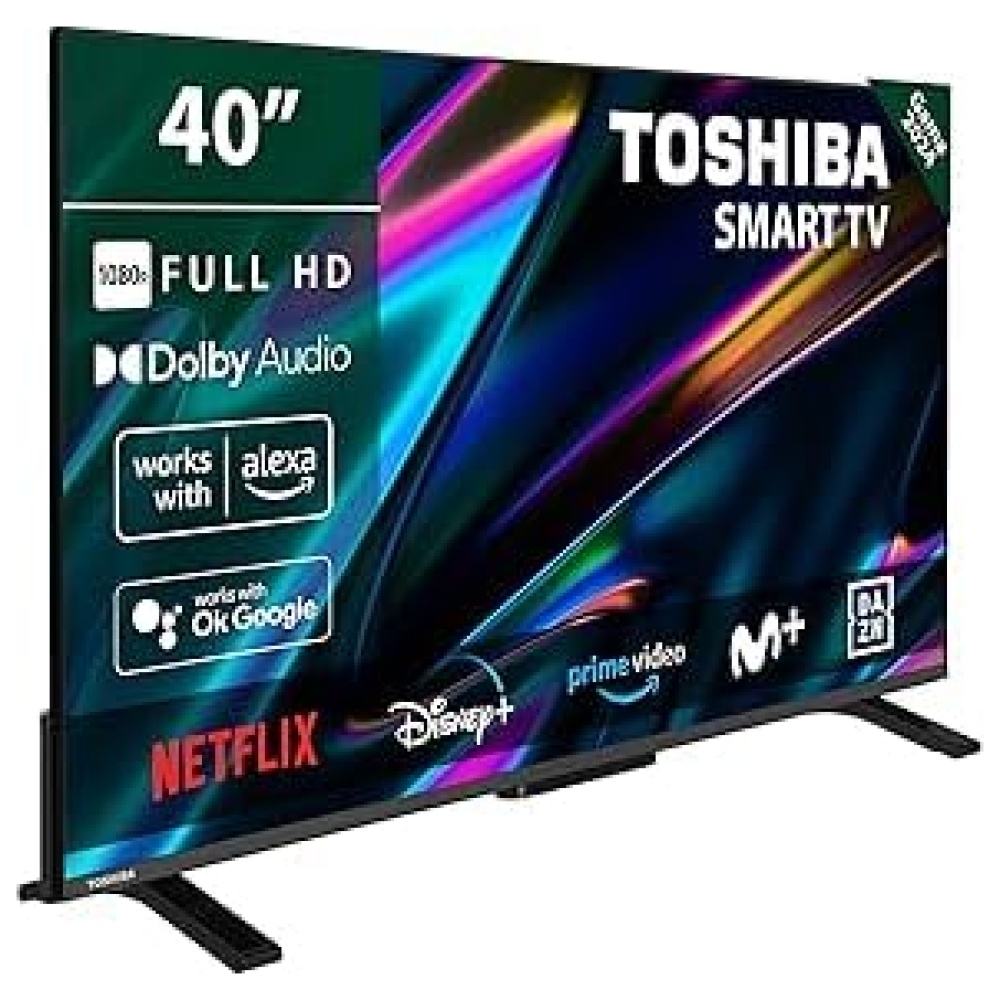
En Bitech, te ofrecemos el increíble TCL Fire TV. Con este televisor, podrás disfrutar de un entretenimiento ilimitado en miles de aplicaciones y canales como Netflix, Prime Video, YouTube, Disney+ y muchos más. Explora un mundo lleno de diversión y entretenimiento.
Además, este TCL Fire TV es compatible con diferentes formatos HDR, como HDR10, HDR10+, HDR HLG y Dobly Vision, para que puedas disfrutar de la mejor calidad de imagen. Gracias a la tecnología Quantum Dot, este televisor ofrece colores excepcionales y cinematográficos compuestos por más de mil millones de colores y matices.
No solo eso, también cuenta con la tecnología 4K HDR PRO, que proporciona una experiencia de alto rango dinámico con un gran contraste, detalles en las sombras y colores vivos y precisos. ¡Te sentirás como si estuvieras dentro de la escena!
Y no podemos olvidar mencionar que este televisor viene con Alexa, para que puedas controlarlo fácilmente con tu voz. Cambia de canal, ajusta el volumen, abre aplicaciones y mucho más. También puedes controlar otros dispositivos inteligentes compatibles en tu hogar.
Si eres un amante de los videojuegos, el TCL CF630 Fire TV es perfecto para ti. Con HDMI 2.1 y ALLM, disfrutarás de la menor latencia y la mejor experiencia de juego.
Y para una experiencia de sonido envolvente, este televisor cuenta con Dolby Vision y Dolby Atmos, que te transportarán a otra dimensión de entretenimiento.
En resumen, el TCL Fire TV de Bitech es el televisor perfecto para disfrutar de un entretenimiento ilimitado, colores excepcionales, calidad de imagen superior, juegos emocionantes y un sonido envolvente. ¡No esperes más y visita bitech.es para adquirirlo!


En BiTech, ofrecemos , 30 días de Devolución GRATUITA, para que puedas comprar con total tranquilidad. Si no estás satisfecho te devolvemos el dinero. A parte, tienes 3 años de garantía.
Más información
En Bitech, te ofrecemos el increíble TCL Fire TV. Con este televisor, podrás disfrutar de un entretenimiento ilimitado en miles de aplicaciones y canales como Netflix, Prime Video, YouTube, Disney+ y muchos más. Explora un mundo lleno de diversión y entretenimiento.
Además, este TCL Fire TV es compatible con diferentes formatos HDR, como HDR10, HDR10+, HDR HLG y Dobly Vision, para que puedas disfrutar de la mejor calidad de imagen. Gracias a la tecnología Quantum Dot, este televisor ofrece colores excepcionales y cinematográficos compuestos por más de mil millones de colores y matices.
No solo eso, también cuenta con la tecnología 4K HDR PRO, que proporciona una experiencia de alto rango dinámico con un gran contraste, detalles en las sombras y colores vivos y precisos. ¡Te sentirás como si estuvieras dentro de la escena!
Y no podemos olvidar mencionar que este televisor viene con Alexa, para que puedas controlarlo fácilmente con tu voz. Cambia de canal, ajusta el volumen, abre aplicaciones y mucho más. También puedes controlar otros dispositivos inteligentes compatibles en tu hogar.
Si eres un amante de los videojuegos, el TCL CF630 Fire TV es perfecto para ti. Con HDMI 2.1 y ALLM, disfrutarás de la menor latencia y la mejor experiencia de juego.
Y para una experiencia de sonido envolvente, este televisor cuenta con Dolby Vision y Dolby Atmos, que te transportarán a otra dimensión de entretenimiento.
En resumen, el TCL Fire TV de Bitech es el televisor perfecto para disfrutar de un entretenimiento ilimitado, colores excepcionales, calidad de imagen superior, juegos emocionantes y un sonido envolvente. ¡No esperes más y visita bitech.es para adquirirlo!