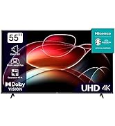
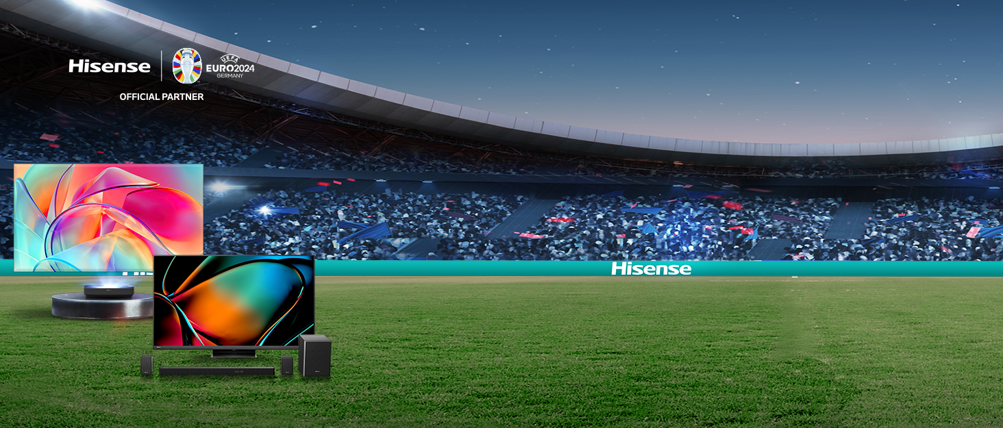
¡Descubre el televisor Hisense 65U7KQ en Bitech.es! Con tecnología Quantum Dot Colour, este televisor ofrece colores brillantes y precisos que te sorprenderán. Gracias a los puntos cuánticos, podrás disfrutar de una amplia gama de colores con un brillo impresionante.
Además, el modo Game Mode de 144Hz garantiza una experiencia de juego fluida y competitiva. La frecuencia de actualización variable y el modo de baja latencia aseguran que no te pierdas ningún detalle en pantalla.
Con el Full Array Local Dimming, los LED independientes en la parte trasera del panel permiten un control preciso del brillo y el contraste. Esto se traduce en colores vivos, negros profundos y una experiencia visual envolvente.
El procesador Hi-View Engine de Hisense optimiza constantemente tu experiencia de visionado. Con análisis en tiempo real, convierte contenido a 4K y mejora el color para que incluso los vídeos de menor calidad se vean mejor que nunca.
Y no podemos olvidar el Dolby Vision IQ y Dolby Atmos, que ofrecen una calidad de imagen y sonido excepcionales. Disfruta de vídeos de mayor resolución, colores brillantes y efectos de iluminación impresionantes, acompañados de un sonido envolvente de alta calidad.
No esperes más y adquiere el televisor Hisense 65U7KQ en Bitech.es para vivir una experiencia audiovisual única. ¡Te esperamos en nuestra tienda de tecnología!

Calidad e Innovación para tu Hogar


En BiTech, ofrecemos , 30 días de Devolución GRATUITA, para que puedas comprar con total tranquilidad. Si no estás satisfecho te devolvemos el dinero. A parte, tienes 3 años de garantía.
Más información
¡Descubre el televisor Hisense 65U7KQ en Bitech.es! Con tecnología Quantum Dot Colour, este televisor ofrece colores brillantes y precisos que te sorprenderán. Gracias a los puntos cuánticos, podrás disfrutar de una amplia gama de colores con un brillo impresionante.
Además, el modo Game Mode de 144Hz garantiza una experiencia de juego fluida y competitiva. La frecuencia de actualización variable y el modo de baja latencia aseguran que no te pierdas ningún detalle en pantalla.
Con el Full Array Local Dimming, los LED independientes en la parte trasera del panel permiten un control preciso del brillo y el contraste. Esto se traduce en colores vivos, negros profundos y una experiencia visual envolvente.
El procesador Hi-View Engine de Hisense optimiza constantemente tu experiencia de visionado. Con análisis en tiempo real, convierte contenido a 4K y mejora el color para que incluso los vídeos de menor calidad se vean mejor que nunca.
Y no podemos olvidar el Dolby Vision IQ y Dolby Atmos, que ofrecen una calidad de imagen y sonido excepcionales. Disfruta de vídeos de mayor resolución, colores brillantes y efectos de iluminación impresionantes, acompañados de un sonido envolvente de alta calidad.
No esperes más y adquiere el televisor Hisense 65U7KQ en Bitech.es para vivir una experiencia audiovisual única. ¡Te esperamos en nuestra tienda de tecnología!
Calidad e Innovación para tu Hogar