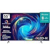
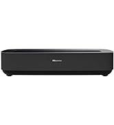
¡Descubre el increíble televisor Hisense 55U6KQ en Bitech.es! Con tecnología Quantum Dot Colour, este televisor ofrece colores brillantes y precisos que te dejarán impresionado. Gracias a su Full Array Local Dimming, disfrutarás de colores vivos y negros profundos en todo el campo de visión. Además, con Dolby Vision y Dolby Atmos, experimentarás un entretenimiento espectacular con detalles perfectos y sonido envolvente.
Pero eso no es todo, este televisor también es compatible con Airplay, lo que te permite reproducir contenido desde tu iPhone, iPad o Mac directamente en la pantalla grande. Y con el procesador Hi-View Engine de Hisense, disfrutarás de una experiencia de visionado óptima, incluso con vídeos de menor calidad.
No pierdas la oportunidad de tener este televisor de alta calidad en tu hogar. ¡Compra ahora en Bitech.es y disfruta de una experiencia visual increíble!


Calidad e Innovación para tu Hogar


En BiTech, ofrecemos , 30 días de Devolución GRATUITA, para que puedas comprar con total tranquilidad. Si no estás satisfecho te devolvemos el dinero. A parte, tienes 3 años de garantía.
Más información
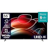
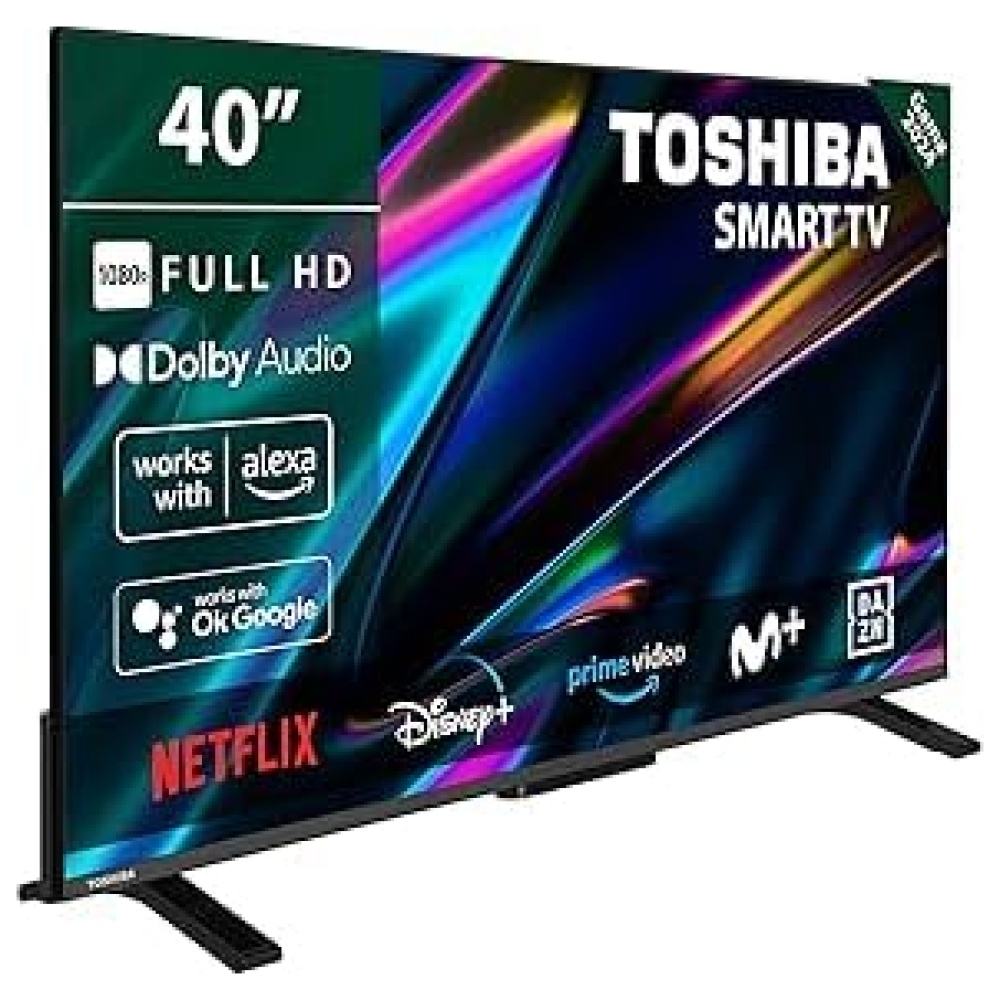
¡Descubre el increíble televisor Hisense 55U6KQ en Bitech.es! Con tecnología Quantum Dot Colour, este televisor ofrece colores brillantes y precisos que te dejarán impresionado. Gracias a su Full Array Local Dimming, disfrutarás de colores vivos y negros profundos en todo el campo de visión. Además, con Dolby Vision y Dolby Atmos, experimentarás un entretenimiento espectacular con detalles perfectos y sonido envolvente.
Pero eso no es todo, este televisor también es compatible con Airplay, lo que te permite reproducir contenido desde tu iPhone, iPad o Mac directamente en la pantalla grande. Y con el procesador Hi-View Engine de Hisense, disfrutarás de una experiencia de visionado óptima, incluso con vídeos de menor calidad.
No pierdas la oportunidad de tener este televisor de alta calidad en tu hogar. ¡Compra ahora en Bitech.es y disfruta de una experiencia visual increíble!
Calidad e Innovación para tu Hogar