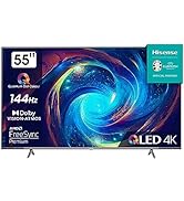
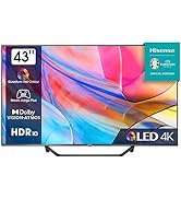
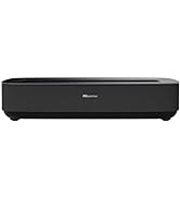
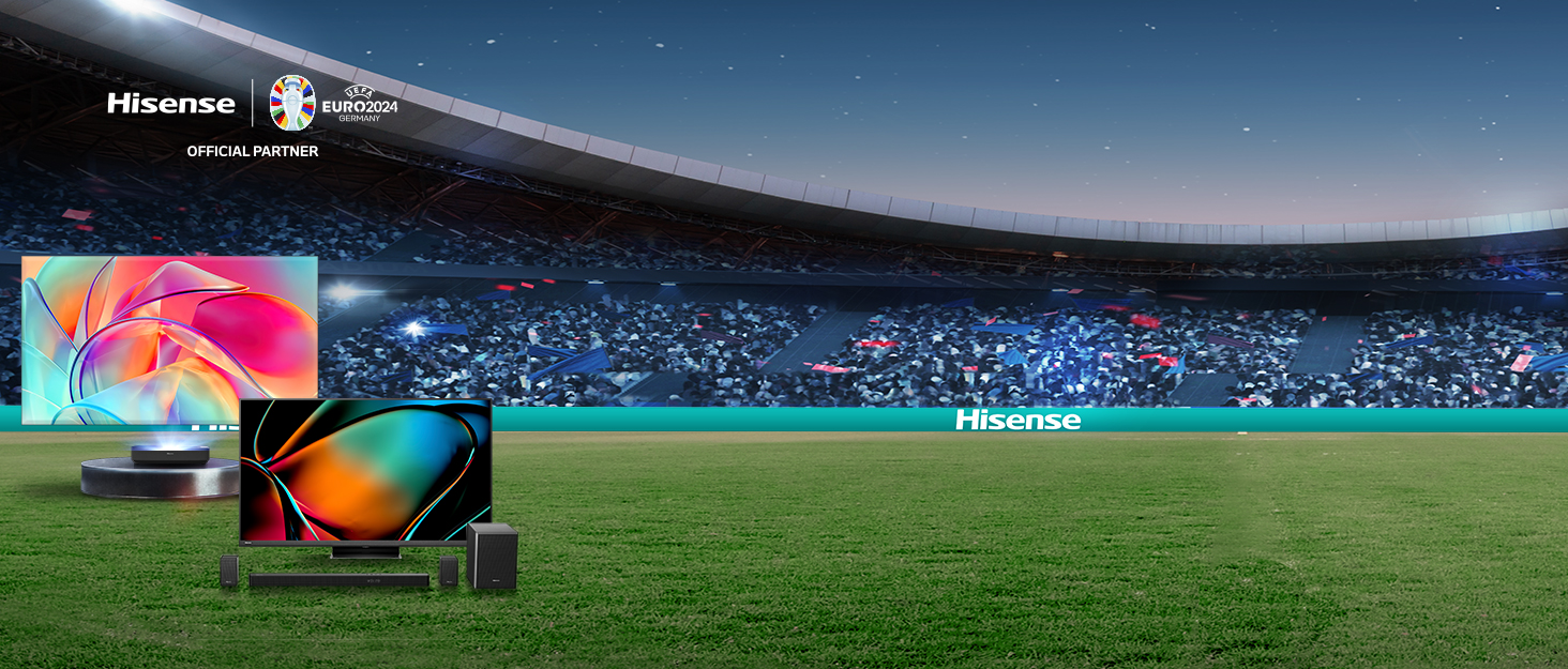
¡Descubre el increíble Hisense QLED Smart TV con Quantum Dot Colour, 60Hz VRR, Dolby Vision, Bluetooth y HDMI! Este televisor te ofrece una calidad de imagen impresionante, con colores vibrantes y negros profundos. Olvídate de preocuparte por la compatibilidad o la calidad de vídeo, ya que cuenta con la tecnología Dolby Vision que garantiza detalles perfectos y colores mejorados.
Además, disfruta de una experiencia de sonido envolvente con Dolby Atmos. Los directores y mezcladores de sonido utilizan esta tecnología avanzada para crear un entretenimiento espectacular, que podrás experimentar en tu televisor con Dolby Atmos.
Si eres un amante de los videojuegos, este televisor también es perfecto para ti. Con el Modo Juego PLUS, disfrutarás de una experiencia de juego fluida y relajada. El panel de 60 Hz, la frecuencia de actualización variable (VRR) y el modo automático de baja latencia (ALLM) se combinan para garantizar un rendimiento sin problemas y sin retrasos.
Además, este televisor es compatible con Apple AirPlay, por lo que podrás reproducir películas, música, juegos y fotos directamente desde tu iPhone, iPad o Mac. Y con el control por voz, podrás interactuar con tu televisor de forma natural, utilizando solo tu voz. Pausa, reproduce, detén, rebobina, avanza rápido y mucho más, todo con comandos de voz.
No pierdas la oportunidad de disfrutar de la mejor tecnología en tu hogar. ¡Compra ahora el Hisense QLED Smart TV en nuestra tienda online Bitech.es y vive una experiencia de entretenimiento única!

Calidad e Innovación para tu Hogar


En BiTech, ofrecemos , 30 días de Devolución GRATUITA, para que puedas comprar con total tranquilidad. Si no estás satisfecho te devolvemos el dinero. A parte, tienes 3 años de garantía.
Más información
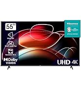
¡Descubre el increíble Hisense QLED Smart TV con Quantum Dot Colour, 60Hz VRR, Dolby Vision, Bluetooth y HDMI! Este televisor te ofrece una calidad de imagen impresionante, con colores vibrantes y negros profundos. Olvídate de preocuparte por la compatibilidad o la calidad de vídeo, ya que cuenta con la tecnología Dolby Vision que garantiza detalles perfectos y colores mejorados.
Además, disfruta de una experiencia de sonido envolvente con Dolby Atmos. Los directores y mezcladores de sonido utilizan esta tecnología avanzada para crear un entretenimiento espectacular, que podrás experimentar en tu televisor con Dolby Atmos.
Si eres un amante de los videojuegos, este televisor también es perfecto para ti. Con el Modo Juego PLUS, disfrutarás de una experiencia de juego fluida y relajada. El panel de 60 Hz, la frecuencia de actualización variable (VRR) y el modo automático de baja latencia (ALLM) se combinan para garantizar un rendimiento sin problemas y sin retrasos.
Además, este televisor es compatible con Apple AirPlay, por lo que podrás reproducir películas, música, juegos y fotos directamente desde tu iPhone, iPad o Mac. Y con el control por voz, podrás interactuar con tu televisor de forma natural, utilizando solo tu voz. Pausa, reproduce, detén, rebobina, avanza rápido y mucho más, todo con comandos de voz.
No pierdas la oportunidad de disfrutar de la mejor tecnología en tu hogar. ¡Compra ahora el Hisense QLED Smart TV en nuestra tienda online Bitech.es y vive una experiencia de entretenimiento única!
Calidad e Innovación para tu Hogar