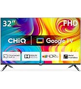
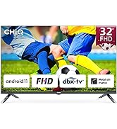
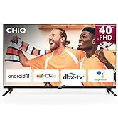
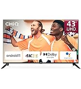
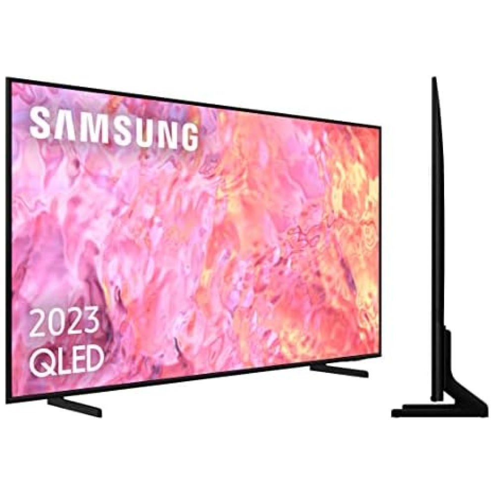
¡Descubre el CHiQ Smart TV en Bitech.es! Este televisor inteligente es perfecto para disfrutar de tus contenidos favoritos con una calidad de imagen y sonido excepcionales. Con una resolución FHD y tecnologías de decodificación dbx-tv y Dolby Audio, experimentarás una imagen más nítida y un sonido envolvente.
Además, el diseño de marco metálico convierte este televisor en una verdadera obra de arte. Su diseño sin marco y su avanzada técnica de fabricación le dan un aspecto elegante y moderno. ¡Los detalles marcan la diferencia!
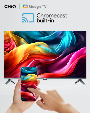
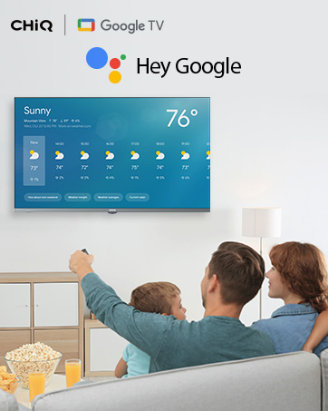
Con el CHiQ Smart TV, acceder a tus contenidos favoritos es más fácil que nunca. Disfruta de una experiencia de TV que agrega películas y programas, y transmite fácilmente desde tu teléfono o tableta directamente al televisor. Además, podrás utilizar el mando a distancia por voz para buscar películas, transmitir aplicaciones y mucho más.
Este televisor inteligente cuenta con potente hardware que garantiza una experiencia fluida, y su Wi-Fi de doble banda te permite disfrutar de una conexión más rápida. Con múltiples interfaces, podrás conectar todos tus dispositivos sin problemas.
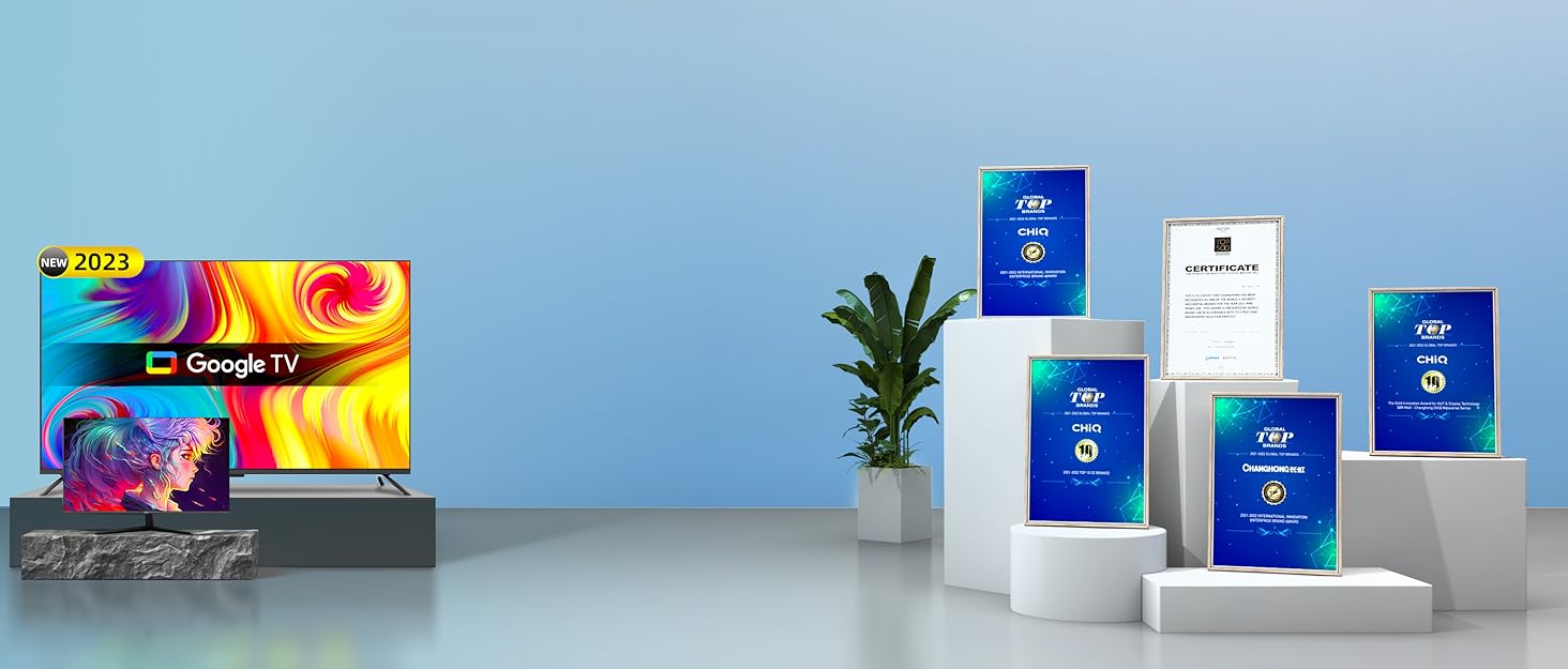
En Bitech.es, encontrarás el CHiQ Smart TV en diferentes tamaños, desde 32" hasta 50". Además, cuenta con sistema operativo Google TV y Android 11, ofreciéndote una amplia variedad de aplicaciones y funciones.
No esperes más y aprovecha esta oferta exclusiva en Bitech.es. ¡El CHiQ Smart TV es la elección perfecta para disfrutar de tus contenidos favoritos con la mejor calidad de imagen y sonido! Además, con la garantía de 2 años de CHiQ, tendrás la tranquilidad de estar adquiriendo un producto de calidad. ¡Compra ahora en Bitech.es y disfruta de la mejor tecnología en tu hogar!


En BiTech, ofrecemos , 30 días de Devolución GRATUITA, para que puedas comprar con total tranquilidad. Si no estás satisfecho te devolvemos el dinero. A parte, tienes 3 años de garantía.
Más información
¡Descubre el CHiQ Smart TV en Bitech.es! Este televisor inteligente es perfecto para disfrutar de tus contenidos favoritos con una calidad de imagen y sonido excepcionales. Con una resolución FHD y tecnologías de decodificación dbx-tv y Dolby Audio, experimentarás una imagen más nítida y un sonido envolvente.
Además, el diseño de marco metálico convierte este televisor en una verdadera obra de arte. Su diseño sin marco y su avanzada técnica de fabricación le dan un aspecto elegante y moderno. ¡Los detalles marcan la diferencia!
Con el CHiQ Smart TV, acceder a tus contenidos favoritos es más fácil que nunca. Disfruta de una experiencia de TV que agrega películas y programas, y transmite fácilmente desde tu teléfono o tableta directamente al televisor. Además, podrás utilizar el mando a distancia por voz para buscar películas, transmitir aplicaciones y mucho más.
Este televisor inteligente cuenta con potente hardware que garantiza una experiencia fluida, y su Wi-Fi de doble banda te permite disfrutar de una conexión más rápida. Con múltiples interfaces, podrás conectar todos tus dispositivos sin problemas.
En Bitech.es, encontrarás el CHiQ Smart TV en diferentes tamaños, desde 32" hasta 50". Además, cuenta con sistema operativo Google TV y Android 11, ofreciéndote una amplia variedad de aplicaciones y funciones.
No esperes más y aprovecha esta oferta exclusiva en Bitech.es. ¡El CHiQ Smart TV es la elección perfecta para disfrutar de tus contenidos favoritos con la mejor calidad de imagen y sonido! Además, con la garantía de 2 años de CHiQ, tendrás la tranquilidad de estar adquiriendo un producto de calidad. ¡Compra ahora en Bitech.es y disfruta de la mejor tecnología en tu hogar!