, Android 11, Frameless, Netflix,")


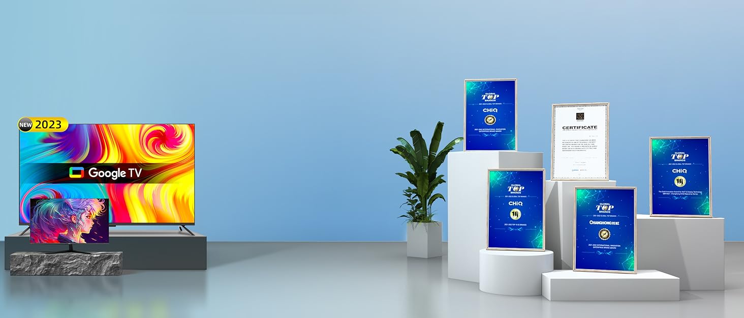
¡Descubre el CHiQ HD 32 Pulgadas Android TV SERIE G7L en Bitech! Este televisor cuenta con una increíble calidad de imagen gracias a su tecnología HDR10 y luces LED de iluminación directa. Las imágenes se ven nítidas y vívidas, ofreciendo una experiencia visual muy realista.
Además, el CHiQ TV está equipado con un sistema de sonido de alta calidad. Los ingenieros de audio de dbx-tv han optimizado el altavoz de cada TV utilizando un procesador digital de señales de audio (DSP), lo que garantiza una calidad de sonido óptima. Podrás disfrutar de un sonido envolvente y claro en todas tus películas y programas favoritos.
Este televisor también ofrece una conectividad excepcional. Con Wi-Fi de banda dual 2,4/5G, podrás disfrutar de una conexión estable y rápida. Además, gracias al Bluetooth 5.0, podrás conectar fácilmente dispositivos como ratones, teclados, altavoces o auriculares Bluetooth para una experiencia de música y juegos ilimitada.
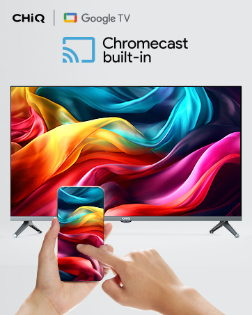
Y eso no es todo, el CHiQ TV viene con el Asistente de Google integrado. Con solo presionar el botón del Asistente de Google en el mando a distancia, podrás acceder rápidamente al entretenimiento, obtener respuestas en la pantalla, controlar dispositivos inteligentes y mucho más, todo utilizando tu voz.
No pierdas la oportunidad de disfrutar de todas estas increíbles características. ¡Compra el CHiQ HD 32 Pulgadas Android TV SERIE G7L en Bitech y lleva tu experiencia de entretenimiento al siguiente nivel!


En BiTech, ofrecemos , 30 días de Devolución GRATUITA, para que puedas comprar con total tranquilidad. Si no estás satisfecho te devolvemos el dinero. A parte, tienes 3 años de garantía.
Más información
¡Descubre el CHiQ HD 32 Pulgadas Android TV SERIE G7L en Bitech! Este televisor cuenta con una increíble calidad de imagen gracias a su tecnología HDR10 y luces LED de iluminación directa. Las imágenes se ven nítidas y vívidas, ofreciendo una experiencia visual muy realista.
Además, el CHiQ TV está equipado con un sistema de sonido de alta calidad. Los ingenieros de audio de dbx-tv han optimizado el altavoz de cada TV utilizando un procesador digital de señales de audio (DSP), lo que garantiza una calidad de sonido óptima. Podrás disfrutar de un sonido envolvente y claro en todas tus películas y programas favoritos.
Este televisor también ofrece una conectividad excepcional. Con Wi-Fi de banda dual 2,4/5G, podrás disfrutar de una conexión estable y rápida. Además, gracias al Bluetooth 5.0, podrás conectar fácilmente dispositivos como ratones, teclados, altavoces o auriculares Bluetooth para una experiencia de música y juegos ilimitada.
Y eso no es todo, el CHiQ TV viene con el Asistente de Google integrado. Con solo presionar el botón del Asistente de Google en el mando a distancia, podrás acceder rápidamente al entretenimiento, obtener respuestas en la pantalla, controlar dispositivos inteligentes y mucho más, todo utilizando tu voz.
No pierdas la oportunidad de disfrutar de todas estas increíbles características. ¡Compra el CHiQ HD 32 Pulgadas Android TV SERIE G7L en Bitech y lleva tu experiencia de entretenimiento al siguiente nivel!