SAMSUNG A54 5G LIGHT GREEN / 8+256GB / 6.4" AMOLED 120HZ FULL HD+
Pilas: 1 Polímero de litio (Tipo de pila necesaria)
Descatalogado por el fabricante: No
Fabricante: Samsung
ASIN: B0BYMQPLCD
Número de modelo del producto: a54
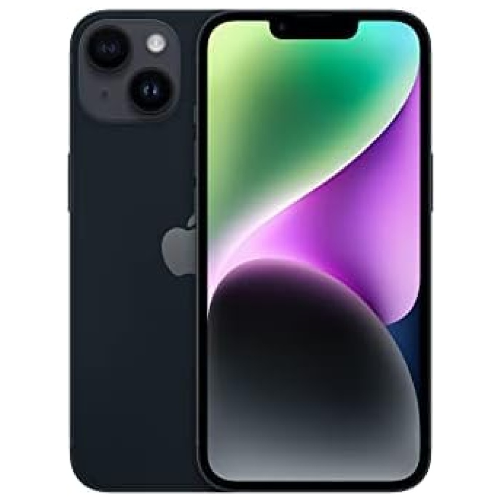
¡Echa un vistazo a este increíble producto de Samsung! El SAMSUNG A54 5G LIGHT GREEN es perfecto para aquellos que buscan un teléfono con todas las funciones. Con una pantalla AMOLED de 6.4" y una frecuencia de actualización de 120Hz, disfrutarás de una experiencia visual fluida y vibrante. Además, cuenta con una gran capacidad de almacenamiento de 256GB para que puedas guardar todos tus archivos y aplicaciones sin preocuparte por el espacio. No te preocupes por la duración de la batería, ya que viene con una batería de polímero de litio de larga duración. ¡No te pierdas esta oferta exclusiva en nuestra tienda de tecnología, Bitech!


En BiTech, ofrecemos , 30 días de Devolución GRATUITA, para que puedas comprar con total tranquilidad. Si no estás satisfecho te devolvemos el dinero. A parte, tienes 3 años de garantía.
Más información
SAMSUNG A54 5G LIGHT GREEN / 8+256GB / 6.4" AMOLED 120HZ FULL HD+
Pilas: 1 Polímero de litio (Tipo de pila necesaria)
Descatalogado por el fabricante: No
Fabricante: Samsung
ASIN: B0BYMQPLCD
Número de modelo del producto: a54
¡Echa un vistazo a este increíble producto de Samsung! El SAMSUNG A54 5G LIGHT GREEN es perfecto para aquellos que buscan un teléfono con todas las funciones. Con una pantalla AMOLED de 6.4" y una frecuencia de actualización de 120Hz, disfrutarás de una experiencia visual fluida y vibrante. Además, cuenta con una gran capacidad de almacenamiento de 256GB para que puedas guardar todos tus archivos y aplicaciones sin preocuparte por el espacio. No te preocupes por la duración de la batería, ya que viene con una batería de polímero de litio de larga duración. ¡No te pierdas esta oferta exclusiva en nuestra tienda de tecnología, Bitech!