")


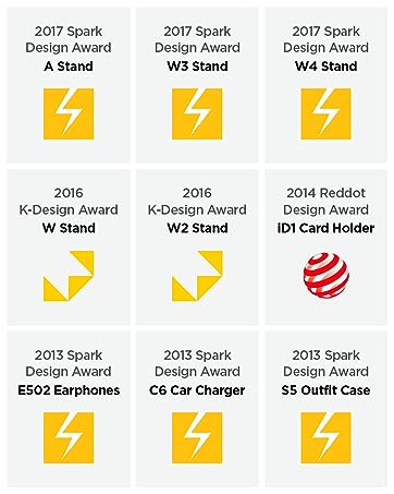
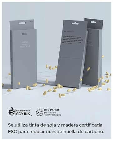
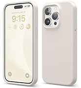
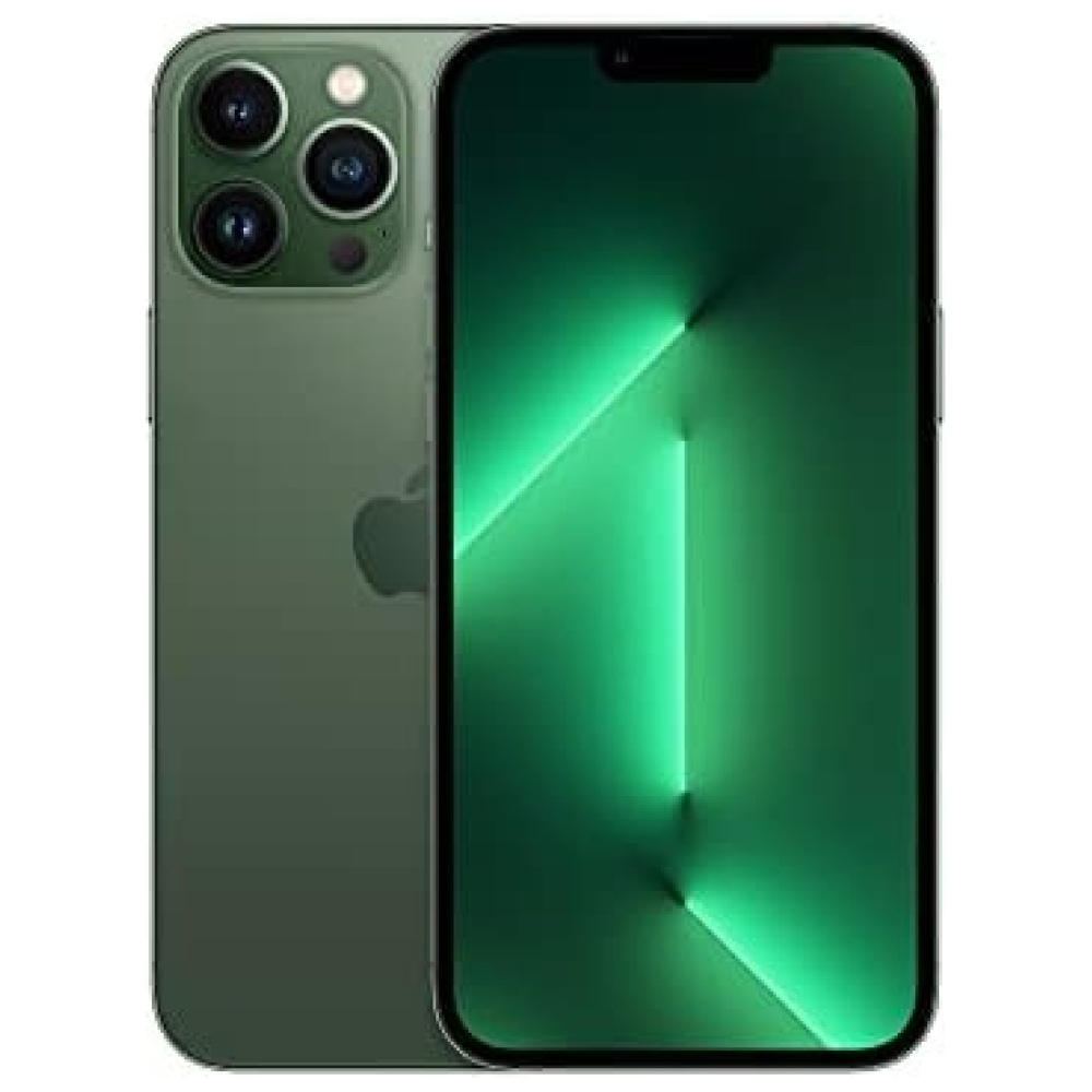
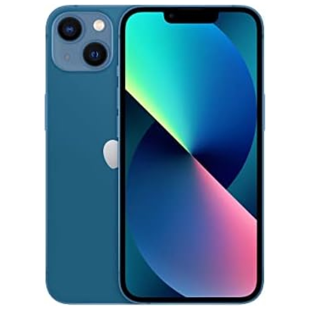
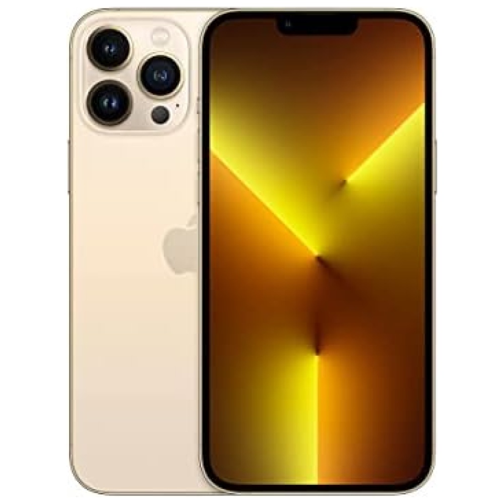
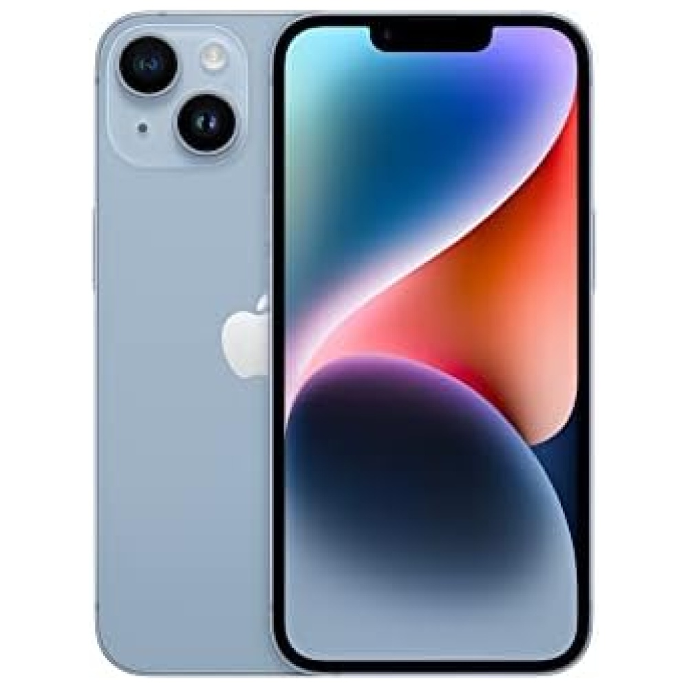
¡Descubre las fundas de silicona de elago, las más vendidas en Amazon durante los últimos cuatro años! Cada año, nuestro diseño mejora para ofrecerte más y más. Utilizamos silicona líquida para crear estas increíbles fundas, que proporcionan un gran agarre y protección a tu teléfono, además de añadir un toque de color. No sacrifiques ninguna característica importante al elegir elago. Ten en cuenta que debido al agarre de la funda, pueden adherirse pelusas u otras partículas pequeñas, pero se pueden limpiar fácilmente con un paño o papel húmedo.
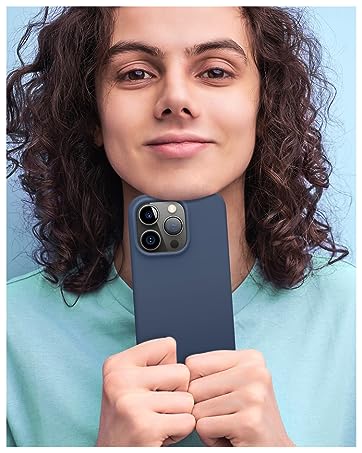
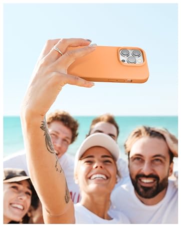
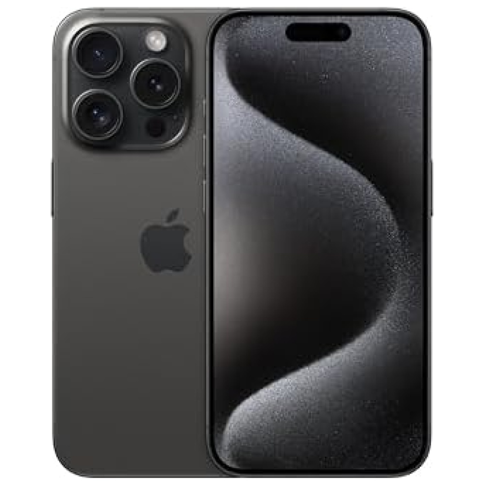
Nuestras fundas ofrecen una cobertura total compatible con tu iPhone 15 Pro. Cubren todos los lados del teléfono, incluyendo la parte inferior y los botones. Además, el borde levantado ayuda a proteger la pantalla y la cámara contra rayones por contacto directo con la superficie. ¡Y por supuesto, son compatibles con la carga inalámbrica!
A diferencia de otras fundas genéricas producidas en masa, todas nuestras fundas son diseñadas en casa desde cero. Desde el concepto hasta el producto final, cada aspecto de la creación de nuestros productos se realiza internamente para asegurarnos de que obtengas una funda que se ajuste perfectamente, proteja tu teléfono en el uso diario y sea genial. ¡Esto te ahorra tiempo y dinero!
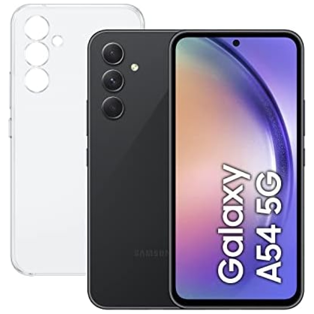
No esperes más, visita nuestra tienda de tecnología Bitech en bitech.es y encuentra la funda perfecta para tu iPhone 15 Pro. ¡No te arrepentirás!


En BiTech, ofrecemos , 30 días de Devolución GRATUITA, para que puedas comprar con total tranquilidad. Si no estás satisfecho te devolvemos el dinero. A parte, tienes 3 años de garantía.
Más información
¡Descubre las fundas de silicona de elago, las más vendidas en Amazon durante los últimos cuatro años! Cada año, nuestro diseño mejora para ofrecerte más y más. Utilizamos silicona líquida para crear estas increíbles fundas, que proporcionan un gran agarre y protección a tu teléfono, además de añadir un toque de color. No sacrifiques ninguna característica importante al elegir elago. Ten en cuenta que debido al agarre de la funda, pueden adherirse pelusas u otras partículas pequeñas, pero se pueden limpiar fácilmente con un paño o papel húmedo.
Nuestras fundas ofrecen una cobertura total compatible con tu iPhone 15 Pro. Cubren todos los lados del teléfono, incluyendo la parte inferior y los botones. Además, el borde levantado ayuda a proteger la pantalla y la cámara contra rayones por contacto directo con la superficie. ¡Y por supuesto, son compatibles con la carga inalámbrica!
A diferencia de otras fundas genéricas producidas en masa, todas nuestras fundas son diseñadas en casa desde cero. Desde el concepto hasta el producto final, cada aspecto de la creación de nuestros productos se realiza internamente para asegurarnos de que obtengas una funda que se ajuste perfectamente, proteja tu teléfono en el uso diario y sea genial. ¡Esto te ahorra tiempo y dinero!
No esperes más, visita nuestra tienda de tecnología Bitech en bitech.es y encuentra la funda perfecta para tu iPhone 15 Pro. ¡No te arrepentirás!