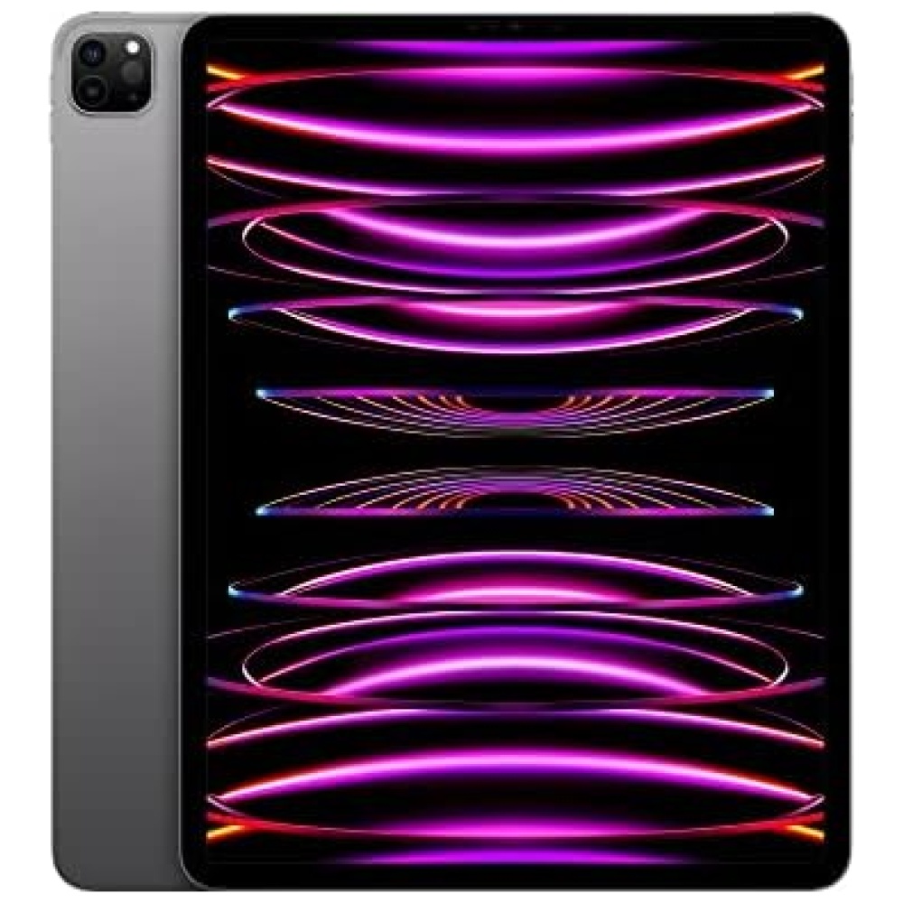
Más información del producto

En Bitech, confiamos en Samsung y su compromiso de crear productos y servicios de alta calidad que mejoren la sociedad a nivel mundial. Valoramos su enfoque en sus empleados y tecnologías, lo que garantiza que cada decisión tomada por la empresa esté respaldada por valores sólidos y un estricto código de conducta.
Si buscas productos confiables y de vanguardia, Samsung es la elección perfecta.

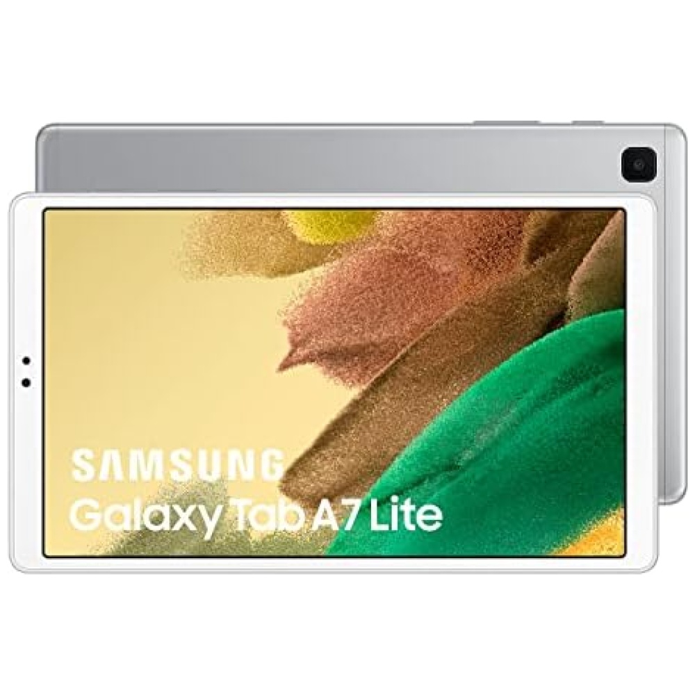
Descubre la increíble experiencia de ver películas y jugar en la pantalla ancha de 8,7 pulgadas del Samsung Galaxy Tab A7 Lite. Su diseño compacto y ergonómico te permite disfrutar durante horas sin cansar tus manos. Además, su resistente marco de metal garantiza una protección duradera contra el desgaste diario.


En BiTech, ofrecemos , 30 días de Devolución GRATUITA, para que puedas comprar con total tranquilidad. Si no estás satisfecho te devolvemos el dinero. A parte, tienes 3 años de garantía.
Más información
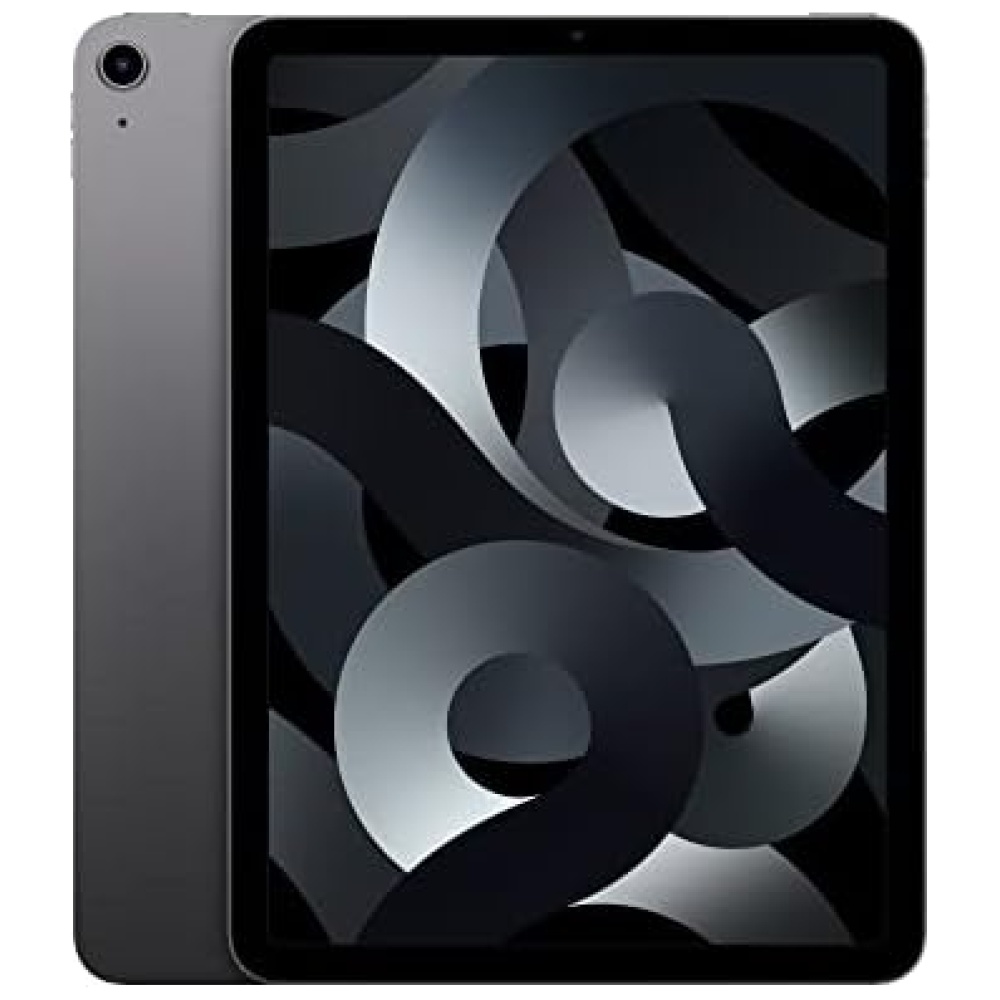
Más información del producto
En Bitech, confiamos en Samsung y su compromiso de crear productos y servicios de alta calidad que mejoren la sociedad a nivel mundial. Valoramos su enfoque en sus empleados y tecnologías, lo que garantiza que cada decisión tomada por la empresa esté respaldada por valores sólidos y un estricto código de conducta.
Si buscas productos confiables y de vanguardia, Samsung es la elección perfecta.
Descubre la increíble experiencia de ver películas y jugar en la pantalla ancha de 8,7 pulgadas del Samsung Galaxy Tab A7 Lite. Su diseño compacto y ergonómico te permite disfrutar durante horas sin cansar tus manos. Además, su resistente marco de metal garantiza una protección duradera contra el desgaste diario.