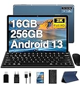
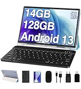
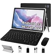
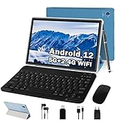
Diseño del teclado: Nuestra tableta cuenta con un teclado QWERTY de diseño estándar internacional
Función de pantalla dividida en la Tablet A15: Ahora podrás disfrutar de la pantalla dividida en nuestra tablet. Simplemente abre una aplicación, mantén pulsado el icono y selecciona "Pantalla dividida". Luego, elige la segunda app y listo.
Protector de pantalla incluido: Incluimos una lámina protectora de repuesto en la caja. Podrás reemplazarla fácilmente cuando sea necesario.
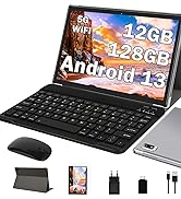
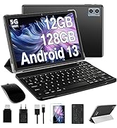
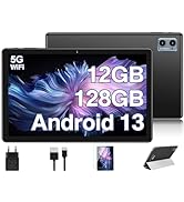
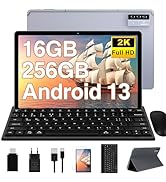
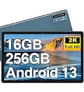
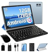
Descubre la Android 13 tablet A15:
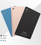
Marca: Oangcc
Sistema: Android 13 OS
CPU: Octa-Core, 2.0 GHz
RAM: 12 GB(6+6)
ROM: 128 GB
Extensión de memoria Microsd/TF:512 GB/1TB
Batería: 6000mah
Cámara trasera: 8 MP
Cámara frontal: 5 MP
Puerto del auricular: Jack de 3,5 mm
Puerto de carga: Puerto tipo C
Conexiones: 5G+2.4G WiFi, Bluetooth, AGPS, Hotspots
Nuestra promesa:
Gracias por elegir la tableta Oangcc A15. Si tienes alguna pregunta, no dudes en contactar con nuestro servicio de atención al cliente en nuestra dirección de correo electrónico. Estaremos encantados de ayudarte en menos de 24 horas.
【5G/2.4G WiFi y Función GPS】: Nuestra tableta de 10.1 pulgadas soporta conexiones WiFi de alta velocidad 5G y 2.4G, lo que mejora la estabilidad de la conexión. Además, cuenta con GPS y Google Maps para ofrecerte un posicionamiento preciso en cualquier momento y lugar. PS: Si necesitas utilizar la navegación GPS sin conexión, descarga el mapa offline con anticipación.
【12GB RAM+128GB ROM y CPU 8 Core】: Nuestra tableta cuenta con una memoria de alta capacidad de 12GB(6+6) RAM+128GB ROM, que se puede ampliar hasta 512GB/1TB con una tarjeta SD (se vende por separado). Además, cuenta con un procesador octa-core de 2.0GHz para un funcionamiento suave y estable del sistema.
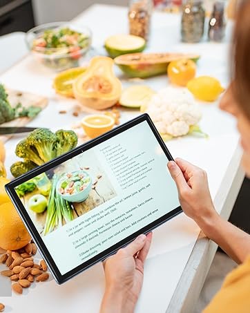
【Tablet Portátil 2 en 1】: La Tablet Android 13 de Oangcc es perfecta para aquellos que necesitan ser más productivos sobre la marcha. Con su modo de trabajo profesional 2 en 1, teclado bluetooth, ratón y funda plegable, podrás cambiar fácilmente entre los modos de tableta y ordenador. ¡Un regalo ideal para tus seres queridos en estas vacaciones!
【Gran Batería y Cámaras Duales】: Nuestra tableta cuenta con una batería de 6000mAh para una mayor duración. Además, cuenta con cámaras duales HD (Frontal 5MP + Trasera 8MP) para todas tus necesidades fotográficas y de grabación de vídeo. Con un peso de aproximadamente 470 gramos, es perfecta para llevar contigo en tus viajes y desplazamientos de larga distancia.
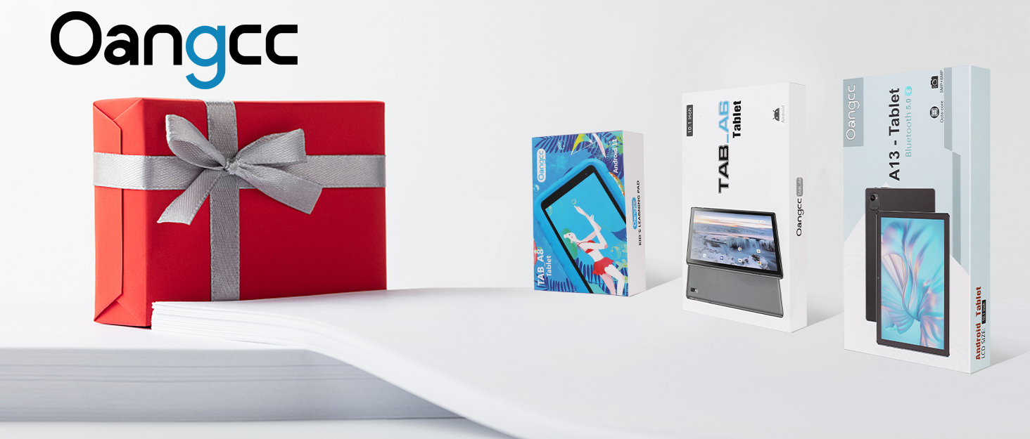

Sobre Nosotros:
Oangcc tiene su propio equipo de diseño y centro de I + D profesional, centrándose en la investigación y el desarrollo de tabletas de Android.
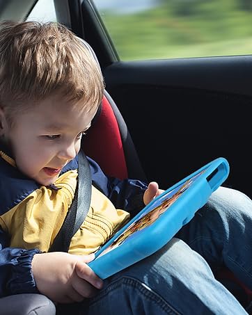
Oangcc crea tabletas más rentables y se compromete a mejorar la calidad y el índice de penetración de sus productos. Nuestra visión es poner tabletas asequibles y prácticas al alcance de todos los usuarios (adultos o niños) que las necesiten.


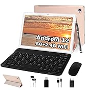
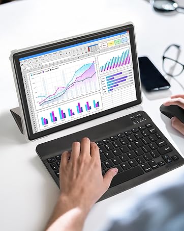
(Conecta un teclado y pasa al modo portátil en cualquier momento y lugar)


Lo Esencial Para Una Fiesta


En BiTech, ofrecemos , 30 días de Devolución GRATUITA, para que puedas comprar con total tranquilidad. Si no estás satisfecho te devolvemos el dinero. A parte, tienes 3 años de garantía.
Más información
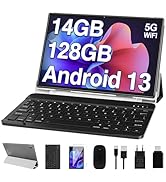
Diseño del teclado: Nuestra tableta cuenta con un teclado QWERTY de diseño estándar internacional
Función de pantalla dividida en la Tablet A15: Ahora podrás disfrutar de la pantalla dividida en nuestra tablet. Simplemente abre una aplicación, mantén pulsado el icono y selecciona "Pantalla dividida". Luego, elige la segunda app y listo.
Protector de pantalla incluido: Incluimos una lámina protectora de repuesto en la caja. Podrás reemplazarla fácilmente cuando sea necesario.
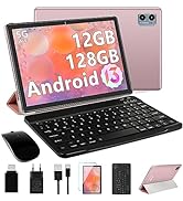
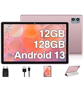
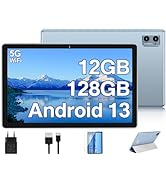
Descubre la Android 13 tablet A15:
Marca: Oangcc
Sistema: Android 13 OS
CPU: Octa-Core, 2.0 GHz
RAM: 12 GB(6+6)
ROM: 128 GB
Extensión de memoria Microsd/TF:512 GB/1TB
Batería: 6000mah
Cámara trasera: 8 MP
Cámara frontal: 5 MP
Puerto del auricular: Jack de 3,5 mm
Puerto de carga: Puerto tipo C
Conexiones: 5G+2.4G WiFi, Bluetooth, AGPS, Hotspots
Nuestra promesa:
Gracias por elegir la tableta Oangcc A15. Si tienes alguna pregunta, no dudes en contactar con nuestro servicio de atención al cliente en nuestra dirección de correo electrónico. Estaremos encantados de ayudarte en menos de 24 horas.
【5G/2.4G WiFi y Función GPS】: Nuestra tableta de 10.1 pulgadas soporta conexiones WiFi de alta velocidad 5G y 2.4G, lo que mejora la estabilidad de la conexión. Además, cuenta con GPS y Google Maps para ofrecerte un posicionamiento preciso en cualquier momento y lugar. PS: Si necesitas utilizar la navegación GPS sin conexión, descarga el mapa offline con anticipación.
【12GB RAM+128GB ROM y CPU 8 Core】: Nuestra tableta cuenta con una memoria de alta capacidad de 12GB(6+6) RAM+128GB ROM, que se puede ampliar hasta 512GB/1TB con una tarjeta SD (se vende por separado). Además, cuenta con un procesador octa-core de 2.0GHz para un funcionamiento suave y estable del sistema.
【Tablet Portátil 2 en 1】: La Tablet Android 13 de Oangcc es perfecta para aquellos que necesitan ser más productivos sobre la marcha. Con su modo de trabajo profesional 2 en 1, teclado bluetooth, ratón y funda plegable, podrás cambiar fácilmente entre los modos de tableta y ordenador. ¡Un regalo ideal para tus seres queridos en estas vacaciones!
【Gran Batería y Cámaras Duales】: Nuestra tableta cuenta con una batería de 6000mAh para una mayor duración. Además, cuenta con cámaras duales HD (Frontal 5MP + Trasera 8MP) para todas tus necesidades fotográficas y de grabación de vídeo. Con un peso de aproximadamente 470 gramos, es perfecta para llevar contigo en tus viajes y desplazamientos de larga distancia.
Sobre Nosotros:
Oangcc tiene su propio equipo de diseño y centro de I + D profesional, centrándose en la investigación y el desarrollo de tabletas de Android.
Oangcc crea tabletas más rentables y se compromete a mejorar la calidad y el índice de penetración de sus productos. Nuestra visión es poner tabletas asequibles y prácticas al alcance de todos los usuarios (adultos o niños) que las necesiten.
(Conecta un teclado y pasa al modo portátil en cualquier momento y lugar)
Lo Esencial Para Una Fiesta