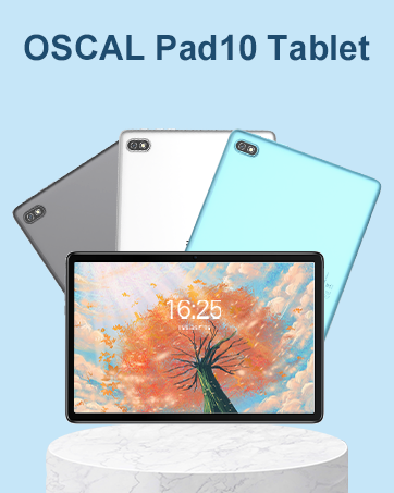
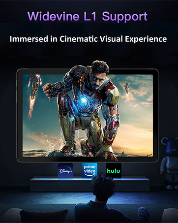
¡Descubre la increíble OSCAL PAD13 Tablet en Bitech.es! Con una amplia pantalla de 10.1 pulgadas y una alta resolución de 1200x1920, podrás disfrutar de detalles realistas y colores vibrantes. Además, cuenta con Widevine L1 para que no te pierdas ningún video popular y experimentes una verdadera experiencia cinematográfica.
Esta tablet también cuenta con altavoces duales Smart-K, que te brindarán un sonido similar al de un teatro, para que disfrutes al máximo de tus películas y series favoritas.
La batería de 7680mAh te sorprenderá con su duración, y gracias a la carga rápida de 18W, podrás recargarla en poco tiempo. Además, la OSCAL PAD13 Tablet cuenta con una cámara frontal de 8MP y una cámara trasera de 13MP, para que captures tus mejores momentos con alta resolución.
Incluye una pluma, una funda y un protector de pantalla, para que puedas tomar notas y dibujar con facilidad. Además, con una garantía de 2 años, puedes estar tranquilo sabiendo que estás cubierto en caso de cualquier problema.
Con el sistema operativo Android 12 y Doke_OS 3.0, podrás personalizar tu tablet, disfrutar de funciones como la aceleración de juegos y el modo PC, y tener acceso a las aplicaciones más populares como Facebook, Skype, Netflix, YouTube y Twitter.
No esperes más y adquiere la OSCAL PAD13 Tablet en Bitech.es para disfrutar de una experiencia tecnológica única. ¡Te esperamos!


En BiTech, ofrecemos , 30 días de Devolución GRATUITA, para que puedas comprar con total tranquilidad. Si no estás satisfecho te devolvemos el dinero. A parte, tienes 3 años de garantía.
Más información
¡Descubre la increíble OSCAL PAD13 Tablet en Bitech.es! Con una amplia pantalla de 10.1 pulgadas y una alta resolución de 1200x1920, podrás disfrutar de detalles realistas y colores vibrantes. Además, cuenta con Widevine L1 para que no te pierdas ningún video popular y experimentes una verdadera experiencia cinematográfica.
Esta tablet también cuenta con altavoces duales Smart-K, que te brindarán un sonido similar al de un teatro, para que disfrutes al máximo de tus películas y series favoritas.
La batería de 7680mAh te sorprenderá con su duración, y gracias a la carga rápida de 18W, podrás recargarla en poco tiempo. Además, la OSCAL PAD13 Tablet cuenta con una cámara frontal de 8MP y una cámara trasera de 13MP, para que captures tus mejores momentos con alta resolución.
Incluye una pluma, una funda y un protector de pantalla, para que puedas tomar notas y dibujar con facilidad. Además, con una garantía de 2 años, puedes estar tranquilo sabiendo que estás cubierto en caso de cualquier problema.
Con el sistema operativo Android 12 y Doke_OS 3.0, podrás personalizar tu tablet, disfrutar de funciones como la aceleración de juegos y el modo PC, y tener acceso a las aplicaciones más populares como Facebook, Skype, Netflix, YouTube y Twitter.
No esperes más y adquiere la OSCAL PAD13 Tablet en Bitech.es para disfrutar de una experiencia tecnológica única. ¡Te esperamos!