

En Bitech, confiamos en la calidad y tecnología de Samsung. Esta marca se dedica a crear productos y servicios de alta calidad que mejoran la sociedad a nivel mundial. Valoramos a nuestros empleados y tecnologías, por eso elegimos trabajar con Samsung.
En Bitech, creemos que los valores sólidos son fundamentales para el éxito de una empresa. Por eso, cada decisión que tomamos está basada en nuestros valores y en un estricto código de conducta.
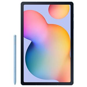
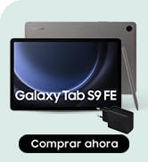
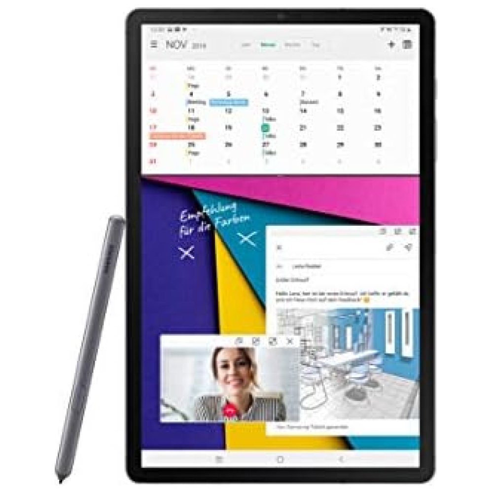
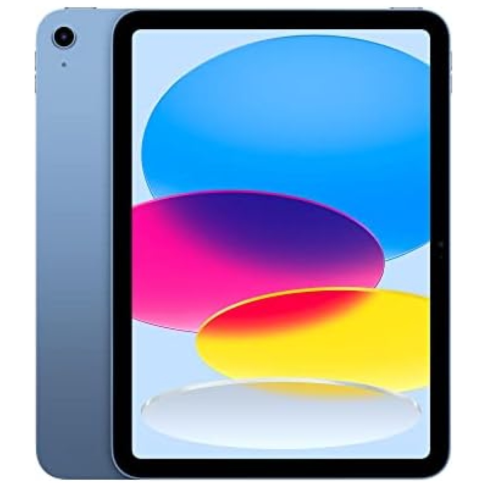
Descubre la Samsung Galaxy Tab S6 Lite 64GB Wifi Azul en Bitech. Esta tablet cuenta con una memoria integrada de 64 GB y un puerto micro SD de hasta 1 TB, para que puedas almacenar todos tus archivos y aplicaciones sin preocuparte por el espacio. Además, su diseño elegante y compacto la hace fácil de transportar.


En BiTech, ofrecemos , 30 días de Devolución GRATUITA, para que puedas comprar con total tranquilidad. Si no estás satisfecho te devolvemos el dinero. A parte, tienes 3 años de garantía.
Más información
En Bitech, confiamos en la calidad y tecnología de Samsung. Esta marca se dedica a crear productos y servicios de alta calidad que mejoran la sociedad a nivel mundial. Valoramos a nuestros empleados y tecnologías, por eso elegimos trabajar con Samsung.
En Bitech, creemos que los valores sólidos son fundamentales para el éxito de una empresa. Por eso, cada decisión que tomamos está basada en nuestros valores y en un estricto código de conducta.
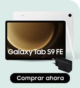
Descubre la Samsung Galaxy Tab S6 Lite 64GB Wifi Azul en Bitech. Esta tablet cuenta con una memoria integrada de 64 GB y un puerto micro SD de hasta 1 TB, para que puedas almacenar todos tus archivos y aplicaciones sin preocuparte por el espacio. Además, su diseño elegante y compacto la hace fácil de transportar.