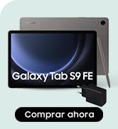
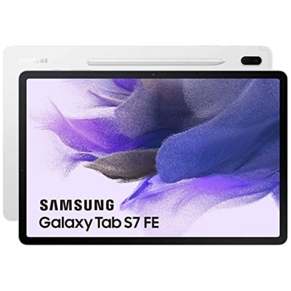
en tu tablet de 12 pulgadas. Además, podrás convertir tus manuscritos en texto con un solo toque, lo que facilita la organización de tus notas.
En cuanto a la cámara, podrás realizar videollamadas manteniéndote en el centro de la pantalla gracias a la cámara frontal. Además, tu voz se escuchará claramente gracias a los 3 micrófonos integrados.
La tablet Samsung Galaxy Tab S7 FE también destaca por su diseño elegante y delgado, que ofrece un cómodo agarre. Además, disfrutarás de vistas y sonidos envolventes gracias a la pantalla de 12,4 pulgadas y al increíble sonido de AKG, los altavoces duales y Dolby Atmos.
En resumen, la tablet Samsung Galaxy Tab S7 FE es perfecta para aquellos que buscan un dispositivo potente y versátil. Con su alto rendimiento, larga duración de batería y funciones avanzadas como el S Pen, esta tablet te brindará una experiencia única. ¡No esperes más y adquiere la tuya en Bitech.es!


En BiTech, ofrecemos , 30 días de Devolución GRATUITA, para que puedas comprar con total tranquilidad. Si no estás satisfecho te devolvemos el dinero. A parte, tienes 3 años de garantía.
Más información
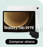
en tu tablet de 12 pulgadas. Además, podrás convertir tus manuscritos en texto con un solo toque, lo que facilita la organización de tus notas.
En cuanto a la cámara, podrás realizar videollamadas manteniéndote en el centro de la pantalla gracias a la cámara frontal. Además, tu voz se escuchará claramente gracias a los 3 micrófonos integrados.
La tablet Samsung Galaxy Tab S7 FE también destaca por su diseño elegante y delgado, que ofrece un cómodo agarre. Además, disfrutarás de vistas y sonidos envolventes gracias a la pantalla de 12,4 pulgadas y al increíble sonido de AKG, los altavoces duales y Dolby Atmos.
En resumen, la tablet Samsung Galaxy Tab S7 FE es perfecta para aquellos que buscan un dispositivo potente y versátil. Con su alto rendimiento, larga duración de batería y funciones avanzadas como el S Pen, esta tablet te brindará una experiencia única. ¡No esperes más y adquiere la tuya en Bitech.es!