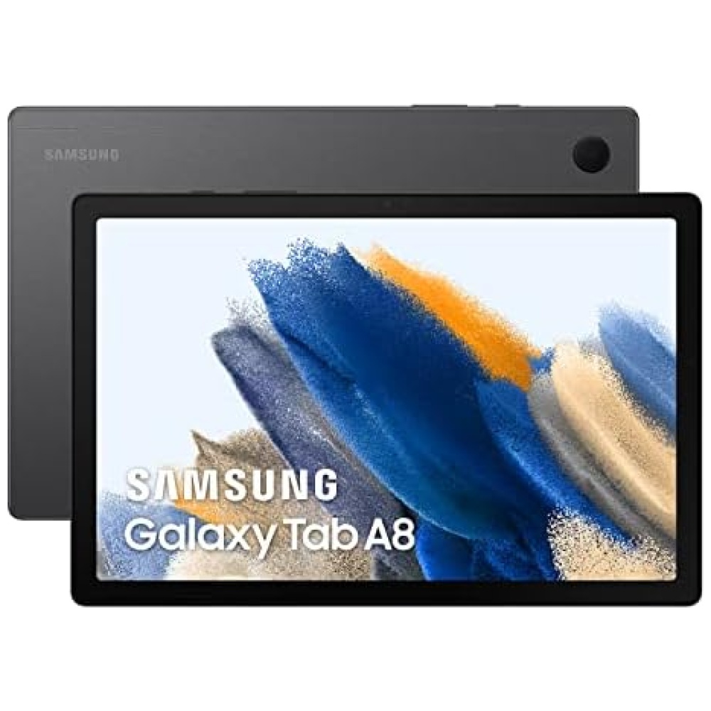
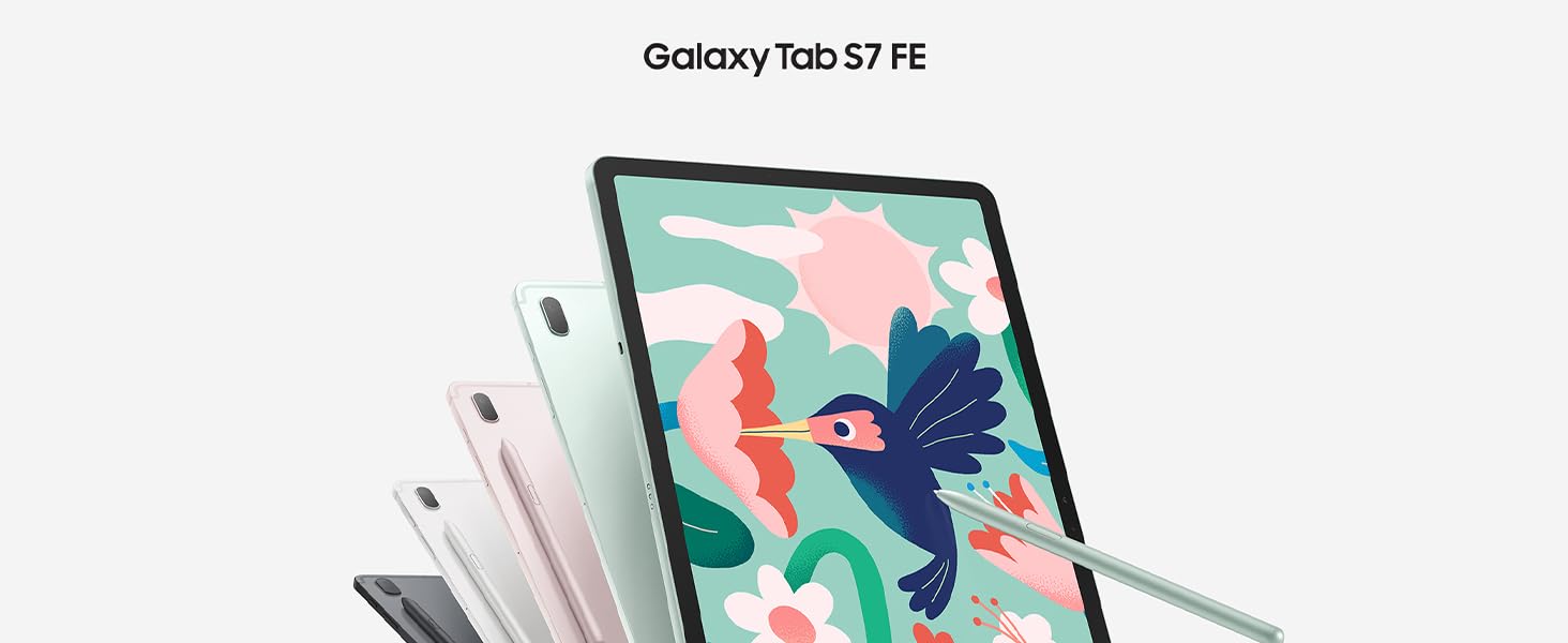
 La belleza está en la simplicidad
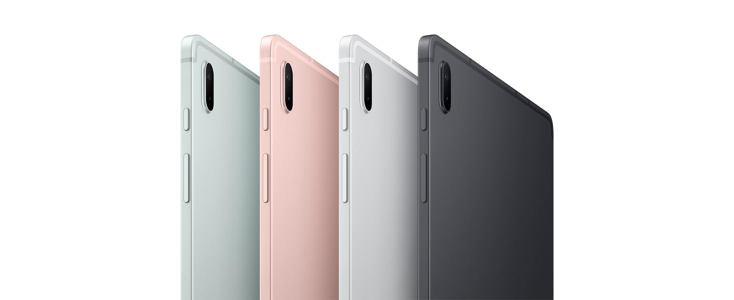
Disfruta de la elegancia de la tablet Samsung Galaxy Tab S7 FE 5G en tus manos. Su diseño sencillo y singular, junto con su formato delgado, te brindan un cómodo agarre.
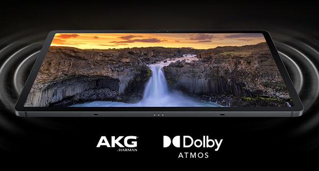
Disfruta de dinámicos colores en la pantalla de 12,4 pulgadas de la tablet Samsung Galaxy Tab S7 FE 5G. Además, su increíble sonido de AKG, altavoces duales y Dolby Atmos te sumergirán en una experiencia envolvente.
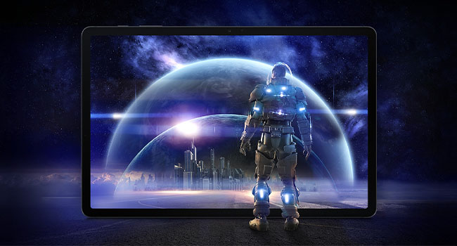
Equipada con un chipset de alto rendimiento Snapdragon 750G, esta tablet Android Samsung Galaxy Tab S7 FE 5G te brinda un rendimiento fluido y rápido. Podrás realizar multitarea con hasta tres aplicaciones a la vez.

Conéctate, descarga y disfruta con la conectividad 5G. Las increíbles velocidades te permitirán descargar en un momento y la baja latencia mantendrá tu conexión sólida y sin lag.
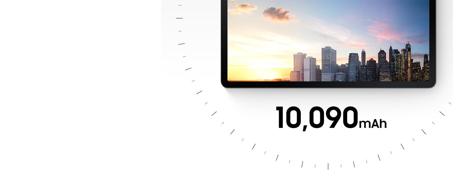
La batería de 10 090 mAh de la tablet Samsung Galaxy Tab S7 FE te permitirá disfrutar de horas y horas de uso sin tener que cargarla. Podrás ver vídeos durante hasta 13 horas, perfecto para maratones de retransmisiones.

La cámara frontal de la tablet Samsung Galaxy Tab S7 FE te mantendrá en el centro de la pantalla durante las videollamadas. Además, cuenta con 3 micrófonos integrados para una calidad de sonido clara.
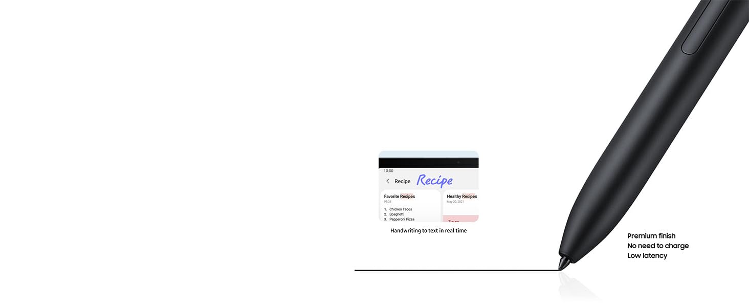
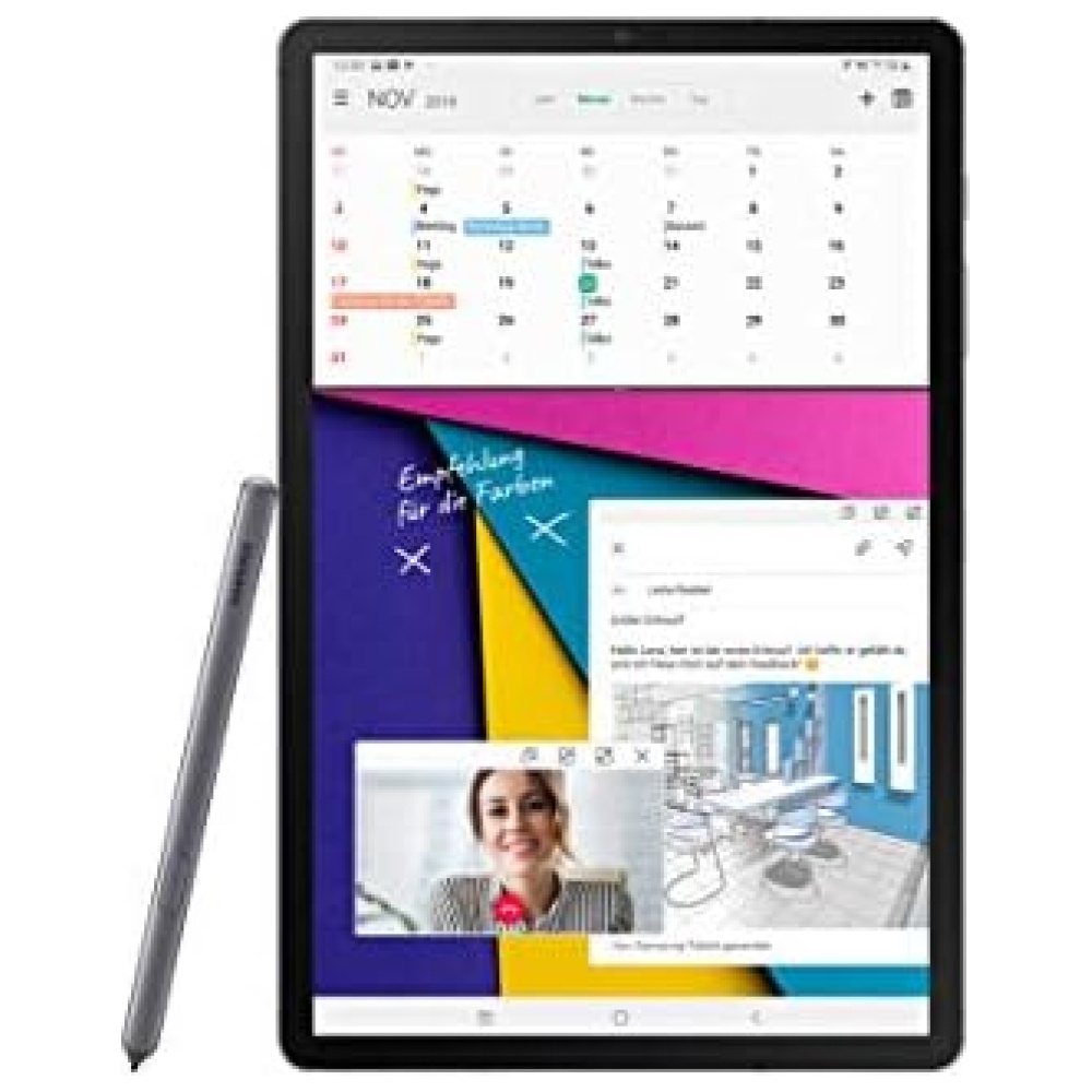
El S Pen incluido en la tablet Samsung Galaxy Tab S7 FE te brinda una experiencia de escritura natural con baja latencia y una punta suave. Podrás digitalizar tus palabras en tiempo real y editarlas con simples gestos.
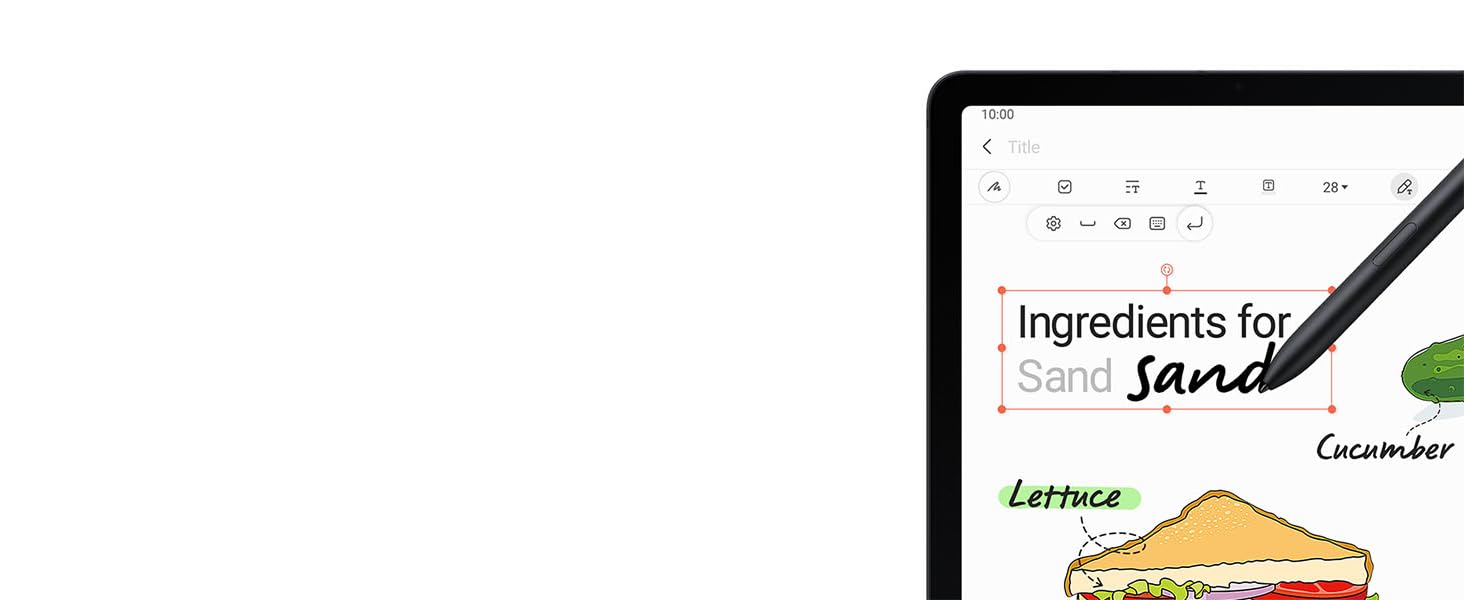
Convierte tus manuscritos en texto de forma automática. Escribe en la barra de búsqueda o en la barra de título de Samsung Notes con el S Pen y luego convierte tus notas en texto con un solo toque.
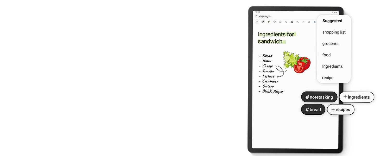
Mientras tomas notas, la aplicación te recomendará títulos automáticamente al analizar el contenido y te sugerirá etiquetas para mantener tus notas bien organizadas en tu tablet de 12 pulgadas.
Con un chipset de alto rendimiento Snapdragon 750G, esta tablet Android Samsung Galaxy Tab S7 FE te brinda un rendimiento fluido y rápido. Podrás realizar multitarea con facilidad con hasta tres aplicaciones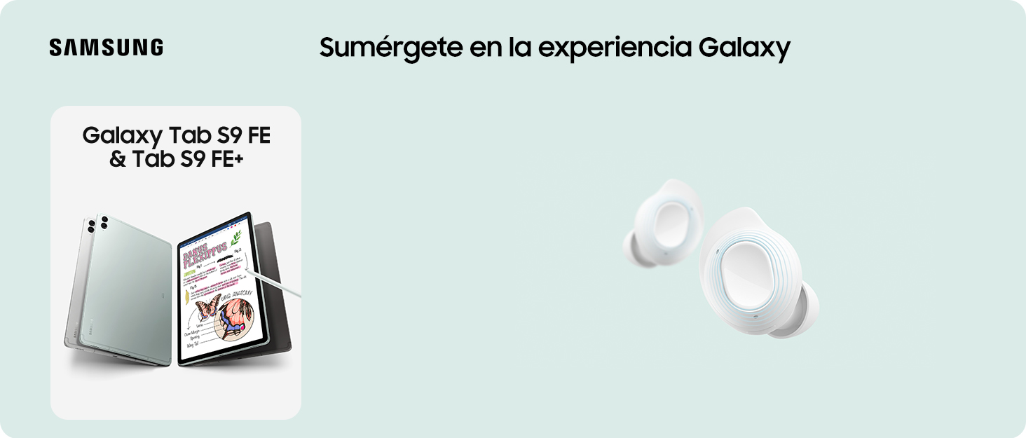


En BiTech, ofrecemos , 30 días de Devolución GRATUITA, para que puedas comprar con total tranquilidad. Si no estás satisfecho te devolvemos el dinero. A parte, tienes 3 años de garantía.
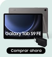
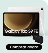
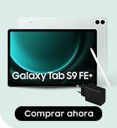
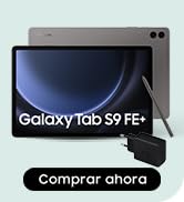
Más información
La belleza está en la simplicidad
Disfruta de la elegancia de la tablet Samsung Galaxy Tab S7 FE 5G en tus manos. Su diseño sencillo y singular, junto con su formato delgado, te brindan un cómodo agarre.
Disfruta de dinámicos colores en la pantalla de 12,4 pulgadas de la tablet Samsung Galaxy Tab S7 FE 5G. Además, su increíble sonido de AKG, altavoces duales y Dolby Atmos te sumergirán en una experiencia envolvente.
Equipada con un chipset de alto rendimiento Snapdragon 750G, esta tablet Android Samsung Galaxy Tab S7 FE 5G te brinda un rendimiento fluido y rápido. Podrás realizar multitarea con hasta tres aplicaciones a la vez.
Conéctate, descarga y disfruta con la conectividad 5G. Las increíbles velocidades te permitirán descargar en un momento y la baja latencia mantendrá tu conexión sólida y sin lag.
La batería de 10 090 mAh de la tablet Samsung Galaxy Tab S7 FE te permitirá disfrutar de horas y horas de uso sin tener que cargarla. Podrás ver vídeos durante hasta 13 horas, perfecto para maratones de retransmisiones.
La cámara frontal de la tablet Samsung Galaxy Tab S7 FE te mantendrá en el centro de la pantalla durante las videollamadas. Además, cuenta con 3 micrófonos integrados para una calidad de sonido clara.
El S Pen incluido en la tablet Samsung Galaxy Tab S7 FE te brinda una experiencia de escritura natural con baja latencia y una punta suave. Podrás digitalizar tus palabras en tiempo real y editarlas con simples gestos.
Convierte tus manuscritos en texto de forma automática. Escribe en la barra de búsqueda o en la barra de título de Samsung Notes con el S Pen y luego convierte tus notas en texto con un solo toque.
Mientras tomas notas, la aplicación te recomendará títulos automáticamente al analizar el contenido y te sugerirá etiquetas para mantener tus notas bien organizadas en tu tablet de 12 pulgadas.
Con un chipset de alto rendimiento Snapdragon 750G, esta tablet Android Samsung Galaxy Tab S7 FE te brinda un rendimiento fluido y rápido. Podrás realizar multitarea con facilidad con hasta tres aplicaciones