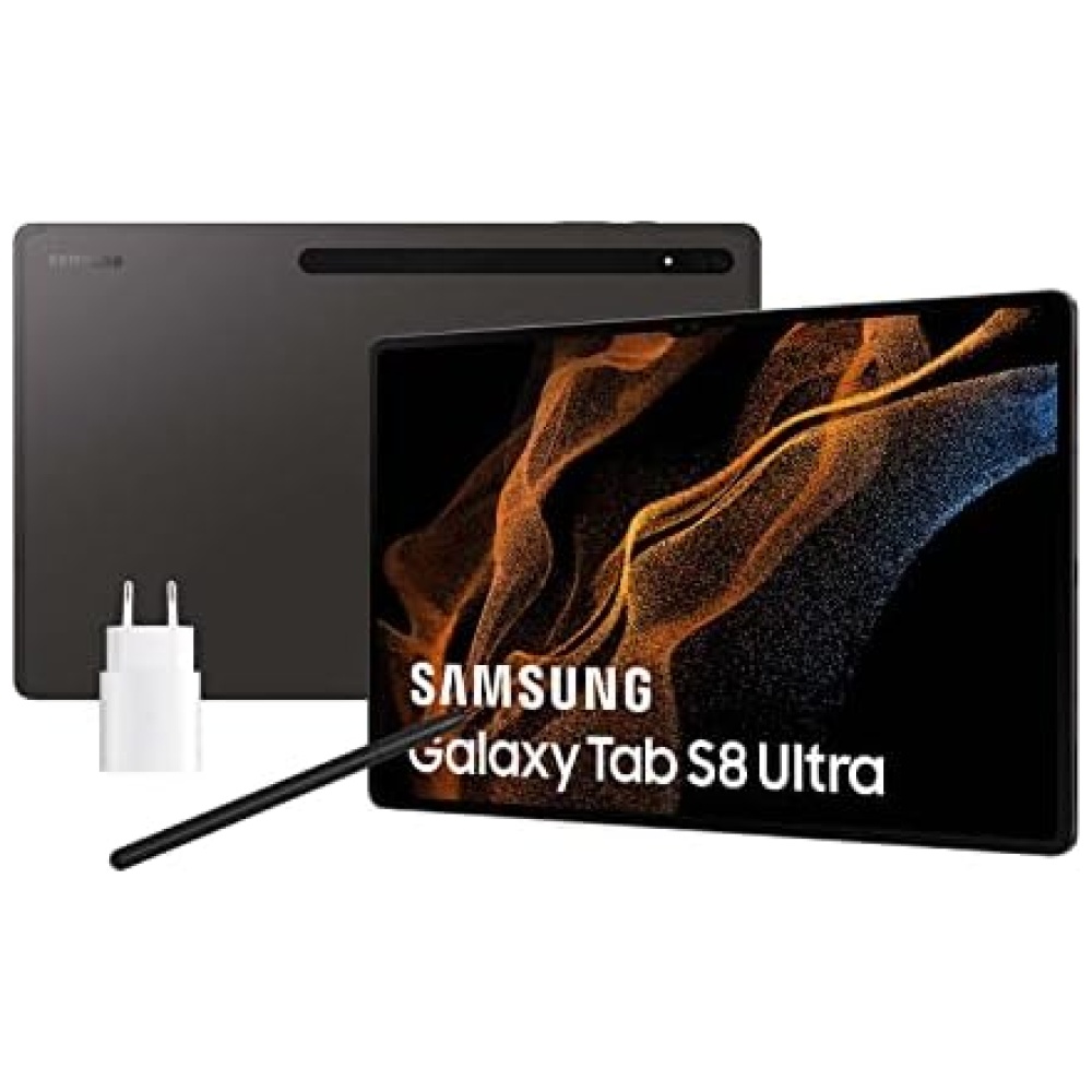
, S Pen, Tablet, 10.4\",")


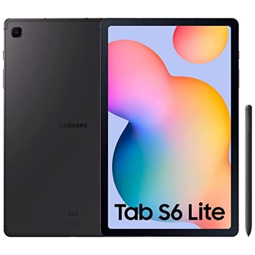
SAMSUNG Galaxy Tab S6 Lite (2022), S Pen, Tablet, 10.4 Pulgadas Pantalla Táctil LCD TFT, Wi-Fi, RAM 4 GB, 128 GB ampliables, Batería 7040 mAh, Tablet Android 12 Oxford Gray [Versión Italiana] 2022
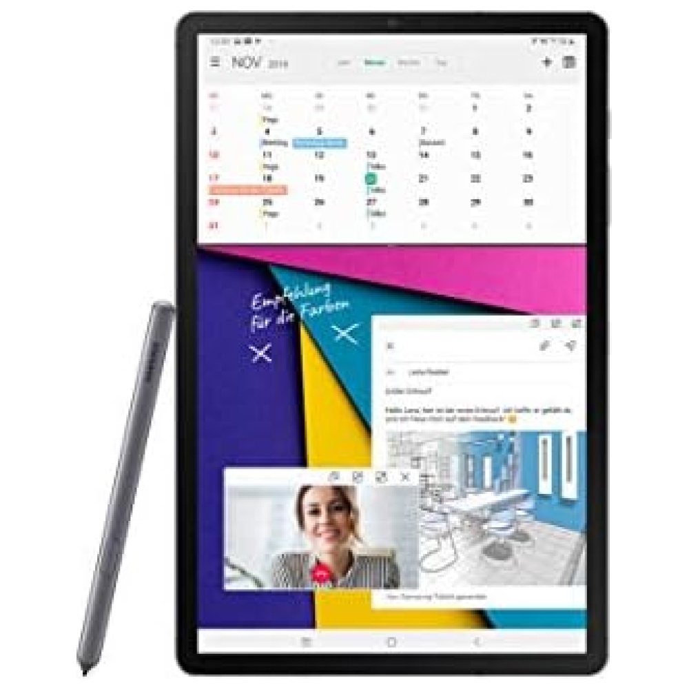
La aplicación Samsung Notes te ayuda a ser más productivo: amplía hasta un 300% para escribir con precisión, resalta texto y convierte notas en formato digital con un solo toque.
Con su diseño ligero y cómodo agarre, podrás usar el s Pen con 4.096 niveles de presión y una punta fina y precisa, para una experiencia de escritura similar a la de un bolígrafo real.
Disfruta de una experiencia Smart Home completa. Con el Galaxy Tab S6 Lite, podrás recibir llamadas y enviar mensajes incluso si tu tableta y tu teléfono están conectados a diferentes redes.
La pantalla de 10.4 pulgadas del Galaxy Tab S6 Lite te ofrece una visualización dinámica e inmersiva. Disfruta de contenidos de YouTube Premium o Netflix* y compártelos con tu familia.
Con altavoces dobles con Dolby Atmos & Sound by AKG, el Galaxy Tab S6 Lite ofrece una reproducción de audio potente y equilibrada. Además, podrás disfrutar de música sin interrupciones con Spotify**.
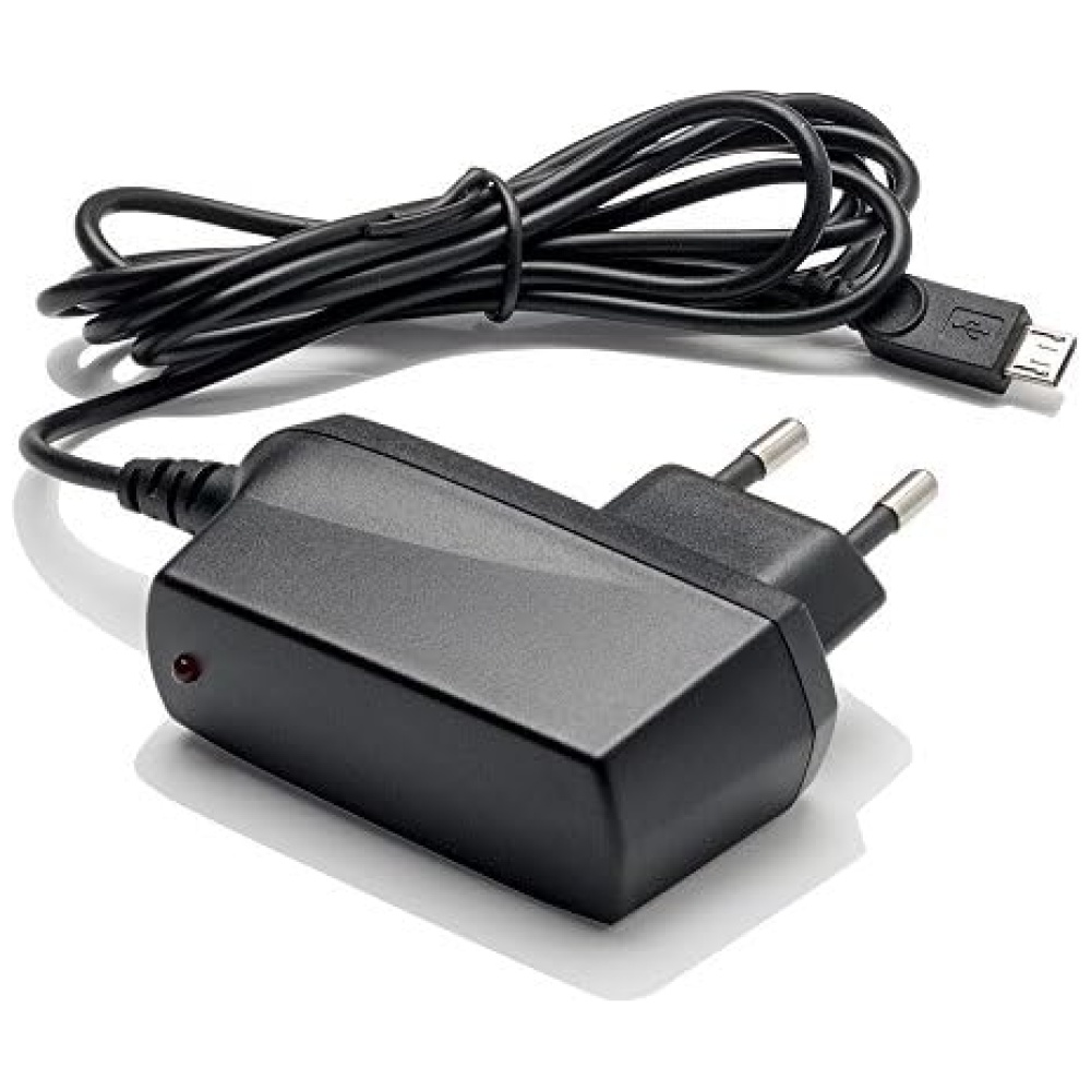
La batería de carga rápida de 7.040 mAh del Galaxy Tab S6 Lite te permite disfrutar de hasta 13 horas de visualización sin preocuparte por quedarte sin batería.
Con una tableta ligera y delgada de solo 7 mm de grosor, el Galaxy Tab S6 Lite ofrece todo el espacio que necesitas. Su cuerpo de metal incluye 4 GB de RAM y 64 GB de memoria interna, ampliables con una tarjeta microSD de hasta 1 TB.


En BiTech, ofrecemos , 30 días de Devolución GRATUITA, para que puedas comprar con total tranquilidad. Si no estás satisfecho te devolvemos el dinero. A parte, tienes 3 años de garantía.
Más información
SAMSUNG Galaxy Tab S6 Lite (2022), S Pen, Tablet, 10.4 Pulgadas Pantalla Táctil LCD TFT, Wi-Fi, RAM 4 GB, 128 GB ampliables, Batería 7040 mAh, Tablet Android 12 Oxford Gray [Versión Italiana] 2022
La aplicación Samsung Notes te ayuda a ser más productivo: amplía hasta un 300% para escribir con precisión, resalta texto y convierte notas en formato digital con un solo toque.
Con su diseño ligero y cómodo agarre, podrás usar el s Pen con 4.096 niveles de presión y una punta fina y precisa, para una experiencia de escritura similar a la de un bolígrafo real.
Disfruta de una experiencia Smart Home completa. Con el Galaxy Tab S6 Lite, podrás recibir llamadas y enviar mensajes incluso si tu tableta y tu teléfono están conectados a diferentes redes.
La pantalla de 10.4 pulgadas del Galaxy Tab S6 Lite te ofrece una visualización dinámica e inmersiva. Disfruta de contenidos de YouTube Premium o Netflix* y compártelos con tu familia.
Con altavoces dobles con Dolby Atmos & Sound by AKG, el Galaxy Tab S6 Lite ofrece una reproducción de audio potente y equilibrada. Además, podrás disfrutar de música sin interrupciones con Spotify**.
La batería de carga rápida de 7.040 mAh del Galaxy Tab S6 Lite te permite disfrutar de hasta 13 horas de visualización sin preocuparte por quedarte sin batería.
Con una tableta ligera y delgada de solo 7 mm de grosor, el Galaxy Tab S6 Lite ofrece todo el espacio que necesitas. Su cuerpo de metal incluye 4 GB de RAM y 64 GB de memoria interna, ampliables con una tarjeta microSD de hasta 1 TB.