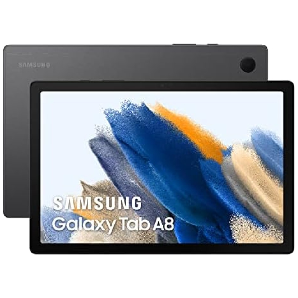
y sumérgete en una experiencia de entretenimiento única. Además, con la suscripción gratuita de dos meses a YouTube Premium, podrás disfrutar de tus videos favoritos sin anuncios.
La Galaxy Tab A8 también es perfecta para el aprendizaje en línea. Con su Screen Recorder integrado, podrás grabar fácilmente tus clases en directo y revisarlas cuando quieras. Y para los más pequeños, Samsung Kids ofrece un entorno seguro lleno de actividades educativas.
Además, con la función de Multiventana, podrás realizar varias tareas a la vez y compartir contenido entre aplicaciones. Y gracias a Samsung Knox, tu información estará siempre segura.
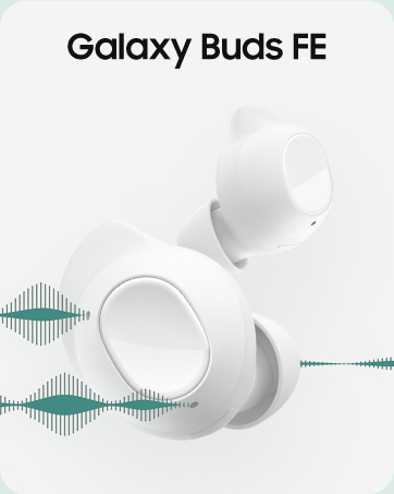
No te pierdas nada con la Galaxy Tab A8. Con la función de Continuar en otros dispositivos, podrás retomar tus actividades justo donde las dejaste en tu teléfono. Y con la conexión automática de tus dispositivos favoritos, como tus auriculares Galaxy Buds, estarás siempre conectado.
En Bitech, nuestra tienda de tecnología, encontrarás la Galaxy Tab A8 y muchos otros productos de última generación. Visita bitech.es y descubre todo lo que tenemos para ofrecerte. ¡No te lo pierdas!


En BiTech, ofrecemos , 30 días de Devolución GRATUITA, para que puedas comprar con total tranquilidad. Si no estás satisfecho te devolvemos el dinero. A parte, tienes 3 años de garantía.
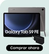
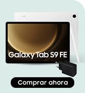
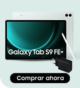
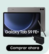
Más información
y sumérgete en una experiencia de entretenimiento única. Además, con la suscripción gratuita de dos meses a YouTube Premium, podrás disfrutar de tus videos favoritos sin anuncios.
La Galaxy Tab A8 también es perfecta para el aprendizaje en línea. Con su Screen Recorder integrado, podrás grabar fácilmente tus clases en directo y revisarlas cuando quieras. Y para los más pequeños, Samsung Kids ofrece un entorno seguro lleno de actividades educativas.
Además, con la función de Multiventana, podrás realizar varias tareas a la vez y compartir contenido entre aplicaciones. Y gracias a Samsung Knox, tu información estará siempre segura.
No te pierdas nada con la Galaxy Tab A8. Con la función de Continuar en otros dispositivos, podrás retomar tus actividades justo donde las dejaste en tu teléfono. Y con la conexión automática de tus dispositivos favoritos, como tus auriculares Galaxy Buds, estarás siempre conectado.
En Bitech, nuestra tienda de tecnología, encontrarás la Galaxy Tab A8 y muchos otros productos de última generación. Visita bitech.es y descubre todo lo que tenemos para ofrecerte. ¡No te lo pierdas!