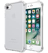
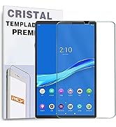
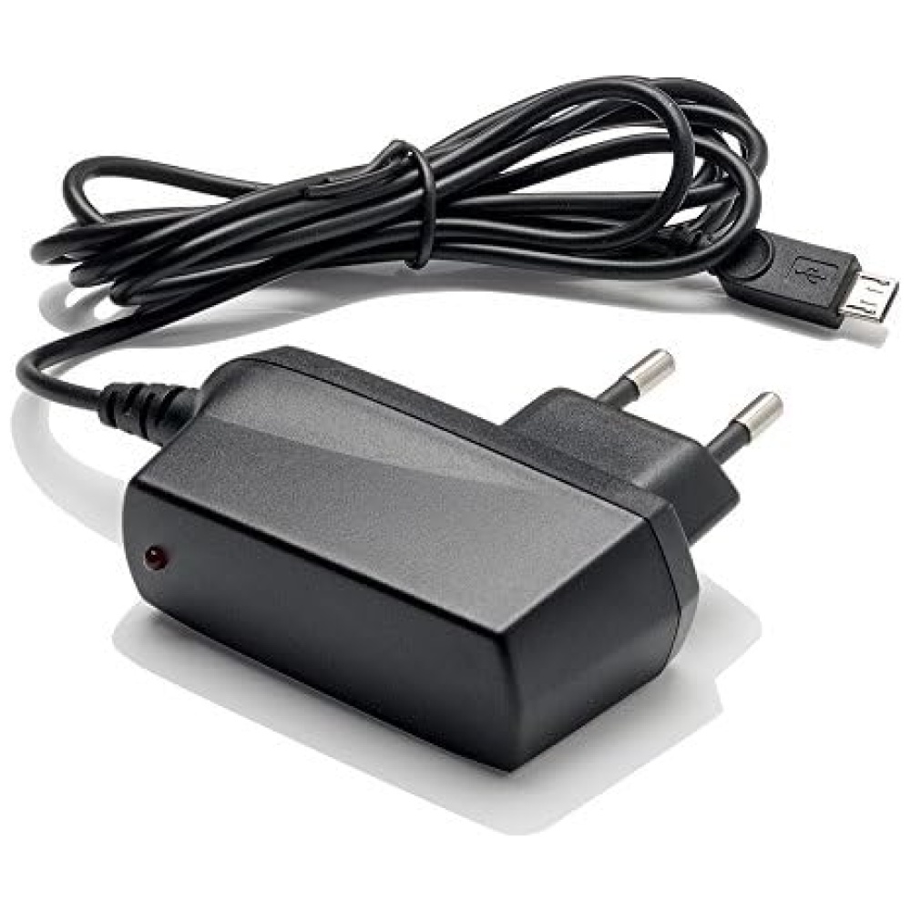
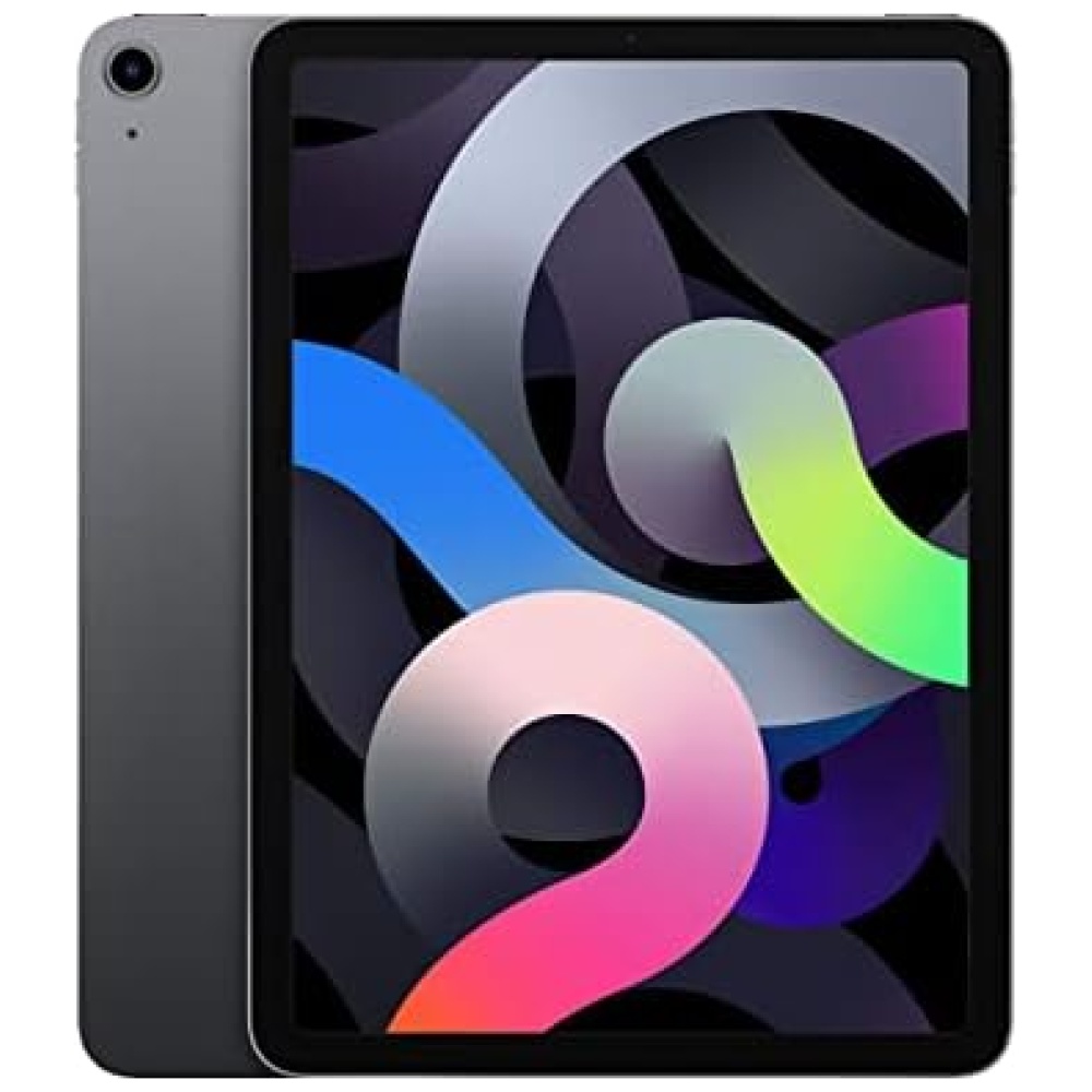
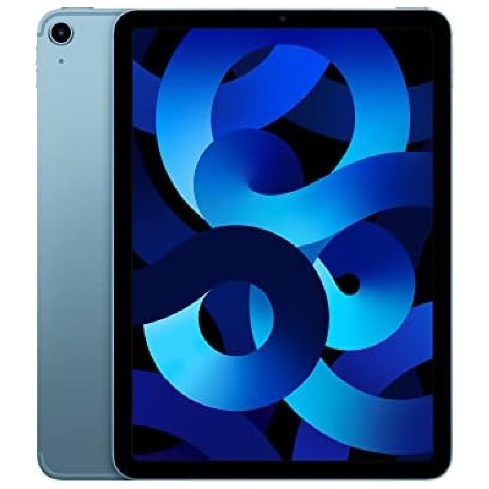
Protege la pantalla de tu ASUS ZENPAD 8" Z380C con el Protector de Pantalla REY. Fabricado con cristal vidrio templado premium, este protector garantiza una dureza de nivel 9H y cuenta con un revestimiento oleofóbico que repele la grasa, manteniendo tu tablet siempre limpia.
No solo protege, sino que también mejora la experiencia táctil de tu dispositivo. Con su tacto agradable, sentirás una suavidad inmejorable al utilizar la pantalla original de tu teléfono.
Además, este protector ofrece una transparencia total y una excelente visibilidad con alto contraste. No perderás ni un detalle de tus contenidos favoritos.
La aplicación de este protector es muy sencilla gracias a su sistema de adherencia sin residuos. Olvídate de las burbujas y disfruta de una pantalla perfectamente protegida en cuestión de segundos.
En Bitech, tu tienda de tecnología de confianza, encontrarás este Protector de Pantalla REY y muchos otros accesorios para tus dispositivos. Visítanos en bitech.es y descubre todo lo que tenemos para ofrecerte.
Somos una empresa española que vende accesorios para móviles y tablets, de forma que nuestros clientes puedan mejorar su experiencia con sus dispositivos electrónicos.


En BiTech, ofrecemos , 30 días de Devolución GRATUITA, para que puedas comprar con total tranquilidad. Si no estás satisfecho te devolvemos el dinero. A parte, tienes 3 años de garantía.
Más información
Protege la pantalla de tu ASUS ZENPAD 8" Z380C con el Protector de Pantalla REY. Fabricado con cristal vidrio templado premium, este protector garantiza una dureza de nivel 9H y cuenta con un revestimiento oleofóbico que repele la grasa, manteniendo tu tablet siempre limpia.
No solo protege, sino que también mejora la experiencia táctil de tu dispositivo. Con su tacto agradable, sentirás una suavidad inmejorable al utilizar la pantalla original de tu teléfono.
Además, este protector ofrece una transparencia total y una excelente visibilidad con alto contraste. No perderás ni un detalle de tus contenidos favoritos.
La aplicación de este protector es muy sencilla gracias a su sistema de adherencia sin residuos. Olvídate de las burbujas y disfruta de una pantalla perfectamente protegida en cuestión de segundos.
En Bitech, tu tienda de tecnología de confianza, encontrarás este Protector de Pantalla REY y muchos otros accesorios para tus dispositivos. Visítanos en bitech.es y descubre todo lo que tenemos para ofrecerte.
Somos una empresa española que vende accesorios para móviles y tablets, de forma que nuestros clientes puedan mejorar su experiencia con sus dispositivos electrónicos.