")


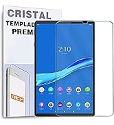
REY 2X Protector de Pantalla para ASUS ZENPAD 3S - Z500M 10 (9.7"), Cristal Vidrio Templado Premium, Táblet
¡Protege tu ASUS ZENPAD 3S con este increíble protector de pantalla de cristal templado! Con una dureza asegurada que cumple con el estándar 9H, este protector mantendrá tu tableta a salvo de arañazos y golpes.
Además, cuenta con un revestimiento oleofóbico que repele la grasa, por lo que tu Táblet estará siempre limpia y reluciente. Y lo mejor de todo, mejora el tacto de la pantalla original de tu tableta, brindando una sensación de suavidad inigualable.
Con una transparencia total y excelente visibilidad, podrás disfrutar de una pantalla con alto contraste y colores vibrantes. Y su sistema de adherencia sin residuos y de fácil aplicación te permitirá instalarlo en segundos, sin complicaciones.
No pierdas la oportunidad de proteger tu ASUS ZENPAD 3S con este protector de pantalla de alta calidad. ¡Compra ahora en Bitech.es y mantén tu tableta como nueva!


Somos una empresa española que vende accesorios para móviles y tablets, de forma que nuestros clientes puedan mejorar su experiencia con sus dispositivos electrónicos.


En BiTech, ofrecemos , 30 días de Devolución GRATUITA, para que puedas comprar con total tranquilidad. Si no estás satisfecho te devolvemos el dinero. A parte, tienes 3 años de garantía.
Más información
REY 2X Protector de Pantalla para ASUS ZENPAD 3S - Z500M 10 (9.7"), Cristal Vidrio Templado Premium, Táblet
¡Protege tu ASUS ZENPAD 3S con este increíble protector de pantalla de cristal templado! Con una dureza asegurada que cumple con el estándar 9H, este protector mantendrá tu tableta a salvo de arañazos y golpes.
Además, cuenta con un revestimiento oleofóbico que repele la grasa, por lo que tu Táblet estará siempre limpia y reluciente. Y lo mejor de todo, mejora el tacto de la pantalla original de tu tableta, brindando una sensación de suavidad inigualable.
Con una transparencia total y excelente visibilidad, podrás disfrutar de una pantalla con alto contraste y colores vibrantes. Y su sistema de adherencia sin residuos y de fácil aplicación te permitirá instalarlo en segundos, sin complicaciones.
No pierdas la oportunidad de proteger tu ASUS ZENPAD 3S con este protector de pantalla de alta calidad. ¡Compra ahora en Bitech.es y mantén tu tableta como nueva!
Somos una empresa española que vende accesorios para móviles y tablets, de forma que nuestros clientes puedan mejorar su experiencia con sus dispositivos electrónicos.