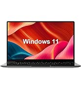
Descripción del producto
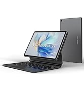
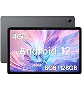
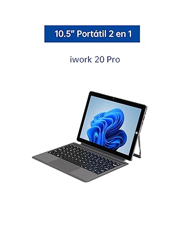
ALLDOCUBE iWork 20 Pro tablet 2 en 1
Respuesta rápida y eficaz
La tableta ALLDOCUBE 2 en 1 cuenta con un potente procesador Intel Celeron N4120 que ofrece un rendimiento fluido y receptivo.
Mucho espacio de almacenamiento
Con 128 GB de almacenamiento interno y la opción de expandirlo con una tarjeta TF de hasta 512 GB, esta tableta te ofrece mucho espacio para guardar fotos, videos y descargar aplicaciones.
Haz más y almacena más
Con 8 GB de RAM y 128 GB de almacenamiento, este tablet pc con Windows 11 te permite realizar múltiples tareas y guardar todos tus archivos localmente.
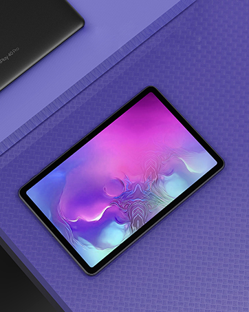
Impresionante experiencia visual
La pantalla IPS de laminación completa de 10.5 pulgadas con resolución Full HD te brinda una experiencia visual increíble, con colores vivos y detalles nítidos.
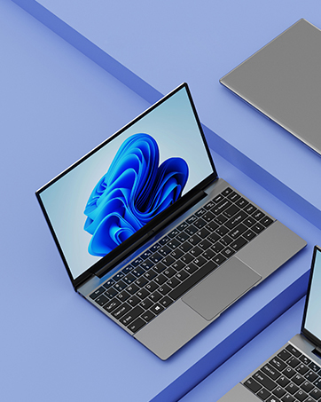
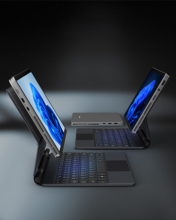
Teclado desmontable y portabilidad
El teclado Pogopin desmontable convierte esta tableta en una verdadera laptop, pero también puedes usarla como una tableta independiente al desconectar el teclado. Además, su peso ligero de 1.32 libras la hace fácil de llevar a todas partes.
Múltiples puertos y cámara dual
Este tablet pc 2 en 1 cuenta con varios puertos, incluyendo USB 3.0, USB Tipo C, HDMI, toma de auriculares y toma de CC. Además, las cámaras duales de 2.0MP + 5.0MP te permiten capturar todos los detalles en tus videoconferencias o trabajos.
¡Descubre todas las funciones y beneficios de la tableta ALLDOCUBE iWork 20 Pro en Bitech.es!


SOBRE ALLDOCUBE
ALLDOCUBE se fundó en 2004, y nuestra gama de productos abarca desde tabletas Android hasta portátiles Windows. Desde sus inicios, Alldocube se ha forjado una excelente reputación gracias a su excepcional experiencia de cliente. Hasta la fecha, Alldocube ya ha creado un gran número de clientes fieles gracias a su continua excelencia en el rendimiento de marketing.


En BiTech, ofrecemos , 30 días de Devolución GRATUITA, para que puedas comprar con total tranquilidad. Si no estás satisfecho te devolvemos el dinero. A parte, tienes 3 años de garantía.
Más información
Descripción del producto
ALLDOCUBE iWork 20 Pro tablet 2 en 1
Respuesta rápida y eficaz
La tableta ALLDOCUBE 2 en 1 cuenta con un potente procesador Intel Celeron N4120 que ofrece un rendimiento fluido y receptivo.
Mucho espacio de almacenamiento
Con 128 GB de almacenamiento interno y la opción de expandirlo con una tarjeta TF de hasta 512 GB, esta tableta te ofrece mucho espacio para guardar fotos, videos y descargar aplicaciones.
Haz más y almacena más
Con 8 GB de RAM y 128 GB de almacenamiento, este tablet pc con Windows 11 te permite realizar múltiples tareas y guardar todos tus archivos localmente.
Impresionante experiencia visual
La pantalla IPS de laminación completa de 10.5 pulgadas con resolución Full HD te brinda una experiencia visual increíble, con colores vivos y detalles nítidos.
Teclado desmontable y portabilidad
El teclado Pogopin desmontable convierte esta tableta en una verdadera laptop, pero también puedes usarla como una tableta independiente al desconectar el teclado. Además, su peso ligero de 1.32 libras la hace fácil de llevar a todas partes.
Múltiples puertos y cámara dual
Este tablet pc 2 en 1 cuenta con varios puertos, incluyendo USB 3.0, USB Tipo C, HDMI, toma de auriculares y toma de CC. Además, las cámaras duales de 2.0MP + 5.0MP te permiten capturar todos los detalles en tus videoconferencias o trabajos.
¡Descubre todas las funciones y beneficios de la tableta ALLDOCUBE iWork 20 Pro en Bitech.es!
SOBRE ALLDOCUBE
ALLDOCUBE se fundó en 2004, y nuestra gama de productos abarca desde tabletas Android hasta portátiles Windows. Desde sus inicios, Alldocube se ha forjado una excelente reputación gracias a su excepcional experiencia de cliente. Hasta la fecha, Alldocube ya ha creado un gran número de clientes fieles gracias a su continua excelencia en el rendimiento de marketing.