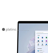
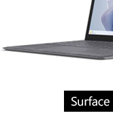
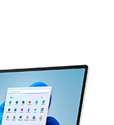
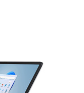
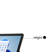
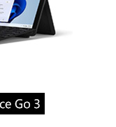
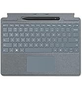
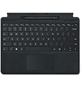
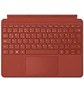
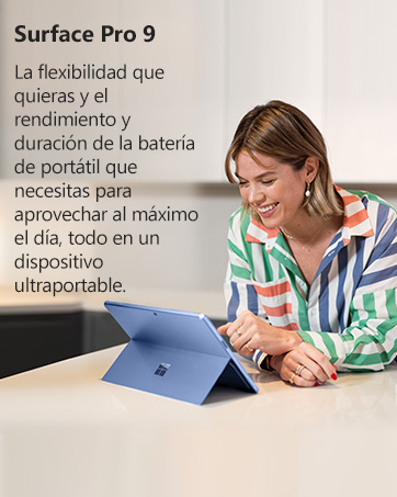
¡Descubre el Surface Pro X en Bitech.es! Trabaja desde cualquier ángulo con su pantalla táctil de 13''. Ajusta el soporte trasero para encontrar el ángulo perfecto. ¡Es como magia! Además, puedes escribir, programar y enviar correos cómodamente con su teclado mecánico retroiluminado (se vende por separado).
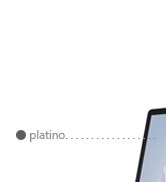
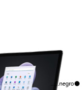
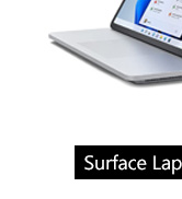
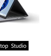
El Surface Pro X es el dispositivo Pro perfecto para la conectividad. Con la opción de conectividad Gigabit 4G LTE, estarás siempre conectado con velocidades ultrarrápidas y estables, ¡incluso en movimiento! Y lo mejor de todo, es el Pro más fino y ligero, pesando tan solo 774g (sin el teclado).
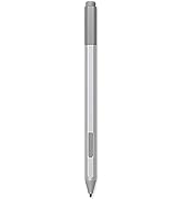
Completa tu Surface Pro X con accesorios esenciales. El Surface Slim Pen 2 te permite escribir, esbozar y navegar con precisión excepcional. Los Surface Earbuds ofrecen comodidad, controles intuitivos y sonido envolvente. Y el Surface Arc Mouse se ajusta a tu mano y se aplana para transportarlo fácilmente.
No te pierdas la oportunidad de tener el Surface Pro X en Bitech.es. Con un procesador Microsoft SQ1, 8GB de RAM, 256GB de disco duro sólido y tarjeta gráfica Microsoft SQ1 Adreno 685, este dispositivo te ofrece un rendimiento rápido y potente. Además, viene con Windows 10 Home y una actualización gratuita a Windows 11 cuando esté disponible.
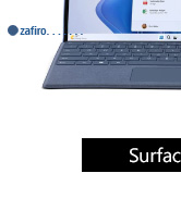
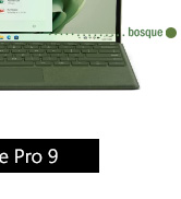
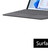
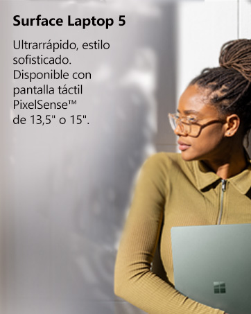
¡Hazte con el Surface Pro X en Bitech.es y lleva tu productividad al siguiente nivel! No olvides añadir el Type Cover (funda con teclado) para una experiencia completa.


En BiTech, ofrecemos , 30 días de Devolución GRATUITA, para que puedas comprar con total tranquilidad. Si no estás satisfecho te devolvemos el dinero. A parte, tienes 3 años de garantía.
Más información
¡Descubre el Surface Pro X en Bitech.es! Trabaja desde cualquier ángulo con su pantalla táctil de 13''. Ajusta el soporte trasero para encontrar el ángulo perfecto. ¡Es como magia! Además, puedes escribir, programar y enviar correos cómodamente con su teclado mecánico retroiluminado (se vende por separado).
El Surface Pro X es el dispositivo Pro perfecto para la conectividad. Con la opción de conectividad Gigabit 4G LTE, estarás siempre conectado con velocidades ultrarrápidas y estables, ¡incluso en movimiento! Y lo mejor de todo, es el Pro más fino y ligero, pesando tan solo 774g (sin el teclado).
Completa tu Surface Pro X con accesorios esenciales. El Surface Slim Pen 2 te permite escribir, esbozar y navegar con precisión excepcional. Los Surface Earbuds ofrecen comodidad, controles intuitivos y sonido envolvente. Y el Surface Arc Mouse se ajusta a tu mano y se aplana para transportarlo fácilmente.
No te pierdas la oportunidad de tener el Surface Pro X en Bitech.es. Con un procesador Microsoft SQ1, 8GB de RAM, 256GB de disco duro sólido y tarjeta gráfica Microsoft SQ1 Adreno 685, este dispositivo te ofrece un rendimiento rápido y potente. Además, viene con Windows 10 Home y una actualización gratuita a Windows 11 cuando esté disponible.
¡Hazte con el Surface Pro X en Bitech.es y lleva tu productividad al siguiente nivel! No olvides añadir el Type Cover (funda con teclado) para una experiencia completa.