Más información del producto
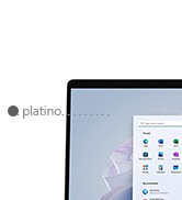
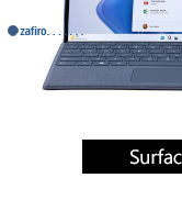
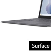
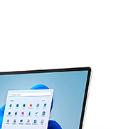
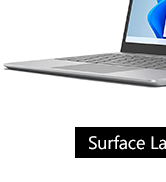
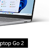
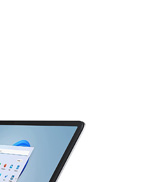
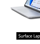
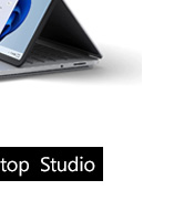
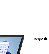
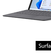
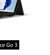
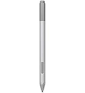
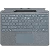
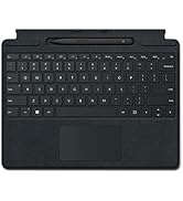
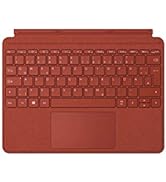
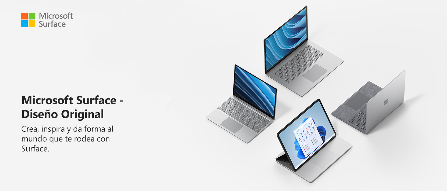
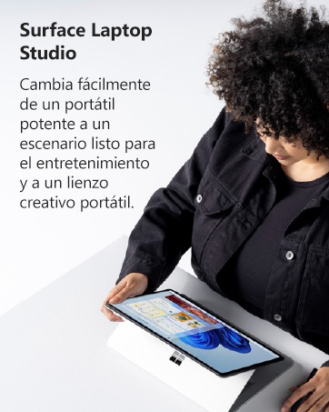
El dispositivo Surface Laptop más potente ahora en Bitech.es. Da vida a tus grandes ideas sin dificultad con los potentes procesadores Intel Core de 11ª generación y la increíble GPU NVIDIA GeForce RTX 3050 Ti para portátiles. Entra rápidamente en tu flujo de trabajo con hasta 32 GB de RAM y una unidad SSD de hasta 2 TB. Configura tu Surface Laptop Studio según tus necesidades. Diseña, anima y presenta con facilidad gracias a la galardonada arquitectura RTX de segunda generación de NVIDIA, que ofrece gráficos con trazado de rayos y funciones de inteligencia artificial vanguardistas. Eleva tus juegos para PC con gráficos que desafían la realidad y empareja tu mando inalámbrico Xbox para obtener la mejor experiencia. Trabaja, juega y crea como quieras con Surface Laptop Studio y Windows 11, que te permiten expresarte de la forma más natural para ti. Fabricado por Microsoft, Surface Laptop Studio ofrece lo mejor de Windows 11. Suscríbete a Microsoft 365 y las posibilidades se vuelven infinitas. Además, con OneDrive puedes sincronizar y realizar copias de seguridad de tu escritorio, documentos y fotos entre dispositivos de forma sencilla. No tendrás que preocuparte por virus, malware o hackers gracias a la aplicación de seguridad de Windows. Windows 11 es el lugar perfecto para todo, desde familia y amigos hasta tus pasiones. Completa tu Surface Laptop Studio con accesorios esenciales como el Surface Slim Pen 2, Surface Earbuds, Surface Arc Mouse y Surface Dock 2. Con un procesador Intel Core i5-11300H, 16 GB de memoria y un almacenamiento SSD de 256 GB, este portátil te ofrece un rendimiento excepcional. ¡No esperes más y adquiere tu Surface Laptop Studio en Bitech.es!


En BiTech, ofrecemos , 30 días de Devolución GRATUITA, para que puedas comprar con total tranquilidad. Si no estás satisfecho te devolvemos el dinero. A parte, tienes 3 años de garantía.
Más información
Más información del producto
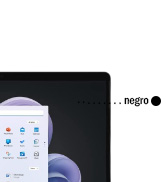
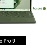
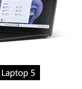
El dispositivo Surface Laptop más potente ahora en Bitech.es. Da vida a tus grandes ideas sin dificultad con los potentes procesadores Intel Core de 11ª generación y la increíble GPU NVIDIA GeForce RTX 3050 Ti para portátiles. Entra rápidamente en tu flujo de trabajo con hasta 32 GB de RAM y una unidad SSD de hasta 2 TB. Configura tu Surface Laptop Studio según tus necesidades. Diseña, anima y presenta con facilidad gracias a la galardonada arquitectura RTX de segunda generación de NVIDIA, que ofrece gráficos con trazado de rayos y funciones de inteligencia artificial vanguardistas. Eleva tus juegos para PC con gráficos que desafían la realidad y empareja tu mando inalámbrico Xbox para obtener la mejor experiencia. Trabaja, juega y crea como quieras con Surface Laptop Studio y Windows 11, que te permiten expresarte de la forma más natural para ti. Fabricado por Microsoft, Surface Laptop Studio ofrece lo mejor de Windows 11. Suscríbete a Microsoft 365 y las posibilidades se vuelven infinitas. Además, con OneDrive puedes sincronizar y realizar copias de seguridad de tu escritorio, documentos y fotos entre dispositivos de forma sencilla. No tendrás que preocuparte por virus, malware o hackers gracias a la aplicación de seguridad de Windows. Windows 11 es el lugar perfecto para todo, desde familia y amigos hasta tus pasiones. Completa tu Surface Laptop Studio con accesorios esenciales como el Surface Slim Pen 2, Surface Earbuds, Surface Arc Mouse y Surface Dock 2. Con un procesador Intel Core i5-11300H, 16 GB de memoria y un almacenamiento SSD de 256 GB, este portátil te ofrece un rendimiento excepcional. ¡No esperes más y adquiere tu Surface Laptop Studio en Bitech.es!